For most of its history, the logo of the US news agency Associated Press has been based on the letters “A” and “P.” The style of the emblem has been evolving over time until it reached its current modern and minimalistic look.
Meaning and history
The Associated Press is a not-for-profit news agency based in New York City. Established in 1846, it has become one of the world’s leading news agencies. It has earned over 50 Pulitzer Prizes and now employs around 3,200 people.
What is AP?
AP is an American news agency that was founded in 1846. Today, the Associated Press is one of the world’s largest news and information agencies. The company, headquartered in New York, operates worldwide and has its news produced in English, Spanish and Arabic languages.
1900
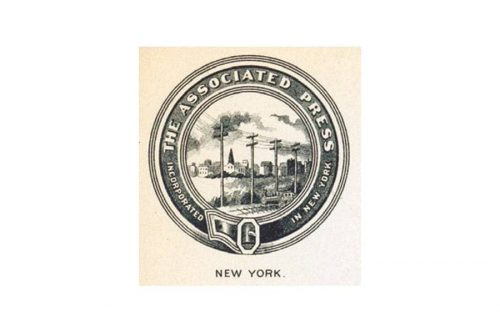
The AP logo used over the first two decades of the previous century was totally different from everything that followed. The visual identity was built around a depiction of a row of telegraph poles with a cannon on the forefront. On the background, there was a town or a village. The design was encircled by the lettering “The Associated Press” and “Incorporated in New York.” The text could be seen on a ring resembling a belt.
1933

In 1933, a completely new emblem was unveiled featuring the “A” and “P” in black and white. The letters overlapped in their vertical bars, so there was only one bar.
1942
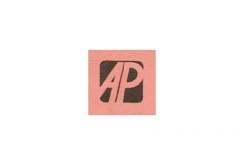
In the 1942 version, this effect wasn’t used, yet the designer accentuated the vertical bars of the two letters by making them parallel to each other. The white fields from the previous logo were colored pink.
1945
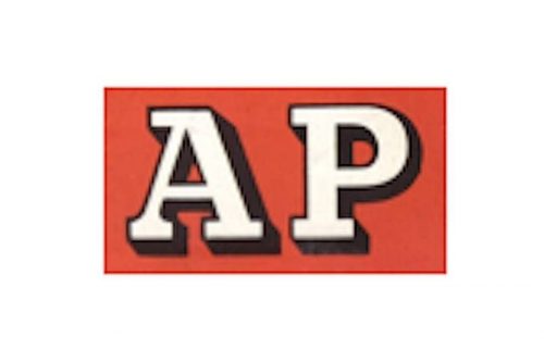
The emblem introduced three years later drew the “A” and “P” even further from each other. This time, both the letters had serif. The glyphs were white with a black shade, while the background was red.
1955

The 1955 version featured not only a new color scheme (white and two shades of green) but also an updated shape of the letters. Once again, the right vertical bar of the “A” overlapped the vertical bar of the “P,” so the letters appeared to be stuck to each other. For the first time, the design was placed inside a circle, which, in its turn, was positioned inside a square.
1961

The following version, which was unveiled in 1961, was a black-and-white roundel logo in which the “A” and “P” were once again separated from each other. While the “A” was a capital letter, the “p” was lowercased. The text “The Associated Press” encircled the design.
1981

Two decades later, in 1981, the new agency made a decisive step towards simplicity and minimalism by getting rid of anything other than the letters “A” and “P.” They were bold and had no serifs. In each of the letters, the solid line was broken by a white gap.
2012 — Today
The redesign of 2012 has introduced a modern and bright yet still very laconic badge for the Associated Press Agency. The new badge features a bold black “AP” lettering in a clean geometric stencil sans-serif typeface, placed against a plain white background and accompanied by a horizontally stretched narrow rectangle in solid red, placed under the monogram, underlining it.
Associated Press emblem
The 2012 emblem

The updated AP logo features the black letters “A” and “P” inside a white container. There’s a bright red “prompt” underline below the letters. While the previous logo was designed internally, this one was developed by the New York design firm Objective Subject. According to the news agency, its updated emblem symbolizes “integrity,” “action,” and “independence.”
Signature
In addition to the primary logo, the organization also has a so-called signature, which combines the primary emblem and the words “Associated Press” aligned horizontally.
Font
The official brand guidelines mention two typefaces: Good and Freight Text. However, the letters featured on the AP logo don’t seem to have been taken unchanged from any of them. The minimalistic sans serif type looks like a heavily modified Good Bold. The most distinctive feature of the logo typography is the white gap on both the letters.
Colors
The classic contrast between black and white has been enlivened by a bright, vivid shade of red. It goes with the code 032 C or 032 U in the Pantone Color Matching System.


