Antena 3 is the name of a famous Spanish tv-channel, which was established in 1988. Today the channel is a part of the Atresmedia Group, which owns several other radio and tv portals. Antena 3 is the number 3 channel in Spain, which is also available worldwide through satellite services.
Meaning and history
The visual identity of one of the most popular Spanish channels has changed a lot throughout the years. The company experimented with its logo since the very first was introduced in 1989, just a year after the channel was launched.
1989 – 1992
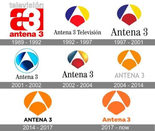
The initial emblem for Antena 3 was introduced in 1989 and stayed with the brand for almost three years. It was a bright red and white badge, designed by José María Cruz Novillo. The logo was composed of a bold lowercase “A” in red, and a digit “3” in white, overlapping the letter. Above the symbol, there was a white “Television@ lettering with a thin black outline, and under — “Antena 3” in red lowercase sans-serif.
1992 – 1997
The redesign of 1992 brought a completely new image to the Spanish tv channel, giving it the emblem we still can see on the screens today. It was designed by Jose Giménez de Pueblo and boasted a stylized abstract emblem, composed of three geometric shapes in different colors, which formed a letter “A” in the negative space. The elements were colored dark blue, red, and yellow, looking delightful and memorable. As for the inscription, it was written in the title case of a classy serif font, in black, and placed under the modern and cool emblem.
1997 – 2001
In 1997 the logo was simplified and refined. The tricolor emblem was now enlarged and the inscription in the iconic Garamond typeface was shortened from “Antena 3 Television” to just “Antena 3”. The lettering became bigger too, adding confidence and creating a more harmonized look of the whole logo. As for the color palette, the abstract badge was still executed in blue, red, and yellow color but now the darker shades of these colors were used by the channel.
2001 – 2002
In 2001 the brand changed the color palette of its logo to blue and white, setting the emblem in gradient glossy shades of blue and enclosing it into a thin circular frame in the same color. As for the lettering, it was still executed in Garamond, but now in its narrowed version, which was more tender and sophisticated, perfectly suiting the new color scheme of the badge.
2002 – 2004
In 2002 the company returns to its original tricolor palette, but intensifies the shades and maker the three elements of the emblem three-dimensional, by adding volume and gradients to them. The lettering came back to the traditional contours and got enlarged again, still written in black Garamond.
2004 – 2014
In 2004 the color palette of the iconic logo was changed to orange and gray, where the graphical part was colored orange, and the lettering in the new typeface and style — in gray. The wordmark was now set in all capitals of a clean and simple sans-serif typeface, which is very close to Trebuchet MS. The changes of 2004 made the badge of the Spanish tv channel lion more modern and progressive, whiteout losing its legacy and individuality.
2014 – 2017
Both elements of the Antena 3 logo were enlarged in 2014. The emblem was almost untouched, just got its elements slightly stretched horizontally. As for the text-part of the visual identity, its typeface was switched to Gotham, an extended and solid sans-serif with a strong character and clean contours. The color of the wordmark was also changed — the light gray was replaced by black.
2017 – Today
In 2017 the logo was refined and softened by the Gedeón design bureau. The elements of the emblem got their contours cleaned and softened, and the color palette is now composed of only orange and white, with the “Antena 3” inscription set in the title case again, and executed in a fancy and stylish Isidora typeface with playful lines.


