Animal Planet is the name of the informational tv-channel, owned by Discovery and dedicated to documentary movies and series about animals. The channel was established in 1996 in the United States and today is very popular all over the globe, having almost 100 million people watching it.
Meaning and history
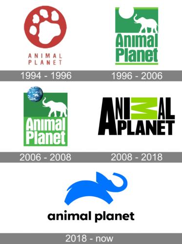
The history of the Animal Planet visual identity can be divided into three periods, where the first two lasted for about ten wars each, and the third one is what we all know now.
1994 – 1996
The very first logo for Animal Planet was created in 1994 and stayed active for a couple of years. It was a red and white composition, with the emblem set above the medium-weight uppercase lettering in a geometric sans-serif font. The emblem comprised a white paw of a big cat drawn on a solid red roundel, using the same shade of red as the logotype.
1996 – 2006
The very first logo was designed for the tv-channel in 1996 and was the most ornate and detailed one. The green and white emblem was placed above the green bold lettering, set in two levels.
The emblem depicted a white contour of the elegant, drawn in profile facing left. The three-dimensional Earth image was placed above the elephant, making it look like the animal is playing with the planet as if it was a ball.
The wordmark featured a custom sans-serif typeface with smooth bold lines and slightly arched vertical bars of the letter “A”.
2006 – 2008
Later, in 2006, the logo was slightly modified — the lettering became white and was placed on a bright green background, while the green of the emblem became a bit more intense and dark.
2008 – 2018
The version of 2008 was completely different. The channel decided to remove all graphics from its visual identity and started using a strong and modern wordmark as its official logo.
The wordmark was executed in black geometric sans-serif font with sharp straight cuts and edges. The only bright detail here was the green letter “M”, lying horizontally on the “A” and “N” of the “Planet”, placed on the lower level.
2018 – Today
The elephant came back to the Animal Planet visual identity in 2018. But today it is a contemporary and more abstract drawing. The blue stylized animal now moves to the right, into tomorrow, as a symbol of progress and development.
The black wordmark in the lowercase is drawn in black and placed under the blue emblem.
The Animal Planet logo looks modern and friendly, and its blue, black, and white color palette adds freshness and youth, evoking a sense of loyalty and reliability at the same time.


