Animal Jam is the name of an MMO game that was released in 2010 and was very popular across the globe, having its versions available for mobile and computer operating systems, as well as the online one. The game is based on wild nature plots and includes some educational puzzles and quests.
Meaning and history
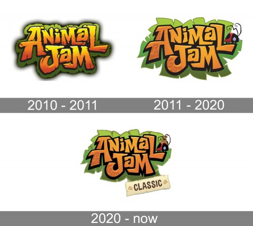
Though the visual identity of the famous online game has been redesigned several times throughout the years, if today you look at the original and current versions of the logo, you will not be able to find many differences. The color palette and style of the lettering have been kept during the whole history of the Animal Jam, and only contours and some minor details were being refreshed from redesign to redesign.
2010 — 2011
The original logo for Animal Jam was introduced in 2010, with the release of the game. It was composed of a dark green banner, stylized as a grass lawn, repeating the contours of the custom-written wordmark in gradient orange and yellow. The inscription was set in two levels and has its hand-drawn capital letters outlined in black and placed very close to each other. This version of the logo was in use for only several months, during the beta testing of the game.
2011 — 2020
In 2011 the first original version of the Animal Jam visual identity saw the light. It was based on the previous version but had some things refined and some — added. The lettering was still drawn in the same style, but got its lines and contours emboldened and cleaned, while the green grass background turned into palm leaves and switched to a lighter green palette with some gradient shades.
On the tail of the letter “L”, there was a playful cartoonish ladybug in its traditional black and red color scheme. The insect had its antennae elongated and curved, looking friendly and cool.
2020 — Today
The redesign of 2020 was held only because the name of the game was changed to Animal Jam Classic, so the third part of the name had to be added. Along with the lettering, the logo switched the color palette of its background to a lighter one, which made the wordmark look brighter and more confident. As for the “Classic” part, it is now written in all capitals of a neat and slightly narrowed sans serif typeface on a light cream rectangular banner, which is placed diagonally on the bottom right part of the logo, under the green leaf.


