

![]() Montpellier Logo PNG
Montpellier Logo PNG
Montpellier is the name of one of the French most popular football clubs, which was established in 1919. Today the club, nicknamed “La Paillade” (“The Straw”), plays in Ligue 1 and has Michel Der Zakarian as the head coach.
Meaning and history
![]()
Though the team’s history started at the end of the 1910s, the current Montpellier club was officially founded in the middle of the 1980s, when it was acquired by the Nicollin family. So the visual identity history of the French football club starts in 1975 and can be split into two periods — the red one, from 1975 to 1989, and the blue one — from 1989 until today.
1919 — 1923
![]()
The original logo was a light grey shield with a red circle in its middle.
1923 — 1931
![]()
The 1923 logo was instead a red circle with two ‘M’ & ‘S’ letters placed inside (on the same spot, more or less). They practically fused with the circle itself.
1931 — 1950s
![]()
In 1931, they adopted a wide red rhomb with ‘SOM’ written inside in a typical sans-serif style (also red).
1950s — 1974
![]()
This emblem depicted a shield shape. There were three sections: a fully red rectangle on the top with the letters ‘SOM’ inside, a red bit on the left, and a white one on the right. These were divided using the bronze outlining. The latter two contained a red image of a cross – a small one with square proportions.
1974 — 1975
![]()
In 1974, they adopted instead a big circle. Nearly ¾ above were painted turquoise, while a little bit below was red. The former contained the writing ‘Paillade SC’ in white, while the latter said ‘Littoral’. There was also a white-blue football image between the two.
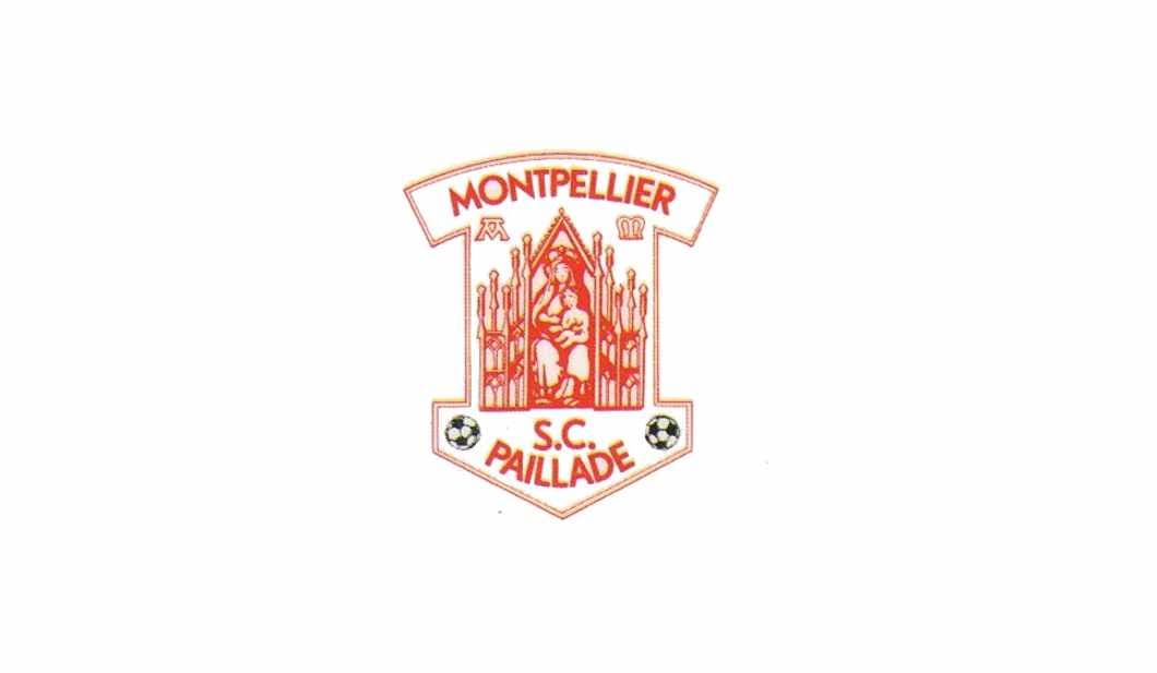
1975 — 1982

The logo designed for the football club in 1975 was composed of a rounded frame, where the wordmark and the team’s symbol was enclosed. The whole composition was executed in a bright red color and placed on a white background. This color palette represented the club as passionate, powerful, and progressive.
On the upper part of the circular badge, there was a “Montpellier” lettering placed along the perimeter. Written in a bold narrowed serif typeface with massive serifs, it was balanced by the “Paillade” inscription arched along the bottom part of the badge.
The red and white football with the “S.C” letters above it was placed in the middle of the badge.
1982 — 1983
For one year the team changes its logo to something not typical for a football club. It was a smooth shield, resembling an arrow pointing down, with the altar where the Virgin Mary was holding little Jesus in her arms.
On the upper part of the crest, there was a “Montpellier” inscription in sans-serif, slightly arched. And the “S. C. Paillade” lettering was placed under the altar. Two black and white footballs were located on both sides of this wordmark.
1983 — 1987
In 1983 the club brings back its logo version from the 1979s, making its outline bolder and cleaner. The red and white color palette and the whole composition remains untouched.
1987 — 1989
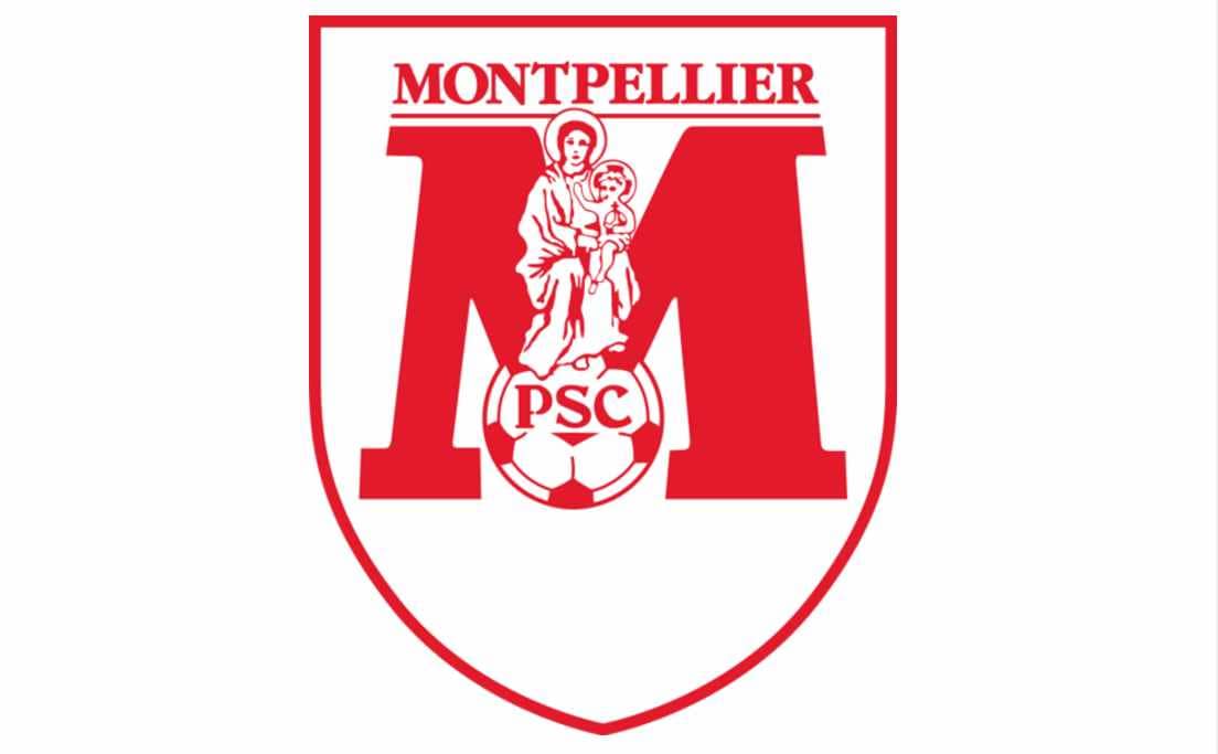
The last red logo for the football club was created in 1987 and only stayed for two years. It was a classic shield in a thin red outline, where the new team’s emblem was located.
The emblem depicted a solid ExtraBold letter “M” in a traditional serif typeface, with the red and white football placed in the central bottom part of it. The “PSC” letters were placed right in the ball.
The Virgin Mary with Jesus was located on the football, and her head was touching the underline of the “Montpellier” wordmark placed on the top part of the shield.
The inscription was executed in all capitals of a bold serif font, with elegant yet massive serifs.
1989 — 2000
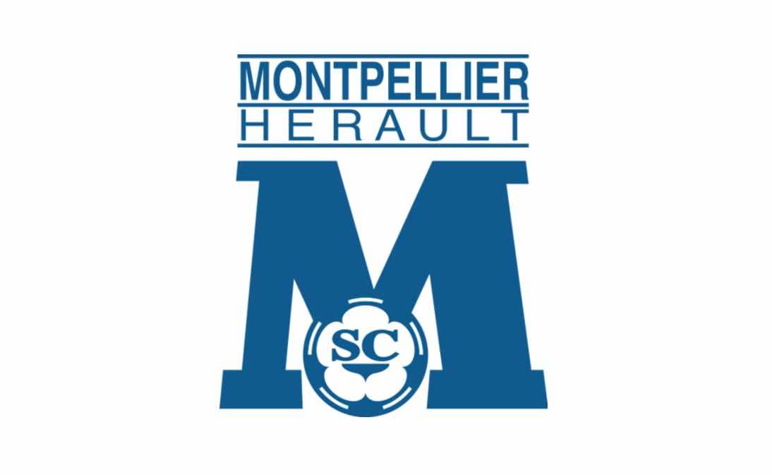
The first blue and white logo were designed for the club in 1989z it was an emblem, taken from the previous version, but without the Virgin Mary.
The bold blue letter “M” and the blue and white football made the main part of the new visual identity. Two letters, “SC”, were written on the ball without any dots.
The new club’s name, “Montpellier Hérault”, was located above the emblem. Two parts of the nameplate were separated from each other and the graphical part by thin horizontal lines.
The wordmark was written in a clean modern sans-serif typeface, with “Montpellier” in bold lines, and “Hérault” a bit extended.
2000 — Today
![]()
In 2000 the new design of the club’s badge was introduced. It features a circular emblem with a wide double outline.
The middle part of the circle features a diagonal striped pattern, executed in blue and white, and boasting three blue and four white stripes. This circle is outlined in thick orange, which is also outlined in white and blue, where the wordmark is placed.
The “Montpellier Hérault Sport Club” inscription is written in blue around the badge’s perimeter and executed in a bold serif typeface, with “Montpellier” in capital letters, and all the other words in a title case.
The “1974” mark, celebrating the team’s establishment, is placed on the bottom part of the white framing.


