Anderlecht is the shortened name of the Royal Sporting Club Anderlecht, a professional football club from Belgium, which was established in 1908, and today plays in the First Division of the Belgian Football League. The club is based in Brussels and has Vincent Kompany as the head coach.
Meaning and history
During the first years after the foundation, the soccer club did not have any outstanding results and was always in the middle of the standings, but this did not prevent Anderlecht from obtaining the status of the Royal Club in 1933.
The first serious success came after the end of the Second World War, when the purple and white took one of the dominant positions in Belgian soccer and began to collect titles of various scales, including in the international arena, becoming the base club for the Belgian national team for many years.
What is Anderlecht?
Anderlecht is the Belgian professional football club, founded in 1908. Although the club was founded at the beginning of the century, it did not earn its first championship trophy until 1947. But today Anderlecht is the most titled team in the country.
As for the visual identity, the Belgian club uses heraldic symbols of its country as the Anderlecht commune, where it was established, showing the value of the history and roots, and celebrating patriotism and loyalty. Almost all the versions of the Anderlecht logo, created throughout the years were based on one idea and color palette, and just the badge from 1933 was different.
1933 — 1981
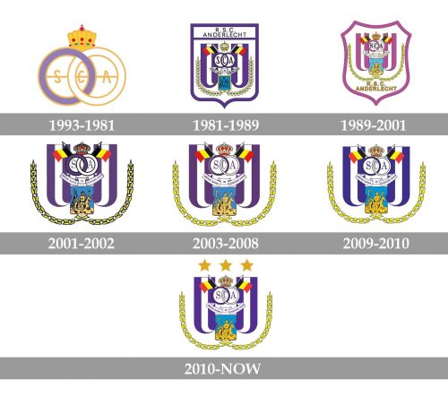
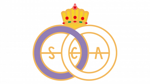
After obtaining the Royal Football Club status, Anderlecht reflected it in its logo in 1933. The badge of the club was composed of two intertwined rings — light purple on the left and white on the right — with a golden outline and a thin golden line coming through them horizontally. Three gold letters, “S”, “C”, and “A” ( standing for “Sporting Club Anderlecht”), were strung on a horizontal line, are placed in each of the three white segments, formed by the intertwined rings. On top of the badge, there was a massive tall golden crown decorated with red and green gemstones.
1981 — 1989
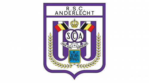
In 1981 the club started using the logo with the elements, which are still kept on the Anderlecht badge today. The logo of that period featured a white crest with a bold purple outline and a rectangular banner with the “R. S. C. Anderlecht” uppercase inscription in black on it.
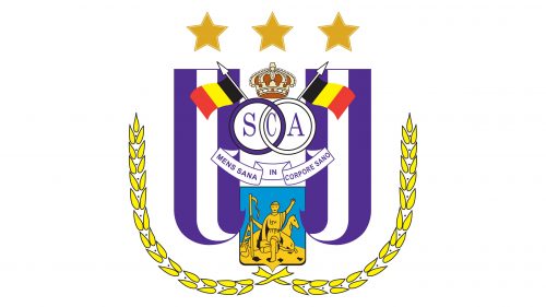
The main part of the crest featured two vertical flags with two purple and one white stripe on each. This is the official flag of the club. On top, the flags were overlapped by the purple rings with the “SCA” monogram, just like on the previous emblem of Anderlecht. The rings were decorated by a yellow crown and two National flags of Belgium, waving to the sides.
Under the rings, there was a white ribbon with the Latin motto, and at the very bottom — a turquoise blue coat of arm of the Anderlecht commune in a yellow frame, underlined by two yellow spikes.
1989 — 2001
The shade of the crest was changed in 1989, along with the color palette and composition of the logo. The medium shade of purple was switched to a lighter one, and the black inscription was removed from the top part of the crest, along with the rectangular banner. Now the “R. S. C. Anderlecht” inscription was executed in yellow and placed at the very bottom of the shield. All other elements got their contours refined, but the geometry remained the same.
2001 — 2002
The color palette from 1981 came back in 2001, but the outline of the crest was removed, so now all the elements of the logo, apart from the full inscription, were simply placed on a plain background. The contours and details of the logo part were refined and strengthened, and the Anderlecht Commune coat of arms was now more visible and distinct. The right ring on the element, placed on top of the badge, turned white again.
2003 — 2008
The Anderlecht badge was refined and became more elegant and light after the redesign of 2003. The bold black outlines of all elements got thinner, and the ring symbol was redrawn: the thickness of the rings was reduced and the letter “C” got narrowed. The yellow spikes now looked more sophisticated and bright, and the man on the Anderlecht commune coat of arms was now easily distinguishable.
2009 — 2010
The redesign of 2009 introduced a new choice of colors for the Anderlecht football club logo. All purple shades on the badge were replaced by the blue ones — on the left ring, and the vertical striped flags. This made the logo look more usual and lack that individuality it used to have, although at the same time the badge became more modern and fresh.
2010 — Today
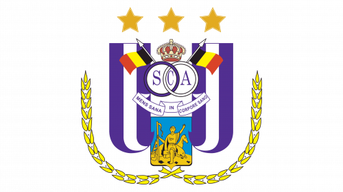
The iconic purple comes back to the Anderlecht logo in 2010, but that was not the only change. Today the logo of the club is decorated by three solid gold five-pointed stars (to celebrate the wins in the national championships), set on top of it in a straight horizontal line. With the stars, the long yellow spikes look more balanced and the whole logo evokes a sense of excellence and confidence.


