 S.P.A.L. Football Club logo PNG
The name of the football club, S.P.A.L. 2013, is short for Società Polisportiva Ars et Labor. The club, which competes in Serie A, was established in Ferrara, Emilia Romagna, in 1907.
Meaning and history
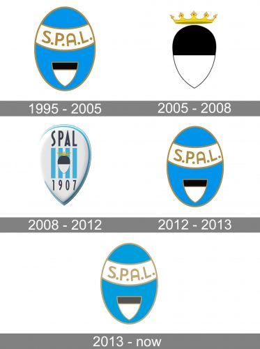
While SPAL has gone through a variety of logos throughout is more than 110-year history, we can point out a couple of visual symbols that have remained comparatively consistent.
1995 — 2005
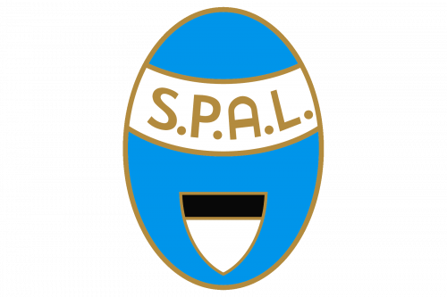
The S. P. A. L. Logo, created in 1995 boasted a sophisticated light blue, white and black color palette with a delicate addition of gold lines and letters. It was a vertically oriented oval with a sky-blue background and gold frame. The bottom part of the medallion was embedded with a white and black triangular crest, and the top part of the badge had a wide white arched banner with the sand-serif gold lettering on it. The banner was outlined in gold as well.
2005 — 2008
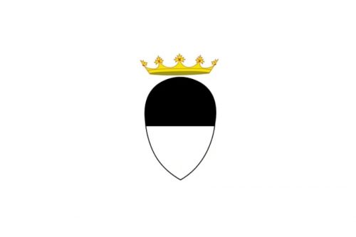
The redesign of 2005 simplified the logo of the football club but made it more elegant and classy at the same time. The blue medallion was gone and the black and white crest changed its shape to a rounded, egg-like shape, with the pointed bottom part. The crest was accompanied by a thin golden crown with red gemstones, which was drawn slightly above the black-and-white element, with some air and space.
2008 — 2012
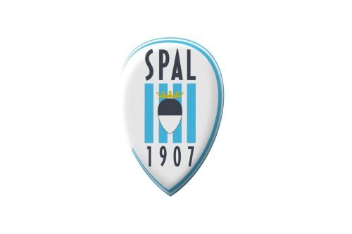
The egg-like crest with a crown became an element of the new badge, designed in 2008. It was a smooth three-dimensional white and light blue badge with black “SPAL” lettering on top, a “1907” date mark on the bottom, and a vertically striped square element in blue and white in the center. The glossy surface of the badge looked sleek and stylish in combination with the bold and modern sans-serif typeface of the club’s name inscription. It was a truly memorable and eye-catching logo, which stayed with the club for less than four years.
2012 — 2013

The light blue medallion from 1995 came back as the official logo of the club in 2012. The elements on the crest were refined and slightly widened, with the triangular crest getting larger and more visible and the gold lettering — more solid. It was a bright logo with a strong contrast, which only stayed in use for a few months.
2013 — Today
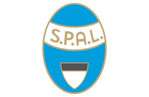
The redesign of 2013 was all about the color palette of the SPAL visual identity. The background of the vertically set oval became lighter, as well as the gold shade of the framing and lettering. As for the triangular crest on the bottom part of the badge, it got its colors muted as well, with black turning gray. The new color scheme looks airy and tender.
SPAL Colors
BLUE
PANTONE: 7688 C
HEX COLOR: #3697C4;
RGB: (54, 151, 196)
CMYK: (74, 27, 9, 0)
WHITE
PANTONE: P 1-1 C
HEX COLOR: #FFFFFF;
RGB: (255, 255, 255)
CMYK: (0, 0, 0, 0)
GOLD
PANTONE: 466 C
HEX COLOR: #C7A76C;
RGB: (199, 167, 108)
CMYK: (23, 32, 66, 1)
BLACK
PANTONE: BLACK 6 C
HEX COLOR: #000000;
RGB: (0, 0, 0)
CMYK: (0, 0, 0, 100)


