AmerisourceBergen Corporation is a drug wholesale company headquartered in Chesterbrook, Pennsylvania, U.S. It was ranked 8th in the Fortune 500 list for 2021 with over $189 billion in annual revenue.
Meaning and history
The AmerisourceBergen logo has always been centered around the name of the brand. It has never left you in doubt which company the sign belongs to. And yet, when it comes to the type of company and the industry, you can hardly figure out anything based on the design – it’s not very meaningful or evocative.
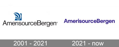
2001 – 2021
The original logo combined the wordmark with an emblem. The wordmark was set in a clean sans and was black.
It combined capital letters (for the initials) with lowercase ones (all the other letters). This was of paramount importance because the name of the brand is immensely long and almost impossible to grasp at a single glance. You have to read it carefully and slowly.
To make matters worse, it joins three words into a single one without any space between them. So, if not for the capital “B” that creates at least some sort of a visual border, people would have had to reread it more than once to be able to understand what it says.
On a more positive note, the type is highly legible. There are no serifs, the letters are lean and have classic proportions.
The emblem is pretty abstract. It combines several curves in white. They are placed over a blue background. The overall impression is dynamic and light, like a hot air balloon floating in the sky.
2021 – present
The design was made a little cleaner and unique.
Firstly, the company got rid of the emblem. The emblem didn’t bear much meaning, was pretty cluttered, and wasn’t very memorable, so the fact that it disappeared was only for the better. Due to it, more attention was now drawn to the name of the brand.
The wordmark now features a rather unusual blurple color. It has some links with the blue color of the previous logo but looks more unique. On the downside, it hardly conjures anything that relates to the pharmaceutical industry.
What is AmerisourceBergen
AmerisourceBergen Corporation is a Pennsylvania-based pharmaceutical distributor. In addition to distributing drugs, it also offers consulting on various aspects of medical business operations and patient services.
What makes the AmerisourceBergen logo stand out is the typeface. On the one hand, the overall shape of the glyphs is regular, which provides adequate legibility. And yet, there are distinctive touches here and there making the design recognizable. The horizontal bar on the “A” is shorter than average resulting in an unexpected white gap in the center of the glyph. The same approach has been used for the “B,” where there is also a gap in the center. This creates a sort of visual rhyme between the two letters.
That said, we still have to acknowledge that the name of the brand is unbelievably long. Given that it has to be written as a single word and within a single line makes it virtually impossible to present it as a logo that is minimalist and easy to grasp.
Colors and font
While the black color of the old AmerisourceBergen logo created a better contrast with the white background, the blurple color is more unique. To preserve adequate legibility, the designers who worked on the project added some weight to the wordmark.
The basic structure of the typeface remained the same in the 2021 logo. And yet, because of the weight and the white gaps, the type looks unlike the one in the previous version.


