American Tourister is a luggage brand headquartered in Providence, Rhode Island, U.S. It belongs to Samsonite.
Meaning and history
The company was started by brothers Sol and Irving Koffler and financed with Sol’s life savings. In 2009, the brand was bought by Astrum International, which was later renamed the Samsonite Corporation.
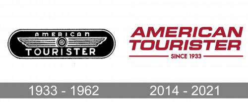
1933 – 1962
The earliest American Tourister logo seen on an old print ad from the company’s website was based on a stylized pair of wings. You could see similar wings on the emblems of multiple airlines and car manufacturers.
Another two old logos had an immediately perceptible patriotic vibe. It was created by the colors of the Flag of the United States (the only colors present in the palette), to say nothing of the presence of the word “American.”
The older of these logos had three stripes, while on the following version, the blue and red stripes were replaced by curved shapes. The logo looked pretty dynamic, due to the curved shapes, and deep, due to the white highlights. The type was a highly legible one, which perfectly fit the purpose: people could easily see it even at a larger distance (for instance, on the luggage of those whom they came across in the airport).
2014 – 2021
The American Tourister logo has grown even simpler and better legible. This time, it is dominated by the name of the brand and features a single color. The glyphs are still large, minimalist, and easy to read even at smaller sizes. They are italicized, to convey speed. The color is more unique, in comparison with the generic old palette.
As a result of the update, the emblem has become better recognizable and memorable.


