 American Heart Association Logo PNG
American Heart Association is a foundation that helps in research and cure of cardiovascular health conditions. It was established in 1924 and today is one of the largest charity organizations in America.
Meaning and history
American Heart Association was founded in 1924, being a successor of the Association of the Prevention and Relief of Heart Disease, which was actually focused on the same problems. The predecessor of AHA was established in New York, so the new Association spent its first years there too but later moved to Texas.
Today The American Heart Association is engaged in the research of cardiovascular medical problems and financing medical help for people with medical conditions, connected to the heart. AHA is one of the largest charity organizations in the world, according to Forbes.
What is American Heart Association?
American Heart Association is a non-profit American organization, which was established in the middle of the 1920s to help people with cardiovascular problems. Today the association successfully operates all over the country, financing research and cure of patients with heart conditions.
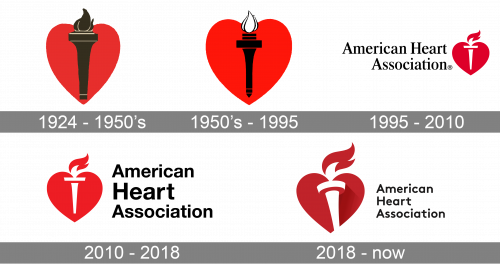
1924 – 1950s
The first insignia was a black torch with a white flame. It was drawn over the bright red heart. It caught eye, as a result.
1950’s – 1995
The redesign of the 1950s has brightened up the color palette of the American Heart Association’s visual identity, making the red of the heart a bit lighter. As for the torch, it was also redrawn with more white accents on it, and the contours were made thin and elegant. The new emblem stayed in use by the organization for more than forty years, being a perfect depiction of its purpose and character.
1995 – 2010

The first logo for American Heart Association was created in 1994 and featured a bright red emblem placed on the right from the logotype, which was set in two levels. The emblem boasted a solid red heart with a white and red torch on it. As for the logotype, it was executed in a classy serif typeface, with all three words of the nameplate set in a title-case. The inscription was written in black.
2010 – 2018

With the redesign of 2010, the red emblem became brighter and larger and was moved to the left from the logotype, which was also refined and rewritten. Now the inscription was set in three levels, with the “Heart” line featuring the largest and the boldest letters.
2018 – Today
The American Heart Association logo is bold and traditional. Its emblem is instantly recognizable and evokes a sense of warmth and reliability.
The wordmark, placed on the right of the emblem is written in three levels and uses a smooth sans-serif typeface with wide and neat lettering. The black color of the nameplate makes it look strong and professional.
The American Heart Association emblem is a dark red heart with a burning torch on it. The flame of the torch is placed on top of the heart, waving to the right. It is a very strong and meaningful insignia, which represents the association’s profile and its passion to help people fight.
The clean lines of both emblem and wordmark make the logo look modern and sharp. The classic black-red-white tricolor palette is a stylish and timeless combination, celebrating power and energy, the main characteristics of the American Heart Association.
Font
The modern and bold title case lettering from the primary badge of the American Heart Association is set in a modern sans-serif typeface with slightly extended contours of the letters. The closest fonts to the one, used in this insignia are, probably, Merrant Bold and Neue Radial C Medium.
Сolor
As for the color palette of the American Heart Association’s visual identity, it is based on a classy and timeless combination of red, black, and white. This scheme also perfectly reflects the essence and purpose of the organization, as red is the first color associated with the heart. Also, it is a symbol of love and caress, which the Association gives to its patients.


