 American Cancer Society Logo PNG
American Cancer Society is an organization helping in cancer research and elimination. It was established in 1913 and today has its offices all over the country. The Society helped in funding of more than 40 Nobel Laureate researches.
Meaning and history
The organization, which is today known as the American Cancer Society was established in 1913 by 15 doctors and businessmen in New York City under the name American Society for the Control of Cancer (ASCC). The modern name was adopted only in 1945. Although, the aims and focus of the society remained the same: The society fights to prevent cancer, save lives, and reduce suffering through research, education, etc.
What is the American Cancer Society?
American Cancer Society is a non-profit organization, which was established in 1913 and is focused on research and cure of oncology diseases. The organization was established in New York, and today is headquartered in Georgia, operating all over the United States.
1928 – 1952
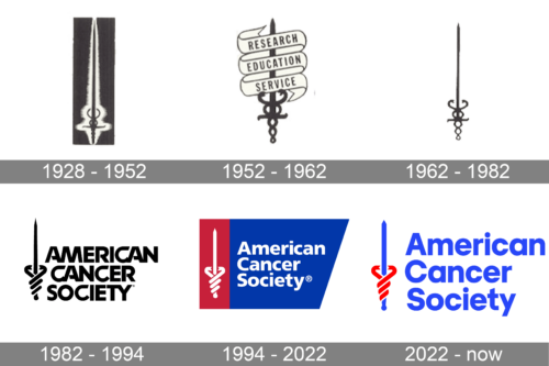
The logo presented here is a sophisticated and emblematic design that integrates the timeless symbol of a sword with additional esoteric elements. At the center is the sword, its straight blade culminating in a sharp point, which embodies attributes such as precision, valor, and determination. The hilt of the sword is adorned with a cross-like structure, typical of historical or heraldic weaponry, suggesting a fusion of martial strength with a sense of tradition or heritage. Wrapping around the hilt in perfect symmetry are two snakes, their bodies coiling in an ornate pattern. The combination of these elements – the steadfast sword and the dynamic serpents – creates a potent visual metaphor for a blend of steadfast resolve and intellectual acumen. The contrast between the dark backdrop and the light, almost silver color of the sword and serpents adds depth and dimension, highlighting the intricate details of this compelling insignia.
1952 – 1962
The image depicts a logo that is both emblematic and evocative, featuring the Rod of Asclepius, an ancient symbol associated with healing and medicine. The rod itself is central, a staff that is entwined by a two snakes, which ascends spirally, a representation of renewal and the cyclical nature of health and disease. In this particular iteration of the symbol, three banners encircle the staff, each inscribed with a word: “RESEARCH,” “EDUCATION,” and “SERVICE.” These words articulate the core values or pillars of a mission, related to a medical or educational institution where research, teaching, and community service are paramount. The classical and elegant serif font of the text conveys a sense of tradition and authority, reinforcing the logo’s connection to the historical and honorable pursuit of knowledge and healing. The simplicity of the black and white color scheme lends the logo a timeless quality, ensuring its message is conveyed clearly and with gravitas. The intertwining of text and symbol in this logo communicates a commitment to advancing the well-being of society through dedicated inquiry, learning, and altruistic action.
1962 – 1982
The logo displays a stark, monochrome logo that features a stylized sword with a cross-shaped hilt, surmounted by two serpents coiling symmetrically around the hilt. The serpents’ bodies twist in harmony, creating a striking balance on either side of the blade, which suggests a sense of equilibrium and intertwining forces. The sword’s pointed blade suggests precision and action, while the serpents imply wisdom and renewal. The use of serpents, creatures laden with cultural significance, adds layers of meaning, hinting at the transformative power of the organization it represents. The simplicity of the design, free from any textual distraction, allows the symbol to speak for itself, ensuring a lasting impression of strength and versatility.
1982 – 1994

The original American Cancer Society logo was introduced in 1945 and featured a modern and strong composition of the three-leveled logotype and an emblem, placed on its left. The emblem boasted an image of the vertically placed sword with two snakes intertwined around its handle. As for the inscription, set in the uppercase, it was executed in a custom contemporary sans-serif typeface with some lines of the letters connected to each other.
1994 – 2022

The American Cancer Society’s visual identity is strong and recognizable. It is composed of a geometrical background with an emblem in its left part and a wordmark in the right one.
The trapezoid of the logo is split into two parts — the vertical rectangle, colored red and featuring an iconic emblem in it, and the bright blue trapezoid, with its left bar sharing with the rectangle.
The wordmark is placed on a blue background and is written in a modern and bold sans-serif typeface. The contrast of white lettering on a bright blue makes the logo stand out and shows the American Cancer Society as a professional and trustworthy organization.
The famous Society’s emblem is a “Sword of Hope”, which became the organization’s symbol in 1928 and is still the main part of its visual identity.
The Sword symbolizes a willingness to fight the world’s most terrible disease, as well as the power and energy of the American Cancer Society. The grip of the sword is formed by two twined serpents, which represent the medical nature of the organization.
2022 – Today
The redesign of 2022 has simplified the composition of the American Cancer Society logo, yet made it stronger by using a bright and intense color palette, with the vivid blue inscription set against a plain white background and accompanied by a blue and red stylized sword, placed vertically on the left from the three-leveled lettering.
Font and color
The white three-leveled inscription from the primary badge of the American Cancer Society is executed in a bold stable sans-serif typeface with the title case letters set in white. The closest fonts to the one, used in this insignia, are, probably, Neue Frutiger World Black or Humanist 777 Std Black.
As for the color palette of the American Cancer society’s visual identity, is based on the patriotic blue, red, and white combination, used for the National Flag of the United States. Blue is a prevailing color here, and it is understandable — this color evokes a sense of reliability and security, while red adds a powerful feeling, and white stands for trustworthiness and transparency.


