The channel at an early stage was called American Movie Classics, but in 2002, due to significant changes in programming, it was renamed AMC. Today it is one of the strongest competitors to such industry giants as HBO and Netflix. The AMC original shows have millions of fans across the globe.
Meaning and history
AMC is an American pay-TV channel specializing in showing movies and TV series of original production. Founded in 1984, its main content was classic movies, but after it began filming its TV series, the channel became known to a wider audience. Projects such as Breaking Bad and The Walking Dead allowed it to compete in quality with HBO.
Over its history, it has adjusted its broadcasting policy several times, which caused it to change its name (originally it was called American Movie Classics) and slogans. In 2002, the period of classics on AMC ended, and the first independent project was released. The most significant event in the new era of the channel was the launch of the Mad Men show in 2007. The series received 15 Emmy awards. The next large success of AMC happened already in a year when the iconic Breaking Bad saw the light. The third most popular show on the AMC channel, The Walking Dad, was released in 2010.
The broadcasting schedule of AMC includes movies of different genres. The film library of the channel has more than 200 names, most of them once won such an honorable award as the Oscar. The peculiarity of this media resource is that each day of the week is dedicated to a different genre. You can see films made in the 1980s as well as movies or shows that were just released yesterday.
AMC has a strong presence in North America and is available to viewers in over 125 countries. AMC Networks International – UK is a leader in international television broadcasting, broadcasting 13 themed television channels in Europe, the Middle East, Africa, and Asia.
What is AMC?
AMC is the name of an American cable and satellite television channel originally created as American Movie Classics to broadcast classic movies and original TV shows. Of the channel’s most famous and successful projects in recent years, it is worth noting the series Mad Men, Breaking Bad, Better Call Saul, and Walking Dead.
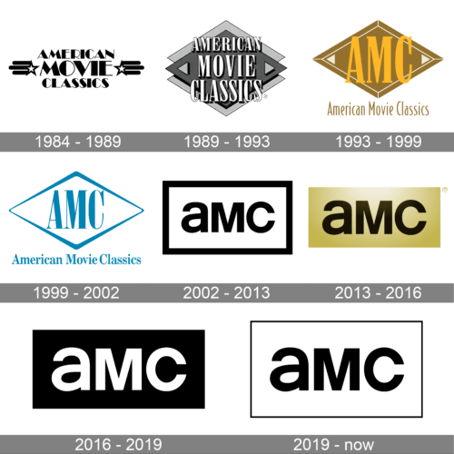
In terms of visual identity, the history of the AMC tv channel can be divided into two eras — the American Movie Classics one, which lasted from 1984 to 2002 and featured classy lettering with some graphical additions, and the AMC era, which started in 2002 with minimalistic sans-serif insignias.
1984 – 1989
The very first AMC logo was created in 1984 and featured an Art-Deco three-leveled “American Movie Classics” inscription in bold black capitals, enclosed between two five-pointed starts, set in white with a black outline and three thick rounded horizontal lines coming out of their contours to the sides.
1989 – 1993
The redesign of 1989 has introduced a more complicated badge, with the lettering rewritten in an outlined and shadowed bold serif font, in white, against a black and gray background with a geometric pattern. It was a double rhombus with two small triangles in the left and right corners. The clean straight lines of the background and elegance of the characters have made up a delicate and confident image, which stayed with the channel for almost four years.
1993 – 1999
In 1993 a new logo for the American Movie Classics was designed. This was the first time the “AMC” abbreviation was placed on the badge. It was a yellow and golden-brown logo with an outline rhombus on the background, a bold yellow abbreviation in a serif font over the rhombus, and a stylish narrowed “American Movie Classics” inscription in a title case, written under the main element.
1999 – 2002
The last American Movie Classics badge was created in 1999 and stayed in use until 2002. It was still the same concept, with an abbreviation set on a rhombus and underlined by a full wordmark, but it was a blue-and-white image with simplified contours of the elements. The logo looked fresh and modern, representing the progress and growth of the channel.
2002 – 2013
The new era for the channel started in 2002, with the new logo introduced in the same year. It was a minimalistic black and white logo with the “AMC” abbreviation set in mixed case but with the same size as the characters. The lettering was written in bold black sans-serif characters on a white background and enclosed into a black rectangular frame, formed with lines of the same thickness as the bars of the letters.
2013 – 2016
The redesign of 2013 has removed the rectangular frame from the primary AMC logo but replaced a plain white background with a light-gold gradient rectangle with no outline. As for the inscription, it remained the same but was slightly enlarged, compared to the previous version.
2016 – 2019
In 2016 the colors of the AMC logo were switched, and now the golden rectangle became solid black, and the bold AMC abbreviation turned white. In this scheme the logo started looking even stronger and more modern, evoking a sense of professionalism and innovation.
2019 – Today
The badge, adopted by the tv channel in 2019, is based on the AMC logo from 2002, but with the black rectangular frame redrawn in thin black lines. The difference in thickness between the letters and the framing makes up a very interesting contrast and adds elegance and style to the simple badge.
Font and color
The mixed case lettering from the primary AMC logo is composed of a lowercase “A” and capital “M” and “C”, written in one size with the same thickness as the bars. The closest font to the typeface, chosen by the Trollbäck & Company bureau for this insignia, is, probably, Suprapower SE Heavy, or Neue Singular H Extra Bold, with some minor modifications.
As for the color palette of the AMC visual identity, it is based on a strong traditional combination of black and white, which looks confident, actual, and professional, no matter what background it is placed on.


