While the Ally Financial logo contains nothing but the name of the brand, in fact, there is a deep meaning behind it. This simple wordmark reflects the bank’s core values.
Meaning and history
Ally Financial (Ally Bank) is one of the largest corporations specializing in digital banking services, such as financing and insurance, in the United States and Canada. The company was founded in 1919 under the name GMAC Inc. and since 2010 has been called Ally Financial Inc. The issuer is based in Detroit, Michigan.
In addition to classic banking services, the company also handles auto finance, corporate loans, insurance, mortgages, Internet banking, and stockbroking. Ally Financial is the largest auto lender in America.
The company was founded back in 1919 by the General Motors Corporation and was designed to finance auto customers in need. It originally had offices in several major cities across the country. By today the business has expanded greatly and has undergone many changes. Ally Financial is constantly expanding its range of services and now can offer its customers not only traditional banking services and car financing, but also online trading and mortgages.
What is Ally Financial?
Ally Financial (Ally Bank) is the name of an American banking company, which was established in Delaware in 1919. Today the company is headquartered in Michigan and has offices located all over the United States, offering its customers such services as banking, mortgage, and electronic trading.
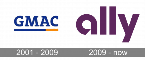
2001 – 2009
The logo, designed in 2001 was pretty modest and simple. It was an uppercase GMAC lettering in a smooth yet massive serif typeface with rounded angles and slightly softened contours of the letters. The dark blue color of the wordmark was complemented by a thick blur and dark yellow underline, with the yellow part only placed under the last letter “C” and a half of the “A”.
2009 – Today
We should start our story from May 2010, when GMAC (General Motors Acceptance Corporation) rebranded itself as Ally Financial. It was not just the new name but a new brand identity with a different message. You can notice it in the television spots comprising Ally’s debut campaign (they were produced by BBH New York). Here, you could see children experiencing problems because of the draconian behavior of regular banks. By contrast, Ally presented itself as your ally in the world of finances. It promised transparency and clarity.
“Straightforward” was the key word used in advertising. If you try to describe the wordmark using a single word, chances are this word will also be “straightforward” (or something similar).
Font
The brand identity of the bank heavily relies on the Benton Sans font. It has been consistently used across all media, from print and outdoor ads to web to mobile. We should point out, though, that the Ally Financial logo is an exception to this rule and does not use the Benton Sans type. The most obvious difference is that the “y” from the logo does not have the curve on its end like the “y” from Benton Sans does. The wordmark is a custom artwork, which is especially obvious in the case of the “a.”
Colors
The signature plum color is an essential part of the company’s brand identity. It is used not only in the Ally Bank logo but also across its website, advertising, etc.


