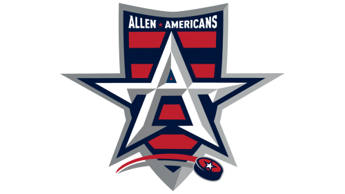
The Allen Americans is a relatively young, but successful ice hockey team. Like the majority of minor teams they boast of a very patriotic looking logo. Based in Allen, which is in Texas, the Americans follow the Texas tradition and feature star shapes in their logo.
Meaning and history
One of the strongest teams of the ECHL, Allen Americans, was established in 2009 as a member of the CHL, moving to the new league in 2014, after the CHL folding. As of 2024, the Allen Americans franchise has already won two Regular Season titles, three Division titles, and five Conference once. Moreover, the club is the winner of such sports trophies as Ray Miron President’s Cup (twice) and Kelly Cup (also twice), which makes the Allen Americans a very strong and provision competitor in the League.
In terms of visual identity, the Allen Americans Franchise has combined all the essential elements in the badge: the representation of its mother state, Texas, the patriotic spirit, and the strength and professionalism of the players. The stylized star, which is the central element of the Americans’ logo, works on all three sides, and makes up a super confident and progressive image for the club.
2009 – Today
If you compare the Americans’ logo and the flag of Texas, you will notice that the team’s logo was designed with due respect to it. First of all, the letter “A” in the foreground looks like a star. There is a five-pointed white star on the puck “flying” underneath, the same as on the flag of Texas.
Secondly, they incorporate the same colors ‒ red, blue and white. The A-star is white with silver fringing. It is placed in front of a shield with red and blue stripes. The shield features silver fringing too. There is a wordmark “Allen Americans” at the top of the shield.
Anniversary Logo
On May 19, 2018 the Americans presented a new logo for the 2018-2019 anniversary season. They placed their present logo on a large blue “X” which is against a red and white background. The “X” is flanked on the left side by “2009” and the right side by “2019”. Underneath there is a red ribbon with the white lettering “10th Anniversary”.


