At the core of Airbnb’s unique market position lies its revolutionary approach to lodging and tourism. Founded in San Francisco, the platform has transformed the way people travel, enabling guests from around the globe to find accommodations that range from a cozy living room to luxurious estates. Central to Airbnb’s operation is the online marketplace that connects hosts willing to rent out their spaces with travelers seeking unique and personalized experiences. The essence of Airbnb’s success is its ability to foster a sense of belonging among its global community, making every trip a more intimate and memorable adventure.
What does the Airbnb logo mean?
The Airbnb logo, known as the “Bélo,” is an abstract symbol that stands for belonging. It is a combination of four elements: a head to represent people, a location icon for place, a heart for love, and an A for Airbnb. This new logo design was introduced as part of Airbnb’s rebrand to capture the essence of the Airbnb community and its vision of bringing people together from all over the world. The inspiration behind this symbol was to create something that represents Airbnb’s core values and mission to make everyone feel like they belong anywhere they go.
Meaning and history
Founded by Brian Chesky, Joe Gebbia, and Nathan Blecharczyk in 2008, Airbnb emerged from a simple need to cover rent into a worldwide phenomenon. Initially, the founders of Airbnb utilized air mattresses in their living room, coining the company name and laying the groundwork for a new era of travel. This big idea swiftly transformed into an online platform that epitomizes sharing economy principles, connecting people across the globe. Airbnb’s journey from offering air mattresses to becoming a global community of hosts and guests underscores its remarkable growth and innovation. The introduction of the new Airbnb logo, symbolizing belonging through its abstract design known as the Bélo, marked a significant milestone in Airbnb’s rebranding efforts. This illustration of passion and commitment towards creating a world where everyone can feel they belong has propelled Airbnb to its current standing as a leader in the travel industry.
As Airbnb navigates through challenges and opportunities, its mission remains unwavering—to make everyone feel like they belong anywhere. The founders of Airbnb, driven by a passion for hospitality and innovation, have successfully harnessed the power of community to redefine travel. Today, Airbnb stands not just as an online marketplace but as a symbol of connection and exploration, continuously expanding its offerings to meet the evolving needs of travelers and hosts alike.
What is Airbnb?
Airbnb is an online platform transforming travel by connecting guests with hosts offering unique places to stay around the globe. It champions a sense of belonging, making every trip memorable.
2007 – 2008
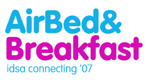
The designers used a font similar to Rundschrift Pro Regular or Bold Comic Sans. The color palette was light and bright, which enhanced a friendly and welcoming feel. The top line, which said “AirBed&”, was done in sky blue, while the “Breakfast” portion featured a pink color. There was also a third line that said “idsa connecting ’07” in a smaller, finer font of a blue color. An alignment of all the lines to the left created a professional look despite the use of fun colors and bubbly font. Besides inscriptions, the logo had no other elements, but the colors compensated for that.
2008 – 2009
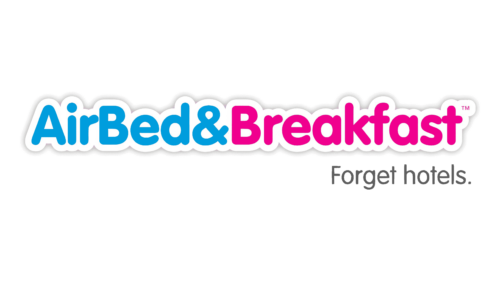
The badge, used by the famous platform in the very beginning, featured a full “AirBed & Breakfast” inscription in blue and pink, with bold rounded sans-serif characters in the title case outlined in thick white, and underlined by a lightweight black “Forget hotels” motto, set in a modern sans-serif font. This logo was only used by the service for a couple of years.
2009 – 2010
When the company changed its name, the logo was also updated. It kept a sans-serif font with rounded ends as well as a blue and pink color palette. This allowed the logo to stay recognizable. The shades have been changed to brighter ones, attracting even more attention. A white border with a shadow provided for a more solid image.
2010 – 2013
This logo has a few things in common with earlier versions. First of all, there is also a white background with a shadow behind the name, just like the previous logo. In addition, a light blue that the audience got used to was a perfect choice. They added a gradient, making the top lighter and the bottom more saturated. As for the font, they went for a cursive, sans-serif font with rounded characters and ends to match the look of the earlier logos. All the characters are lowercase and the “Air” portion slightly overlaps the “bnb” part of the name. The designers took a fun and playful logo the company had earlier and created a professional and solid brand image while preserving the key elements of the earlier versions.
Who designed the Airbnb logo?
The Airbnb logo was designed by London-based design agency, DesignStudio, in collaboration with Airbnb’s founders. This collaboration was part of a comprehensive rebranding effort aimed at redefining the brand’s identity and positioning in the market. The design process involved extensive research, including traveling around the world to meet with members of the Airbnb community. This immersive approach helped the designers and the co-founder of Airbnb, who played a significant role in the project, to capture the essence of the brand and translate it into the new logo design and overall brand identity.
2013 – 2014
The original logo for Airbnb was designed in 2008, but it was already the second version, as the company, started as Air Bed and Breakfast used another logotype, containing the whole name for a couple of years.
The first Airbnb version featured a white and blue cursive inscription, visually split into two parts, with the “Air” slightly overlapping the “BnB”. The wordmark in the lowercase looked friendly and welcoming, evoking a sense of security and reliability, and showing the company’s confidence and professionalism.
2014 – Today
The logo, created in 2014, might seem simple from the first sight but has many hidden meanings in its abstracts and lightweight emblem, placed on the left from the lowercase wordmark.
The emblem, resembling a rounded letter “A” has a drop-shape loop in the middle, which stands for the location pin symbol, and a person’s head, to show the process of choosing the accommodation. While the main “A” shape of the image also looks like the heart, turned upside-down, which represents the company’s attention to the customers and warmth.
Symbol controversy
What color is the Airbnb logo?
The primary color of the Airbnb logo is a shade of red, specifically chosen for its vibrancy and warmth. This color is complemented by a secondary palette used across various elements of the brand’s identity. The choice of red was intentional to grab attention and evoke feelings of passion and love, resonating with the brand’s message of belonging and welcoming. The secondary palette supports the primary color in bringing the brand’s vision and values to life, enhancing the overall brand experience.
Shortly after the launch of the 2014 logo, the company started to receive complaints stating that the emblem resembled genitalia. The company decided to commission a customer survey to make sure their logotype was appropriate. The survey, which was carried out by Survata, showed that the controversial likeness was noticed only by a minorityofconsumers.
Font and color
The Airbnb wordmark in the lowercase is executed in a traditional sans-serif typeface, which is very similar to JT Energy Bold and BR Candor Semi Bold fonts, with rounded shapes of the letters and elegant contours. The typeface makes the whole logo look serious and solid, evoking a sense of responsibility and loyalty.
What font is the Airbnb logo?
The font used in the Airbnb logo was custom designed as part of the Airbnb rebrand. This unique typography was crafted to complement the new logo design, aiming to reflect the brand’s warmth, approachability, and the sense of belonging that Airbnb promotes. The creation of a custom font was a strategic move to elevate the overall brand’s identity to the next level, ensuring that every aspect of the brand’s visual representation was in harmony with its core values and messaging.
The pink and white color palette of the Airbnb logo is a reflection of kindness and friendliness, it shows the company as a young and fun one, evoking a tender and caring feeling. This soft yet bright combination also makes the Airbnb logo stand out, as it is not very common, though looks sophisticated and stylish.


