In addition to the main logo, the French flag carrier Air France also has a heritage icon nicknamed Hippocampe Ailé.
Meaning and history
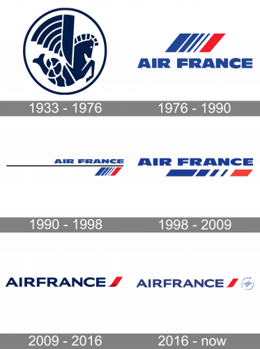
Air France was founded on October 7, 1933. Its history was marked by several important events, including the acquisition of a stake in UTA in January 1990 and the merger with Air Inter in 1997. In June 2000, Air France and Delta Air Lines, together with Aeroméxico and Korean Air, created the SkyTeam alliance. Air France’s main hub, Paris-Charles de Gaulle, is the key airport in Europe for connectivity.
In 2004 Air France merged with another major European carrier, Dutch KLM. As a result of the deal, the French government’s share of Air France dropped from 54.4% (of the former Air France) to 44% (of the combined airline). Subsequently, its share decreased to 25% and then to 17.6%. Both carriers are members of the SkyTeam airline alliance.
In 2010, Air France-KLM Cargo’s operations and fleet were merged with the Dutch airline Martinair Cargo under the common brand name AIR FRANCE KLM Cargo Martinair. In August 2011 the airline was included in the list of the 10 safest airlines in the world.
What is Air France?
Air France is the name of the France’s main national airline, which began flying in 1933. Air France is part of the SkyTeam alliance, based at Paris Charles de Gaulle airport. The company’s fleet includes 224 aircraft, including the latest Airbus A380 and Boeing 787.
1933
When the company was founded, it adopted the Hippocampe Ailé icon as its primary logo. It featured a mythical creature called hippocampus or hippocamp. It is a winged animal with the upper body of a horse and the lower body of a fish. On the emblem, the hippocampus is placed inside a circle. The design is dark blue on the white background.
1976
The mythical creature disappeared from the primary Air France logo. It now featured a parallelepiped combining blue, white, and red stripes. The lettering “Air France” in bold blue letters could be seen below.
1990
Both the elements have remained on the logo but their position and proportions changed. The company name grew smaller and moved to the top. The parallelepiped moved to the bottom right corner. There was a long black bar between them.
1998
This version was much cleaner. Gone was the black bar that had cluttered the previous design. The company name became much larger. The parallelepiped, which was still below the wordmark, preserved the stripes but it looked like a part cut out of the parallelepiped from the previous logo.
2009
The type grew lighter, while the parallelepiped was replaced by a red ribbon.
2016
The palette of the Air France logo has been slightly watered down.
Font and color
The Airfrance logotype in a royal and chic shade of blue is written in all capital letters of a bold sans-serif typeface with solid and strong shapes and distinct lines. The typeface of the inscription is very similar to such fonts as LCT Picón Extended Extra Bold and Venn Extended XBold but with come lines modified and cleaned.
The traditional French tricolor, blue-red, and white, is the palette of the Airfrance logo and a celebration of its country and legacy. This elegant and timeless combination represents the reliability and transparency of the company along with its progressiveness and passion, the value of the comfort of its passengers, and its safety.


