Air New Zealand Logo PNG
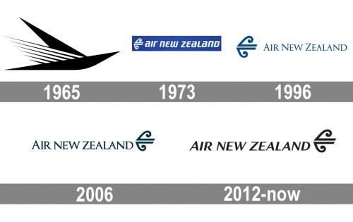
Since 1965, the Air New Zealand logo has been modified around five times.
Meaning and history
The oldest and the largest air carrier of New Zealand has been operating both domestic and international flights since the beginning of the 1940s. Today the company is a member of Star Alliance, one of the most reputable and elite associations in the industry.
Air New Zealand operates flights to 51 locations, 20 of which are inside the country, and the rest 31 — in almost 20 countries across the globe, mostly in Asia. The air carrier is based in Auckland.
What is Air New Zealand?
Air New Zealand is a he name of the National air carrier of New Zealand and the largest airline in the country. The company was established in 1940, and today has a fleet of 105 aircraft, operating the flight to more than 50 locations across the globe.
1965
The original logo was borrowed from the company’s predecessor, Tasman Empire Airlines Limited. The design featured a stylized bird in flight.
1973
The symbol that became the highlight of the design consisted of two parts combining a straight bar and a curve. The lettering “Air New Zealand” in lowercase glyphs was placed to the right.
1996
The name of the brand was uppercased. It now featured a serif type.
2006
The shade of blue grew darker and somewhat warmer, while the symbol moved to the right.
2012
The redesign of 2012 made the Air New Zealand logo more stylish and elegant by changing its typeface, softening angles, and emboldening all elements of the emblem. The lettering got slanted, with the first “A” still enlarged, compared to other uppercase symbols, but not as much as on the previous version. The symbol remained untouched, only the color palette was switched to monochrome.
Font and color
The custom sophisticated typeface of the uppercase Air New Zealand logotype is soft and smooth, based on such elegant fonts as New Millennium Bold Italic or Optima Std Bold Italic. But with the letter lines slightly arched from one side and the ends rounded, made softer and friendlier.
The timelessness of the inscription is elevated by the classic black and white color palette, which looks great on advertising and the planes of the air carrier.


