Admiral initially focused on car insurance. It has diversified into home, multi-car, and travel insurance, servicing various markets. Admiral is known for its customer-centric approach and community involvement. The company, listed on the London Stock Exchange, remains operationally based in Cardiff, Wales, and is recognized for its award-winning services.
Meaning and history
Admiral began in 1993, concentrating on car insurance in the UK. From its start with 57 employees, Admiral has grown to over 11,000 staff across eight countries. They now offer a range of products including MultiCover, MultiCar, home, and travel insurance. The company has evolved to not only provide insurance but also to engage in community and sponsorship activities, reflecting their commitment to societal contributions. Additionally, Admiral has been recognized for their services with various awards, marking their journey from a startup to a provider of award-winning products and services.
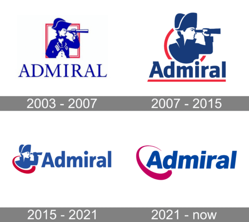
2003 – 2007
The logo depicts the silhouette of an admiral gazing through a telescope, framed within a red-bordered square, suggesting a strategic vision. Beneath this, the word “ADMIRAL” is presented in an elegant, serif font, with each letter spaced generously. The use of blue signifies trust and depth, resonating with the company’s branding as authoritative and dependable.
2007 – 2015
In this emblem, a distinguished maritime leader is depicted in silhouette, gazing intently through a telescope, framed by a dual-hued orb of crimson and navy, representing watchfulness and proficiency. Beneath this, the moniker “Admiral” is etched in an assertive, serifed script, underscored by a robust crimson line, denoting a foundation of resilience and vigor. This representation is a salute to the storied tradition of seafaring command and the precision of nautical exploration, encapsulating the brand’s dedication to steadfast service and authoritative presence in its field.
2015 – 2021
The emblem captures the essence of “Admiral” with a side-view silhouette of a time-honored naval commander, his gaze fixed forward, symbolizing a strategic outlook. Framed within a circular motif cleaved in red and blue, the figure stands for alertness and anticipation. The company’s name emerges beneath in a prominent, blue, sans-serif type, asserting a contemporary flair. This imagery weaves a narrative of heritage with a touch of the contemporary, reflecting the brand’s storied past in leadership and its progressive trajectory. It’s a visual pledge of the brand’s commitment to leading with innovation while honoring its historic foundation.
2021 – Today
The “Admiral” insignia is artistically crafted, showcasing the brand’s moniker in a robust, blue, sans-serif font, symbolizing trust and expertise. The letter “A” is ingeniously merged with a vibrant magenta motif, reminiscent of a sweeping wave, adding a touch of dynamism. This blend of graphic elements and letterforms enhances the brand’s distinctiveness and accessibility, encapsulating Admiral’s dedication to superior customer relations and their pioneering spirit in the realm of insurance. This emblem not only stands as a hallmark of quality but also as an invitation to experience the company’s forward-thinking approach to protecting and serving its clientele.


