

![]() Liberty Mutual Logo PNG
Liberty Mutual Logo PNG
Liberty Mutual is an insurance company from the United States, which specializes in property insurance services. The company was established in 1912 and today has its offices and subsidiaries on all the continents where more than 50 thousand employees work. The annual revenue of the group is almost 50 billion USD.
Meaning and history
![]()
The company’s visual identity is a tribute to the background and heritage of a famous American insurer. The logo is composed of a recognizable emblem with a wordmark on its right.
The symbol of the firm was chosen in the same year when the business was established and depicts an iconic symbol of the United States of America — the Statue of Liberty.
1918 – 1919
![]()
The very first logo of Liberty Mutual was fully text-based. The two-leveled logotype in black featured the enlarged and emboldened “Liberty Mutual” in the uppercase placed above the “Insurance Company” written in the same style and color but with a smaller size of the letters.
1919 – 1921
![]()
In 1919 the logo was redesigned for the first time and the only thing that got changed was the typeface. From a bold and modern sans-serif, the company switched to an elegant and confident serif typeface with sophisticated yet strong lines. The bottom level of the inscription got even smaller, while the main wordmark became wider and more stable.
1921 – 1923
![]()
In 1922 the Liberty Mutual Logo was redrawn again, and this is when the first graphical emblem was introduced. Executed in a monochrome palette, it featured a vertically oriented oval medallion in a thin double black and white frame with a white image of the Statue of Liberty placed on a black background. With a lot of thick stylized rays coming out of its torch.
1923 – 1985
![]()
In 1923 the image was redrawn in a smoother and more modern way, with the hand and the torch coming out of the medallion’s framing. The background gained a solid checkered pattern and the lines of the Statue of Liberty itself started looking softer and finer than on the previous version.
1923 – 1936
![]()
Another badge, introduced in 1923 featured a colored brown and gold medallion placed between the two-part of the logotype executed in a sophisticated serif typeface and underlined by a small-sized “Insurance Company Hime Office, Aniston” tagline written in the same font, but it lightweight version.
1936 – 1960
![]()
The first constant logo was composed of a wordmark in all capitals set in two levels and a graphical emblem.
The upper part of the Statue of Liberty was drawn in confident black lines and placed on an oval background, which featured a pattern consisting of many parallel horizontal lines.
1960 – 1985
![]()
The nameplate was executed in an elegant serif typeface, which is very similar to Plantin Pro Roman, designed by Frank Hinman Pierpont and named after Christophe Plantin, a printer from the 16th century.
This old-style serif font was a perfect reflection of the firm’s traditional and fundamental approach and the value of the Liberty Mutual roots and legacy.
The monochrome color palette of the company’s visual identity added to its seriousness and professionalism, showing the insurer as a reliable and responsible one.
1985 – 1994
![]()
The contours of the logo were emboldened and modernized in 1985. The monochrome badge started looking stronger and contemporary after the frame of the medallion got removed and the typeface was switched to a sleek and smooth serif with sharp ends of the lines.
1994 – 2000
![]()
The thick horizontal lines from the medallion’s background became thinner in 1994. The typeface also got its lines refined, but it went almost invisible. The main changes of this period were about the graphical part, and only its finesse, not the concept.
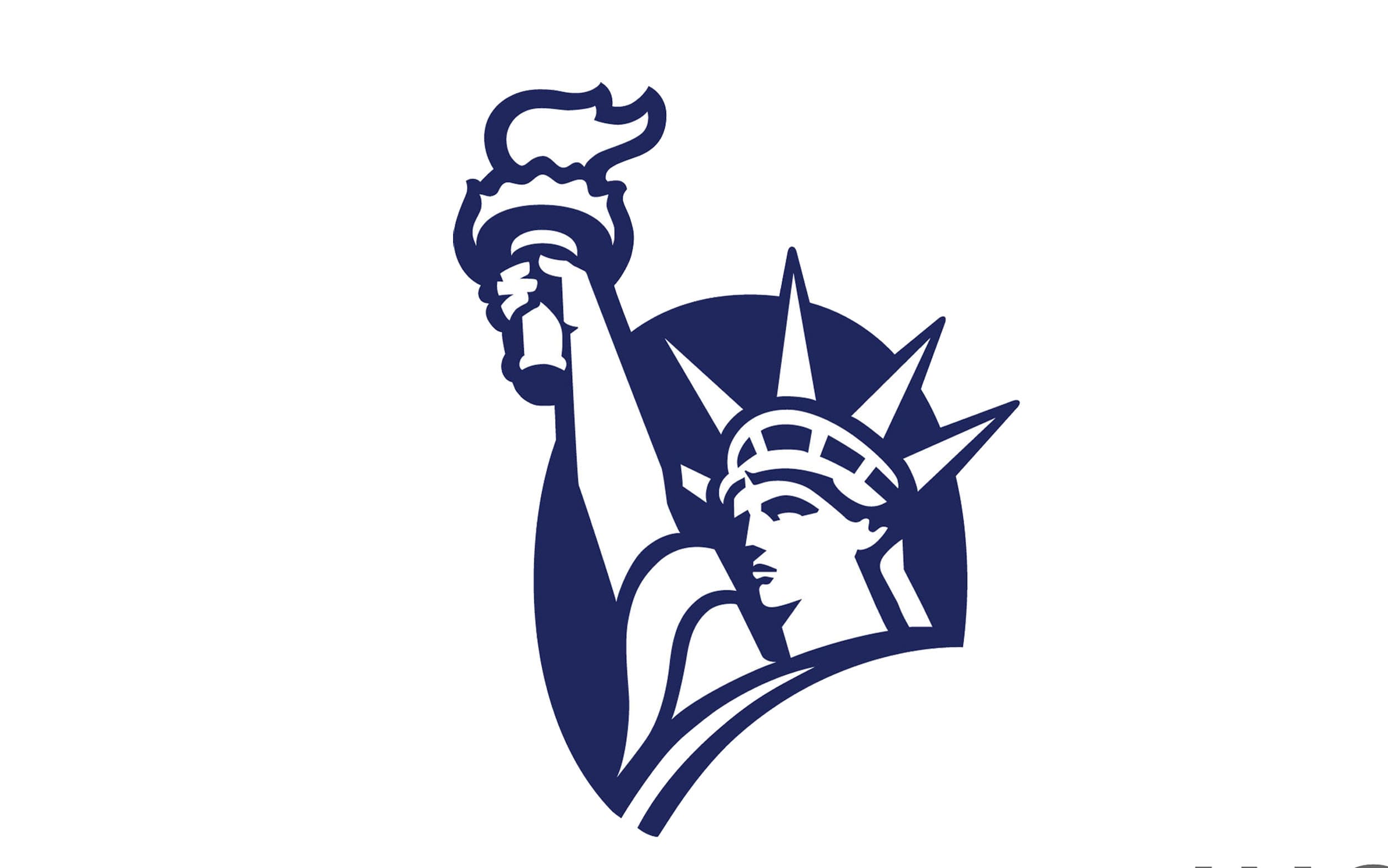
2000 – Today
![]()
The redesign of 2000 brought a new color palette and modern contours to the visual identity of a famous American insurance firm.
The current logo is still composed of a nameplate and an emblem, but now the company’s symbol is placed on the left. The new color scheme features gray, blue and white combination, which represents professionalism, authority, and expertise. The color palette evokes a sense of trust and responsibility of the company, making their customers feel comfortable and protected.
The emblem has sleeker and more distinct contours, and the oval background is now colored blue, without any pattern.
Font
![]()
The wordmark now features only two capital letters and is executed in a more modern serif typeface, which is very similar to a transitional Perpetua Bold font, which was designed by Eric Gill in the 1920s.
Being one of the most popular typefaces in history, Perpetua boasts elegant and distinct serifs and smooth sophisticated lines, evoking a sense of finesse and luxury.
Review
Liberty Mutual is one of the world’s largest property and casualty insurers, which was established in the 1910s and grew into one of the Fortune100 companies, with its subsidiaries and operating offices in almost 30 countries across the globe.
The group’s three business units include Personal Insurance Lines, Commercial Insurance Lines, and Liberty Mutual Investments.
The Personal Insurance Lines include automobile, home and life insurance plans for individuals. While the Commercial Insurance unit works with commercial multi-peril, property, general liability, commercial automobile, surety, and workers compensation.
Liberty International offers insurance products to customers around the world. They include casualty, reinsurance, marine, energy, and engineering insurance programs. And today it is the fastest-growing department of the group.
The company offers all the possible insurance solutions for individuals, families, and business and allows to customize the policies to the personal needs of every customer.


