

![]() France 2 Logo PNG
France 2 Logo PNG
France 2 is the name of a French TV-channel, which was established in 1963 by France Televisions, one of the largest European companies in the television segment. Today the channel broadcasts not only in its country but all over Europe, South and North America, Australia, and Africa.
Meaning and history
![]()
The visual identity of the popular French TV channel has changed a lot during the years, as well as the channel’s name, which came to the current France 2 only in 1992, and before that was known as Deuxieme Chaine de la RTF and Antenne 2.
1963 – 1964
![]()
The very first logo of Deuxieme Chaine de la RTF was very simple and laconic. White serif lettering placed on black background above the bold white “2”. The inscription was set in all capitals and looked elegant and professional, evoking a sense of expertise and authority.
The additional version of the channel’s first year had a “Chaine 2” written in white cursive over a dark gray rectangle.
1964 – 1967
![]()
The name of the channel was changed to Deuxieme Chaine de l’ORTF or ORTF 2 in 1964, and the logo was redrawn in the same year. A new badge still featured a monochrome color palette, but the composition became more complex, with the addition of a thin geometric ornament, formed by three intertwined ovals placed behind the stylized capitalized inscription.
1967 – 1972
![]()
The first colorful emblem was introduced by the channel in 1967. It was a solid background horizontally divided into two equal parts — red on top, and mustard on the bottom. The black “Deuxieme Chaine Coleur” inscription was written over the bright background in a traditional sans-serif typeface.
1972 – 1975
![]()
The logo of France 2, created in 1972, looked very feminine and sophisticated. It was a white circle placed in a calm red background. Inside the white part, there was an abstract green and pink composition, resembling tulips, set in a circle, and a bold “2” in white set in the middle of an image. The “2” was surrounded by “Chaine” and “Coleur” from up and down.
1975 – 1982
![]()
The new name of the channel, Antenne 2, came up in 1975, along with the renewed visual identity. The badge from those years boasted a solid black background with an n acid-bright composition, where the handwritten green “2” intertwined with a red “A” stylized as a star and was surrounded by light blue brushstrokes. It was a very unique and progressive emblem, which stayed with the channel for seven years, but was used as an official one for just two of them.
1977 – 1986
![]()
In 1977 a more professional and strict emblem was designed for Antenne 2. A bold lowercase inscription with the first “A” enlarged and drawn in red, and the green “2” placed on the end of the wordmark, were complementing the black lettering, making it eye-catching and friendly.
1983 – 1986
![]()
In 1983 another logo was introduced by the channel. It was a fancy light blue circular badge, which looked like a bubble, with a bold dark “A2” monogram on it. The lowercase letter and its modern contours made the logo look progressive and stylish, while the gradient blue color palette and circular geometry made it welcoming and kind.
1986 – 1987
![]()
The redesign of 1986 introduced a completely different concept of the Antenne 2 visual identity. It was a bright composition with a bold enlarged “2” in gradient purple and gray, placed in a solid black background, with a delicate lowercase “A” written in cursive over the “2”. The letter had its tail elongated and curved upright and was executed in gradient yellow and red, evoking a sense of strength and energy.
1987 – 1988
![]()
In 1987 the color palette of the channel’s visual identity was switched to a stricter and more professional one — now the dark gray digit with a red-letter were placed on a light gray background with a horizontal striped pattern. The new color scheme made the logo stronger and more confident, accenting on authority and expertise.
1988 – 1990
![]()
The dark gray “2” gained a white shadow and the background got lighter in 1988. Now it was colored in a light shade of gray and had its white horizontal lines placed at a bigger distance from each other, which made the whole emblem look fresher.
1990 – 1992
![]()
The Antenne 2 logo was changed again in 1990. Now it was a red three-dimensional “2” with its sides in yellow gradient. The digit was placed in ¾ standing on a bright blue square. The “Antenne” lettering in all capital was written above the colorful part in a classy and traditional serif typeface, in black. This was the last Antenne 2 logo, as in 1992 the channel was renamed France 2.
1992
![]()
The very first logo for the new name of the channel was created in 1992 but has never been used by France 2. The logo was composed of a stylized abstract emblem placed in the left from the “France Deux” lettering in a title case sans-serif font, written in red and yellow. The emblem featured a white “2” which was formed by a negative space of two frags — red and orange.
1992 – 2002
![]()
In 1992 a new emblem was designed — a bold red “2l with a white cursive “France” written along its bottom line. It was simple yet bright and memorable imaged which stayed with the channel for ten years.
2002 – 2008
![]()
The red and white color palette was kept, but the composition of the logo got completely shanked in 2002. The white digit with a lowercase sans-serif inscription above it was placed on a red trapezoid, set vertically.
2008 – 2018
![]()
In 2008 the logo was made glossy and vivid by adding some gradient shades to the red background. The white elements on the badge became light silver, which made the contrast stronger, and the overall picture — brighter.
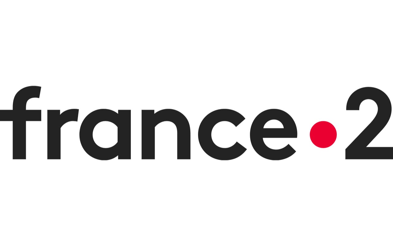
2018 – Today
![]()
In 2018 the France 2 logo was redesigned by the Movement bureaux. The new emblem featured a bold black lowercase lettering in sans-serif with a solid red dot separating the “France” from the “2”.
Font and color
The France 2 logotype created by the Parisian Movement agency is written in a custom sans-serif typeface, which is LL Brown. The letters in the wordmark use bold lines, clean contours, and look massive yet stylish.
The black and red color palette of the channel’s visual identity is a reflection of professionalism and reliability, along with passion and energy.


