Activia is a Danone dairy product label, which was first introduced in 1987. The brand is famous for its digestive improvement qualities, as has bifidobacteria, which is strong probiotic, in its composition. The yogurt is distributed and well-known in more than 50 countries across the globe.
Meaning and history
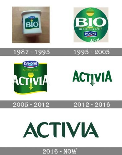
The Activia visual identity was based on the same color palette since the beginning of its history. The shades were slightly modified, but the concept remained the same until today. Green, white and yellow.
What is Activia?
Activia is one of the Danone brands, which was established at the end of the 1980s, and is known for its yogurts, containing bifidobacteria, very useful for the gut and digestive health. Today the products of the brand are sold all over the globe.
1987 – 1995
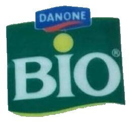
The original Activia logo featured a square dark green badge with a softened bottom line, accompanied by yellow color. The white “Bio” lettering was set in the middle of the badge, executed in a custom typeface with “B” and “O” capitalized and the “I” in the lowercase city having its dot in yellow. The iconic “Danone@ emblem was placed on the upper part of the badge.
1995 – 2005
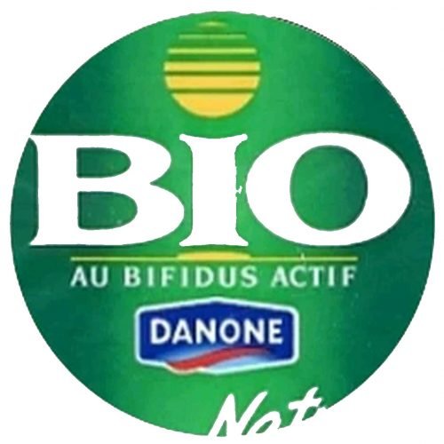
The redesign of 1995 made the green badge circular and refined the lettering l, adding some yellow elements and a delicate white tagline to the nameplate. The “BIO” in white custom sans-serif was now underlined by a yellow horizontal with an emboldened middle part. As for the dot above the “I”, it became enlarged and had a striped horizontal pattern — yellow and green. The Danone emblem was moved from the upper part of the badge to the bottom.
2005 – 2012
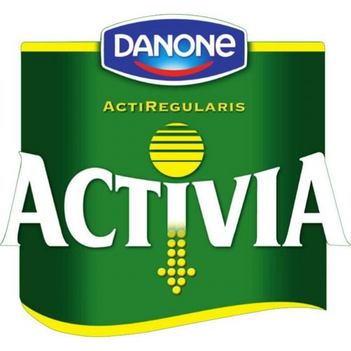
The name of the product was changed to Activia in 2005, and this is when the new logo was introduced by the brand. The shape of the badge returned to the original one — a square with a waved bottom line. The color palette remained unchanged, but the shades of green and yellow got elevated to brighter gradients. The Danone blue badge was back on the top line of the emblem, set above the stylized yellow dot above the “I”. The bottom part of the same letter was elongated to the bottom having its tail pointing down like an arrow, composed of several solid yellow dots.
2012 – 2016
The Activia logo was simplified in 2010, keeping the inscription with an arrow on the “I” as the only element. The logotype was colored dark green and placed on a white background, looking serious, stable, and professional, and evoking a sense of protection and expertise.
2016 – present
With the last logo redesign of 2017, the brand’s logo gained more sleek and modern lines and a richer tone of green. The text-based logo looks good on its own and on the packaging, when placed under the “Danone” emblem and is complemented by the golden details of the background and tagline.
Font and Color
The modern sans-serif typeface of all the capital letters of the nameplate boasts smooth bold lines with curved tails and shortened horizontal bars of both “A”. The font is similar to Cocon, designed by Eric Bloemsma, but is slightly modified.
The dark green of the Activia wordmark symbolizes nature and health, energy alongside active and positive thinking. It is a simple yet powerful logo, which is instantly recognizable and evokes a sense of the reliability of quality and beneficial products.


