The Noodles & Company restaurant chain specializes in American noodle dishes and pasta. However, it also offers a variety of other dishes, including soups and salads. The company is headquartered in Broomfield, Colorado, US.
Meaning and history
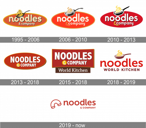
For much of its history, the Noodles & Company logo has experimented with the “mustard and ketchup” palette and has used the noodle theme, in a more or less explicit form.
What is Noodles & Company
Noodles & Company is a chain of fast-casual restaurants located in various corners of the US. There are around 450 restaurants, while the number of employees is around 8,000 (as of the fall of 2021).
1995 – 2006
The original Noodles & Company badge, created in 1995, featured a horizontally-oriented oval with an orange background and yellow outline, overlapped by a two-leveled inscription in the lowercase of a modern sans-serif typeface. The top part of the oval was accompanied by a large gray skillet with a spaghetti swirl in it. This version of the logo has stayed with the chain for more than ten years.
2006 – 2010
The redesign of 2006 has intensified the color palette of the Noodles & Company logo, making orange brighter, and setting the lettering in white for a stronger contrast. The contours of all elements were cleaned and refined, making the look more professional and confident. The emblem also got some white accents, which created a vivid voluminous look to the image.
2010 – 2013
The corporate legend telling about the creation of the brand explains that the concept belongs to Aaron Kennedy, an ex-marketing executive of Pepsi. He noticed that restaurants offering noodle dishes are too scarce. In 1994, he began working on the menu together with Joe Serafin and Ross Kamens. In late 1995, the first restaurant started working.
One of the earliest examples of the logo already features the familiar red and yellow palette. Here, the words “noodles” and “company” in white are placed inside an ellipse. The ellipse is of a light and brownish shade of red.
The yellow outline of the ellipse has the same color as the stylized ampersand. The color is pretty similar to that of mustard. As a result, the combination of the colors evokes ketchup and mustard – an immensely popular palette for logos of fast-food chains.
Above the wordmark, there is a spoon housing a stylized noodle.
On the whole, the meaning of the logo is utterly transparent. It looks appetizing and inviting. It almost explicitly says “food” (or “noodles,” to be precise). The “hint” could be easily understood even by new customers, which was important in the era of the brand’s expansion.
2013 – 2018
While the updated Noodles and Company logo doesn’t say “food,” it does have something appetizing. Once again, the palette is quite similar to the logos of many of its most popular competitors. While the shade of red has grown slightly darker, the “mustard and ketchup” association is still in place.
The spoon with the noodle has disappeared, but the ampersand has preserved its noodle shape. The free space allowed the designers to capitalize the name of the brand. As a result, the logo has grown better legible.
2015 – 2018
In 2015 the company has changed the shape of its logo from oval to rectangle, keeping the color palette and style of the previous version. Now the geometric banner withlettering and a graphical ampersand got a narrow brown underlining element with the “World Kitchen” inscription in the title case of a fancy serif font.
2018 – 2019
The logo, used by the brand in 2018 had no geometric figures on the background, and the bold red “Noodles”, underlined by a brown uppercase “World Kitchen” and an iconic emblem, set against a plain white background. It was a very modern version of the logo, which represented the growth and evolution of the company.
2019 – Today
The logo was redrawn. The first word looks somewhat similar to the way it was written in the logo used before 2013 – the letters still slightly resemble noodles here. There were slightly updated, though.
The second word has grown smaller, and it is capitalized like in the 2013 version. More notably, the iconic red ellipse is gone.
The logo still has a link with the type of industry the company operates in – you can see a stylized depiction of a part of a noodle. Yet, the noodle here also looks like hundreds of other things, a horseshow, for instance. It will hardly be enough to see this small element to get what the company does. So, the meaning of the logo opens up to you only if you already know the brand.
Colors and font
Although the company eventually dropped the mustard color from the palette of the logo, it is still extensively used on the website. The Noodles & Company logo looks rather light because the majority of the space is occupied by white.
The type used in the word “noodles” was inspired by the product itself. You can clearly see it in the rounded ends of the “n” and the “l.”


