Actavis is an American pharmaceutical corporation, which was established in 1974 by Allen Chao. The company operates internationally, with its 49 manufacturing facilities and 27 distribution centers in more than 100 countries across the globe. The corporation changed its name to Allergan in 2015, but the Actavis trademark is still among the most recognizable names in the world’s Pharma industry.
Meaning and history
The visual identity of the pharmaceutical corporation has always been bright yet simple and based mostly on the text. The last created logo for Actavis was created in 2013 and had a delicate emblem on the left of the wordmark.
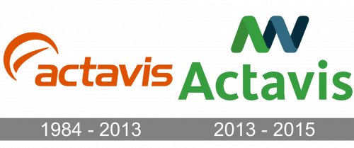
1984 – 2013
The very first logo of the company was designed in 1984 and featured a wordmark in the lowercase with an abstract emblem, placed on the left and slightly above the first letter of the inscription. The emblem was executed in an orange and white color palette, symbolizing energy, passion, and happiness the company was aiming to give to its consumers.
As for the graphical symbol, it was a C-like shape with a short smooth stroke inside. Resembling a moon, the image added softness and style to the inscription, making the logo recognizable and balanced.
The wordmark in the lowercase was executed in a bold and modern sans-serif typeface, very similar to Handel Family fonts, slightly italicized.
2013 – 2015
The redesign of 2013 changed the logo dramatically. The color palette was switched to green and blue on white, the lowercase was replaced by the title case and even the new sans-serif typeface was completely different now.
The green and blue color scheme symbolize new life, growth, and success, which are the most important aims for any company, especially pharmaceutical. The blue accents of the logo represent reliability and expertise, showing the corporation and professional and stable.
The emblem of the redesigned logo is a sleek thick line, forming a wave or spiral, showing the progressive approach and value of innovations. The lines of the symbol repeat the silhouette of the letter “A”, making the logo look harmonized and balanced.
Font
As for the wordmark, is it now executed in a simple yet solid sans-serif typeface, without any inclinations and modifications. The font looks similar to FF Kievit Std Bold or FF BeoSans Bold, both are modest and simple, yet elegant and timeless.


