The ABC (the American Broadcasting Company) is one of the USA’s biggest television groups. Founded in 1943, now it has grown to cover all continents and is available in many countries.
Meaning and history
The ABC visual identity has always been strict and serious, based on the monochrome color palette, its current circular logo was introduced in 1962, based on the shape of the previous versions, but bringing a fresh lock and a modern touch to them.
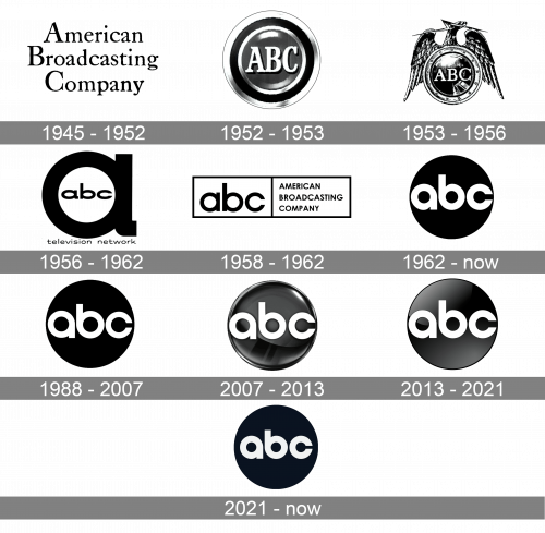
1945 – 1952
The original logo for ABC was created in 1945 and featured a three-leveled wordmark in black, placed on a white background. The “American Broadcasting Company” inscription was written in a title-case and executed in a traditional serif typeface, which looked modest, professional, and timeless.
1952 – 1953
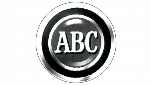
The second logo instead resembled the button of various shades of white, grey and black. This round shape was divided into several ring layers, as well as a grey core in the center. That’s where the acronym – three serif letters of the color white – was held.
1953 – 1956
In 1953 the logo was completely redesigned and the text-based badge was replaced by a fancy ornate emblem, composed of a circular badge with a wide frame, and a stylish and detailed bird with its shape elongated wings, placed on the upper part of the logo. The “ABC” lettering in white serif capitals was placed in the center of the circle, on the gradient black and gray background, which resembled a metal surface and added power and strength to the traditional badge.
1956 – 1962
The visual identity of ABC was evolved in 1956, by bringing a modern and minimalist logo, which looked solid and stylish, reflecting the seriousness of the company and its progressiveness. The new logo was composed of an extra-bold stylized letter “A” in the lowercase, with the “ABC” inscription inside. The wordmark was also set in the lowercase and featured a fancy extended sans-serif typeface.
1958 – 1962
The 1958 logo uses a very wide white rectangle with black edges. It’s divided into two equal sections. The left one holds the network’s acronym, written in black lowercase letters. On the right, there’s a translation, written in all capital, black letters in three lines.
1962 – Today
The logo we all know today was designed for the broadcasting company in 1962, by Paul Rand. The white lowercase wordmark was placed on a color black circle. The rounded lettering had bold smooth lines and looked balanced and strong on a circular badge, evoking a sense of confidence and dedication. This logo, which is still used by ABC as it is, has become a basis for several further redesigns.
1988 – 2007
In 1988 the iconic badge was slightly modified by making the lines of the letters thinner and lighter, which gave a more delicate and soft look to the whole badge, though the composition, style, and color palette remained untouched, the new logo looked fresher and airier.
2007 – 2013
The redesign of 2007, held by Troika Design Group, brought a three-dimensional emblem to the ABC visual identity. The glossy gradient badge had three white letters embossed on it.
2013 – 2021
In 2013 another logo version we all can see today was created. It is a combination of the original badge of 1962, and the one, introduced in 2007. The gradient sleek circle is more matte now, but still has a three-dimensional feeling, just a flatter one. The lettering on the badge repeats Paul Rand’s logotype, showing the strong company’s link to tradition and legacy.
2021 – Today

The redesign of 2021 brought back the flat ABC logo from the 1960s, but with the contours slightly refined. The black circle got all gloss and gradient removed, and became solid and plain again. As for the lettering, it is still white and bold, in a rounded sans-serif, which is Today something in between the font from 1962, and the one from the 1988 logos medium-thick lines and smaller size of the letters, a very delicate yet confident mood, and a recognizable iconic concept, — this is what it all is about.
Shape and colors
It consists of a black circle with the lowercase ‘abc’ acronym enclosed in it. Later, the logo occurred on various objects and came in different color permutations. In 2007 a glossy 3D version appeared, and it conveyed a degree of elegance and modernity. The current logo design has come a 50-year-long way and pretty much retained its original message, which is expressed in its glaring simplicity. It was to reflect the ABC’s clear and concise approach to communication and advertising. There are several versions, which differ in colors and are used on TV, on air, online, in leaflets, brochures, etc.
ABC Studios logo
 In addition to the regular ABC emblem comprising the letters “abc” in a black circle, the ABC Studios logo also includes the lettering “studios” in black. The type looks rather similar to that featured in the regular wordmark, at least the “d” looks like a reversed “b” from the “abc” text.
ABC Family logo
 Before being renamed Freeform, the ABC Family TV channel had several logotypes. The final one, which was used from 2003 to 2016, featured the word “family” in black next to the regular ABC logo. The letters of the ABC Family logo were larger and featured a different typeface.
ABC News logo
The logotype of the news division of the American Broadcasting Company is based on the network’s primary roundel emblem. Next to it, the word “NEWS” can be seen. It is given in black in a traditional serif typeface. All the letters are capitalized and are larger than the “ABC” text.
Author of the symbol
Paul Rand (1914-1996) was a renowned US graphic designer and art director. Starting from 1972, he has been part of the New York Art Directors Club Hall of Fame. Rand’s popularity was mostly due to his corporate logo designs. In addition to the ABC symbol, the list of his works includes the logos for IBM, UPS, Enron, and NeXT.


