A League is the name of a men’s football league, established in Australia in 2004. Today it has grown into the strongest and most reputable league in Australia and New Zealand, with twelve team members competing in it (one from New Zealand).
Meaning and history
A League is at the top of the football championships in Australia and New Zealand. The most prestigious trophy the men’s soccer team can win. In the very beginning, when the league was only in project, as the National Soccer League successor, it was through to have only eight teams in it. But today the League is composed of twelve teams, where eleven are from Australia and just one — from New Zealand.
What is A League?
A League is the name of the most reputable soccer league in Australia and New Zealand, which was established in 2004, as an evolution of the National Soccer League.
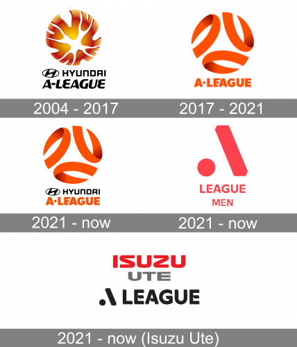
In terms of visual identity, A League’s logo has undergone two major redesigns since the day of its foundation. And the separate logo under the Isuzu sponsorship was designed in 2021 for the A League Men.
2004 – 2017
The very first A League badge was created in 2004, with the three-dimensional orange emblem, placed above two levels of black inscription: the Hyundai logotype (with the emblem of the brand), and a smooth italicized “A-League” in fancy elegant capitals. The emblem looked like the sun, or a wheel, which makes sense with the automobile specialization of the sponsor.
2017 – 2021
The redesign of 2017 changed the concept of the badge and completely redrew it in an intense orange color palette. The emblem now featured three ribbons, curved and forming the circle. As for the lettering, it was just the “A League” in bold sans-serif capitals, with thick lines and gusto Al cuts of some horizontal bars.
2021 – Today
The Hyundai logotype was brought back to the A League badge in 2021. It was set in the corporate style, placed after the iconic emblem of the automaker, and executed in black. The Hyundai badge was separating the orange emblem from the orange inscription, balancing the badge and adding a touch of professionalism to the whole concept.
A League Men
2021 – Today
The very first badge for A League Men was introduced in 2021. It features a completely different style, as well as a different sponsor: the automaker from this badge is not Hyundai but Isuzu. Although the original version does not have any sponsorship affiliation. The primary badge, executed in a bright pink color, is composed of a solid circle set on the bottom of the line, on the left from a slash sign, forming a stylized letter “A”. The symbol is followed by an uppercase “League Men” inscription in a custom sans-serif typeface.
Isuzu Ute
2021 – Today
The Isuzu Ute A League badge is executed in a black and red color palette, and uses the same style of inscription, as the pink badge. But here the logotype of the league with the stylized “A” is set in black and placed under the red and gray “Isuzu Ute” logo, written in the corporate style of the brand, with wide contours of the letters and smooth sleek lines.
Font and color
The bold geometric lettering from the primary badge of the A-League is set in a custom typeface, which is based on such fonts as Gill Sans Greek Pro Greek Bold and Humanist 521 Bold, with some sharp diagonal cut-out stencils added to the horizontal bars of the characters.
As for the color palette of the A-League visual identity, it is based on a cool and very special neon shade of peachy pink, a color, which can rarely be seen on one emblem, not to mention the sport-related badges. It looks bright, super-modern, and stylish, showing the League as a progressive and growing one.


