Although the logo of the lemon-lime drink 7up has undergone several redesigns, it has preserved the concept of a diagonal motion that could be seen even in the earliest version.
Meaning and history
The logo for the famous sweet drink has always been bright and evoked a bubbly and fresh sense, just like the brand’s product itself. There was nothing really complicated and special about its logo design, but it still made the 7UP bottles stand out on the shelves of the store across the globe.
1929
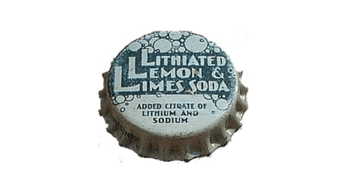
The very first logo for 7UP was created in 1929 and could be seen on the metal caps of the beverage bottles. The original name of the drink was Lithiated Lemon and Limes Soda, and this is what was written on the logo in thick white characters on a dark green background, decorated by numerous outlined bubbles. This version of the badge was only active for several months until the product was renamed 7UP.
1929 – 1932
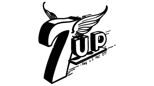
Later in 1929, the new 7UP badge was introduced. It featured a cool stylized “7l with small wings, drawn in thick black contours and followed by an underlined uppercase “UP”. All the elements of the logo were drawn in volume, turned in ¾, which made the whole composition more dynamic and vivid.
1930 – 1931
The 7UP logo from the beginning of the 1930s featured a circular medallion with a boldly outlined wordmark written in its top part. The small “UP” was decorated by a triangle pointing down, to the additional “Lithiated Lemon Soda” lettering. The logo stayed active for only several months.
1930
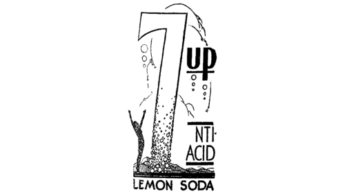
The redesign of 1930 has introduced a fully rethought version of the 7UP badge, which looked very art-decoish. It was composed of a very tall and elegant “7” decorated with many outlined bubbles in different sizes. On the left of the digit a person with his hands stretched up was drawn in black, and on the right — the bold black “UP” was set in a modern and chic sans-serif, outlined.
1931 – 1939
In 1931 the new concept for the 7UP logo was introduced. It was the predecessor of the iconic badge we all know today. The diagonally-oriented inscription in volume was set against a white background and enclosed into a square frame. The image was complemented by several bubbles drawn on its bottom part. The logo stayed in use for eight years.
1939
The redesign of 1939 has cleaned up and strengthened all contours and shapes on the 7UP logo, creating a modern and professional badge and slightly stretching the banner vertically, with the corners rounded. The black banner got two white geometric lines drawn on the top and bottom parts, adding some freshness to the heavy image.
1939 – 1969
The very first logo for 7UP was introduced in 1943 and featured a square badge with rounded angles. The body of the emblem was colored red, white the up and bottom sides were thickened and painted in black.
The wordmark was placed in the middle of the badge in white with a thick black outline, which balanced the framing. Seven white circles were placed around the inscription to represent the bubbles of the drink.
1966 – 1974
In 1966 the 7UP badge got a new look. The enlarged uppercase lettering was drawn flat in dark green, against the plain white background, with the digit separated from the letters by a small solid red circle. It was quite a minimalistic yet still very bright and memorable badge.
1968 – 1974
In 1968 the logo was simplified and cleaned. Now it was just a white wordmark on a plain red background, with no frames or additional graphics. A very minimalist and modern image.
1975 – 1980
The logo, used by 7UP at the end of the 1970s, boasted the main logotype formed by numerous solid green circles in different sizes, drawn in lines, creating the contours of the digit and the letters. The first part of the badge was separated from the second by the slanted red square with the white “7UP” logotype from the previous version of the badge.
1977 – 1978
The redesign of 1977 introduced somewhat new: the brand’s logo was redrawn in solid black against a plain white background with no colorful accents. But the brightness here was achieved by the shapes of the logotype’s elements. The extra-bold characters featured elongated tails and loops, making up a unique geometry.
1980 – 1987
In 1980 the typeface of the wordmark was refined and made sharper and more stylish. Between the numeric and text parts of the brand’s name a large red dot in a white outline appeared. This was the birth of today’s famous 7UP logo.
1987 – 1995
The logo, introduced in 1987 featured a completely new color palette — the green inscription in a double blue and white outline and a solid red dot were placed on a white background. The dot was overlapping the “7”, while the “UP” parts were overlapping the dot, so the logo looked like a three-layered one.
1989 – 1995
The redesign of 1989 has straightened the direction of the inscription and simplified its style, removing the blue shadows from the composition, and brightening up green and red shades. In this version, the logo was used by the brand for more than five years.
1995 – 2000
Another redesign was made to the 7UP badge in 1995, the color palette remained the same and no new elements or details were added to the composition, but the characters and a digit were stretched, with the “7l becoming super tall, and the whole logo is placed diagonally, in the up-right direction. The red circle got enlarged and compressed.
2000 – 2010
The green color was replaced by white in 1993. Another change was about the typeface of the logotype — it became more elegant and italicized. The serifs of the letters were small yet sharp and added an edgy and cool feeling to the emblem.
2010 – 2015
Another three-dimensional logo was introduced in 2007, it was composed of three layers — a white “7” in a green and black outline on the bottom, a glossy red dot over it, and the sleek “UP” with slightly curved serifs on top of the structure. This logo stayed with the brand for only three years but is considered to be one of the most recognizable in 7UP history.
2015 – 2024
In 2015 the contours of the 7UP badge were cleaned and refined; with the shades of green getting plain and dark, which created a more professional and sleek look. As for the red sphere, it is still drawn three-dimensionally, but in deeper shades and with more gloss on the surface, compared to the previous badge.
2024 – Today
In 2024 the company decided to come back to a flat design but kept the modern shapes of the elements and their disposition. The plain white “7”, followed by the white “Up” and decorated by the solid red circle is placed against a bright green background with no gradients or outlines.
Symbol
What makes the 1943 label unique is the stylized depiction of bubbles (we will see the bubble idea, in a transformed shape, in many of the following versions). While preserving the 3D looks, this version gets rid of the whole wings-and-skateboard idea and adds some color. The letters (white with a black shade) are placed in a red box with two black lines.
The 1972 version is pretty minimalistic in comparison with all the other ones. The flat red-and-white logo contains nothing but the “7up” lettering in a simple red box with rounded corners.
Over the following 40 years, there has been some playing around with the colors, textures, variations of the 3D effect, as well as sizes and numbers of the bubbles.
Font
The type of the domestic 7up logo is simpler and more minimalistic without sacrificing recognizability. The “7” and “up” seem to have more in common than the same parts of the lettering in the international logotype.


