

![]() 5sos Logo PNG
5sos Logo PNG
The Australian rock band 5 Seconds of Summerhad to change its original wordmark due to accusations incopyright violation.
Meaning and history
![]()
2012 — 2014

The original logo for the 5 Seconds of Summer band was created in 2012 and featured a monochrome composition where the white handwritten “SOS” and the iconic band’s emblem were placed on a solid gray circle with a graphite texture. The whole name of the band was written under the circular emblem in a bold sans-serif typeface, with the “Of” stylized as a pencil writing.
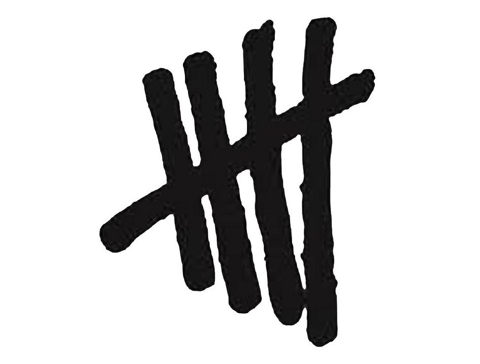
2014 — 2018
![]()
The redesign of 2014 kept the idea of the original logo, but removed the gray circle from its visual identity, keeping only stylized lettering in two levels, set diagonally above the black icon — four vertical lines with one horizontal, standing for “5”.
2018 — 2019
![]()
A completely new logo was introduced by the band in 2018. The minimalist and strict approach was implemented for its design: the new emblem featured only black sans-serif “5SOS” lettering set on a white background. The bold letters had clean and distinct contours and enough space between each other to not look heavy or messy.
2019 — Today
![]()
In 2019 the band redesigns its logo again, changing the color palette to calm yellow and black and placing the “5 SOS” inscription on a black horizontally stretched rectangle with the inner yellow framing with the rounded angles. The inscription changes its typeface to an extended and more geometric index and the letter “O” got a drumstick placed diagonally on it.
Emblem controversy
According to many sources, in spring 2015, a shop called Undefeated threatened the rock band to sue it because their logos were way too similar. To avoid a major copyright battle, the band just stuck to another emblem.
However, the band members have never officiallyconfirmed this information.
Font
![]()
The typeface looks unique due to the unusual shape of the characters: each of them is broken in two or three parts.
Color
![]()
The tally logo featured a black-and-white color scheme, while the current scull logo may be given in a variety of colors. The standard version features the band name in white and the pink sculls against the black background.


