Visa is the name of an American financial company, established in 1958, which by today has created one of the most popular payment systems in the world. The company was founded and is now headquartered in the United States, but has its European subsidiary in London, which operates on the local market. Apart from issuing credit and debit cards, Visa also provides its clients with the possibility of electronic transfers.
Meaning and history
The Visa visual identity has always been one of the most recognizable logos in the financial segment across the globe, and the company did everything not to lose its individuality with all the redesigns throughout history. The logo we all can see today is part of the badge, created in 1976, and it still looks edgy and modern, as simplicity is the key.
What is Visa?
Visa is the name of one of the world’s most popular payment systems, which was established in California in 1958. Today Visa debit and credit cards are being issued by banks all over the globe, making the company one of the most valuable in the world.
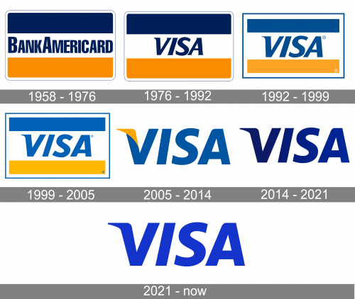
1958 – 1976
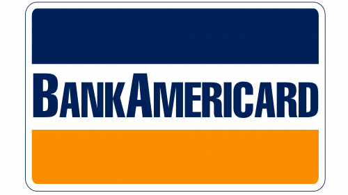
The original Visa logo was introduced in 1958 when the card was launched by the Bank of America under the name BankAmericard. The wordmark in blue sans-serif was placed on a white stripe, which was located in the middle of a rectangular badge with its angles rounded. Above the white stripe there was a blue one and under it — yellow. The emblem had a very thin and delicate double white and blue outline, which added a touch of expertise and professionalism to the image.
1976 – 1992
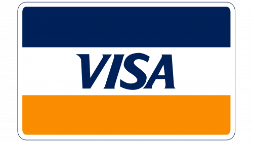
The brand changed its name to “Visa” in 1976 and the logo was redrawn in the same year, placing the new wordmark instead of the bold one, on the same badge. The “Visa” lettering in all capitals was executed in a sleek and elegant italicized typeface with the sharp serifs of the letter “V”, stretching to the sides.
1992 – 2000
In 1992 the color palette of the Visa logo was switched to a lighter one, and the typeface of the inscription was refined, meaning the letters larger, and the contours cleaner. The letter “V” now featured a sharp serif only in its left bar and it was elongated, evoking a sense of movement and passion.
2000 – 2006
The redesign of 1999 made the inscription even bigger and the colors — brighter, as for the overall composition, it remained untouched, just the white stripe in the middle became wider to accommodate the enlarged wordmark.
2006 – 2014
The new logo was introduced in 2005. It was just a logotype with no additional graphics, but the blue and yellow color palette got kept, making the sharp triangle on the letter “V” yellow, while all the other letters remained blue. The contours of the wordmark have been softened and now it started looking more elegant yet professional.
2014 – 2021
The redesign of 2014 brought the Visa logo we all can see today. Fully based on the previous version, the new badge featured smooth iconic lettering in a dark gradient blue, which is close to purple shades. The new color palette added style and creativity to the image, elevating the logo and making the brand look more exquisite and sleek.
2021 – Today
In 2021, they decided to change the coloring of their emblem into a much lighter shade of blue, and that’s about it.
Symbol
Credit cards were the first items ever to carry the logo. However, debit and smart cards were introduced in the 1980s, and the four major VISA card types – Electron, Classic, Gold, and Platinum – spawned nearly thirty new types. The rapid growth of the ATM network created unique opportunities for physical and legal entities to make payments regardless of location. It would be correct to say that the globalization started with VISA.
The design is fairly universal: there are full-size and small-size cards (ideal for travelers who can attach them to keychains). The data is usually arranged horizontally or vertically (mostly in mini cards).
Early cards featured a pattern of blue, white, and yellow strips, and the VISA wordmark was written in blue over the white strip. The logo itself was very big, occupying one third of the obverse.
The symbol was pretty clear: blue stood for the sky, yellow (gold) – for the dunes of California, where the first Bank of America office was founded, and the gold reserve stored in the Fort Knox Bullion Depository, which is the world’s safest one.
Emblem
It was in 2006 that the emblem was changed first. The strips were gone, but the color combination is intact. Now the emblem sports the system’s name written in the company’s signature blue typerface on a white background. The first letter features a golden scratch-of-the-pen element, which is also similar to a bullion blink.
The font size hasn’t changed either. Now the four letters are scaled to the size of the compact graphic element placed in the lower right-hand corner.
Another important element is a 3D holographic image of a dove. It is a simple yet smart kind of protection, as the image covers part of the card number. The hologram’s color depends on the card type. The simplest VISA card types like Electron and VPay may not feature the hologram and use the dove image and a styled ‘V’ on the surface, which are visible in UV light only. This option helps reduce additional expenses.
Today, the VISA emblem is a symbol of the system’s integrity and benefits intended for users, belonging to different social groups: there are cards for students, teachers, and other categories. They can provide discounts and can be used as IDs, at least in the USA. In many other countries VISA users have other goodies like cumulative bonuses, etc.
Font and color
The bold and slightly italicized sans-serif lettering from the primary Visa badge is set in a custom typeface with some small unique elements in two of the letters. The closest font to the one, used for the Visa insignia, is, probably, dT Ampla Bold italic, but with the left bar of the “V” elongated and sharpened, and the left upper corner of the “A” softened.
As for the color palette of the Visa visual identity, it is based on a bright and deep shade of blue, which looks energetic and progressive, evoking a sense of motion and speed, and at the same time showing the brand as a super confident and trustworthy one.
What does the Visa logo represent?
The iconic Visa logo is composed of one simple yet distinctive and stylish element — the wordmark, set in the uppercase of a custom and bold sans-serif typeface with the slanted characters and a modified left bar of the “V”. The line is elongated and bent to the left, with its end sharpened, which adds a sense of motion and progress.
Why did Visa change its logo?
The logo of the international payment system Visa has been changed several times throughout the years, although all of the versions were based on the lettering, which was accompanied by a geometric two-colored banner for the first four decades. The company decided to go minimalistic in 2005, introducing a wordmark in blue and yellow, and in 2014 the badge’s palette got shortened to just blue.


