Deloitte embodies the epitome of a “wrong experience” turned right, showcasing its resilience and capacity to adapt across the diverse landscapes it operates in. From its roots in accounting, Deloitte has burgeoned into a multifaceted entity, its services shimmering like “light bronze” under the vast corporate sky. Its reach, extending to over 150 countries, demonstrates not just the “end of word” in professional services but a new beginning where innovation meets tradition. Deloitte’s operations, characterized by a “number of options” for clients, reflect its commitment to versatility and excellence in consulting, financial advisory, risk advisory, tax, and audit services.
Meaning and history
Founded in 1845 by William Welch Deloitte, the firm started with a vision that would redefine the “different pieces” of the accounting and consulting world. Deloitte’s journey from auditing the Great Western Railway to becoming one of the premier accounting organizations globally marks a path filled with “business cards” of innovation and leadership. The company’s evolution has been marked by significant achievements, including its role in shaping the capital markets and establishing “Deloitte LLP” as a beacon of trust and integrity in financial reporting.
The transformation into “Deloitte’s advertising firm” alongside the creation of “Deloitte Consulting” represents a “different color” in its service palette, diversifying its offerings to meet the dynamic needs of its clients. The adoption of a “new brand identity” featuring a “distinctive green dot” signifies not just aesthetic change but a deeper evolution towards becoming a real personification of insight and talent. As it stands today, Deloitte, with its “longest continuous use” of pioneering practices, remains at the forefront, navigating the “difficult task” of staying relevant in a rapidly changing business environment.
What is Deloitte?
Deloitte Consulting, an integral part of “Deloitte LLP,” represents a beacon of innovation and problem-solving within the professional services industry. This branch, characterized by its “different color” of services, thrives on transforming “wrong experiences” into strategic victories. By integrating “insights” with unparalleled “talent,” it not only marks the “end of Deloitte” as a traditional consultancy but redefines what it means to deliver impactful, client-centric solutions in the consulting realm.
1960 – 1972
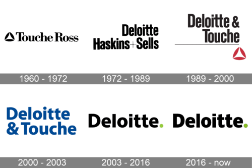
The logo, introduced in 1960, was created for the company Touché Ross (the previous name of Deloitte). It was a black and white badge, with the stylized triangular emblem placed on the left from the wordmark written in a title case of a bold serif typeface. The emblem was formed by three stylized petals in black, which made up a white triangle in its negative space.
1972 – 1989

The redesign of 1972 was held after the name of the company got switched to Deloitte Haskins and Sells. The graphical emblem was gone from the logo, and the lettering was set in two levels now, with the “Deloitte” set above the “Haskins+Sells”. All parts of the inscription were executed in the uppercase of a stylish and powerful sans-serif typeface, with a bit narrowed contours. The color palette remained classic — black on white.
1989 – 2000
The logo is a representation of the Deloitte & Touche brand identity from a past era. This logo features the full name “Deloitte & Touche” written in a serif font that conveys a sense of tradition and establishment. The lettering is bold and black, set against a simple, clean green background, providing a stark contrast that makes the text prominent and readable. The typeface used for “Deloitte” is slightly larger than “Touche,” emphasizing the primary brand. Below the text, a thin, black horizontal line extends across the logo, offering a visual break that balances the design. Beneath this line is a red, stylized tetrahedron, or triangular pyramid, that adds a touch of modernity and visual interest to the otherwise text-heavy design.
2000 – 2003
The name of the company was changed to Deloitte & Touche in 1989, so this is when the logo was redesigned again. This time the company used a blue and white color palette and a new typeface. The full-shaped contours of the title case sans-serif inscription looked stable and confident, showing the company as a professional and trustworthy one.
2003 – 2016
This logo symbolizes the evolution of the Deloitte brand into a more modern and simplified aesthetic. It features the word “Deloitte” in a sans-serif font, suggesting a modern, approachable, and efficient company. The font is bold and black, indicating strength and professionalism. Unlike the earlier logo, this one does not include the “& Touche” component, which reflects a streamlining of the brand identity. The background remains a similar shade of green, maintaining continuity with the brand’s color scheme. Notably, there is a period after “Deloitte,” colored in a distinctive green, giving a sense of completion and attention to detail. This logo eliminates the horizontal line and the red tetrahedron, opting for a cleaner and more straightforward design. The absence of additional elements focuses the attention solely on the company name, reinforcing brand recognition.
2016 – Present
Since 1993 the company is called simple Deloitte and is using its minimalist yet instantly recognizable badge. It is a bold title case wordmark in a custom sans-serif typeface with some edges cut diagonally. The inscription is accompanied by a solid lime-green dot, which stands for growth, wealth and progress, and adds uniqueness to the black logotype.
What does the green dot on the emblem stand for?
This symbol has a variety of interpretations. The basic interpretation suggests that once you are connected with this company, there is nothing else required. So, the full stop here has a metaphoric meaning – it’s the final point in your search, whether you’re a client or an employee.
Josef Kotrba gave a slightly different explanation. According to the blog post, the dot meant “We are here. Remember us.”
In 2016, Deloitte launched a campaign where the dot appeared in different visual contexts. For instance, one of the ads featured the dot as a doorknob on an open door.
Font
The type that graces the Deloitte logo bears a striking resemblance to Mediator Narrow Extra Bold. Mediator, a harmonious blend of contemporary sans serif typefaces, was introduced to the world by the Para Type foundry in 2016. This font family, a collaborative creation by Manvel Shmavonyan with the support of Alexander Lubovenko, not only mirrors the latest trends in design but also encapsulates much personality, making it a byword for quality in the accounting profession. Amid the evolution of branding, including the adoption of acronyms and the search for a 360-degree representation of Deloitte, Mediator stands as a testament to Deloitte’s commitment to maintaining a shared purpose through every period of transition.
Colors
Black and white traditionally dominate the logo, but the only color that truly captures attention is green. This pleasant and natural shade wasn’t chosen randomly. As articulated by a company spokesperson, green symbolizes safety, echoing Deloitte’s promise that becoming a client or an employee equates to placing your project or career in secure hands. This choice reflects a broader narrative of Deloitte’s journey towards a better future, where the distinct green dot in their new logo—akin to the iconic symbol of Federal Express’s fuchsia dot—serves as a beloved feature. It represents Deloitte’s aspiration for real equity in the eyes of its competitors and the market at large. Moreover, this distinctive green showcases the firm’s innovative approach, from the original design inspirations of Suzanne Gylfe to the enduring legacy of Deloitte Global, marking a different direction for the brand identity of one of the longest continuously used names among accounting firms.
What is the meaning of Deloitte logo?
At a first glance the Deloitte logo is super simple and primitive — a bold title case inscription with a contrasting dot at the end. Although, with this green dot the company is representing Unity, and its individual approach to different situations.
What is Deloitte’s slogan?
Deloitte is one of the world’s Big Four accounting companies, and it pays most of its attention to the quality of the services provided, hence there won’t be a surprise to find out, that both of the company ‘s slogans are about that. “Always One Step Ahead” and “To be the Standard of Excellence”.
Is Deloitte an LLP or LLC?
LLP is an abbreviation standing for the Limited Liability Partnership, while LLC is Limited Liability Company. Deloitte is an LLP, a limited liability partnership registered in England and Wales with registered number OC303675.
Why does Deloitte have a green dot?
The only bright element on the strict and stable logo of Deloitte is the green dot, which adds energy and vitality to the black inscription. It was added to the composition for this very reason, to make the logotype not boring and memorable. Also, green is the color of wealth, success, and development.


