BlackRock, Inc. is an investment management corporation based in New York City, US. As of the fall of 2021, it had more than $9 trillion in assets under management. The number of employees only in the offices based in the United States was over 7500.
Meaning and history
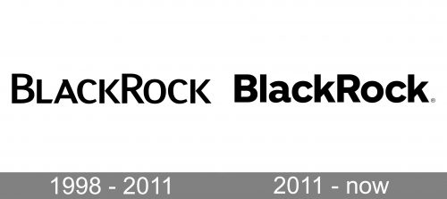
No matter how simple the BlackRock logo may seem, its serious style is quite adequate for the type of company it belongs to. It is interesting, though, to compare the current version to its predecessor.
What is BlackRock
BlackRock has been known as the largest asset management company in the world. The corporation works in 30 countries, but its clients come from approximately 100 countries.
1988 – 2011
The history of the company officially started in 1988. It was established by eight co-founders with the mission of offeringcorporate customers asset management services from a risk management perspective.
The earliest logo already was a rather successful one. It featured the name of the brand in a sans serif typeface. All the letters were capitals by shape, but the “B” and “R” were made larger. Due to this, the wordmark is better legible as you can see the beginning of each of the two words forming it. Otherwise, it would have looked more like just several letters put together.
The type deserves special attention. On the one hand, it is perfectly legible. The overall proportions of the glyphs are classic, based on the oval. This choice seems fully justified. It is common knowledge that a company working in such spheres as finance and investment shouldn’t adopt experimental logos and too unusual typefaces. These elements would have made it look somewhat unreliable and unsafe, which may damage its image in the eyes of the client.
That said, any logo needs to have a unique touch in it – otherwise, it will fail to do what it is supposed to – create a distinctive visual representation of the company. To meet this requirement, the authors of the BlackRock logo added a couple of small details here and there. Note, for instance, the top of the “A,” where the right diagonal bar is slightly longer than it should be.
We can also appreciate other nuances in the shape of the letters, which make them look modern and a bit unusual. However, the company hasn’t gone overboard on it, soas not to look too experimental, and thus, unreliable.
2011 – present
The update made the logo look generic, although the “reliability” and “stability” messages seem to be more obvious now.
The structure of the wordmark remained the same: there is the name of the company in black. It is more grammatical than its predecessor, as only the initials are capitalized here, while all the other letters are lowercase.
The glyphs still have classic proportions, only now they are based not on the oval but the circle. The font is bolder and it has lost much of its elegance. The refined “c” and “k” were replaced by glyphsthat look more traditional. Also, the variation in the thickness of the lines is less notable now. However, the “a” seems to slightly break the rule – it is probably the most unique glyph here.
Colors and font
The designers who developed the BlackRock logo opted for the most obvious palette. They made black the only color and combined it with the white background. We should mention, though, that the brand also used a version, where the lettering was white, while the background was dark blue.
The type is key for this brand identity. The glyphs look rather heavy and stable, which helps the brand convey reliability.


