

![]() Tinder Logo PNG
Tinder Logo PNG
The fact that Tinder replaced its wordmark with an icon conveyed an important message. The dating app was trying to make it clear: people recognize it instantly and don’t even need the text for it. In other words, the Tinder logo has reached Nike Swoosh status.
Meaning and history
![]()
2012 — 2017
![]()
Tinder was incubated inside Hatch Labs. It started work in 2012 and quickly gained success among users. Only two years later, there were around one billion user registrations per day.
2017 — Today
![]()
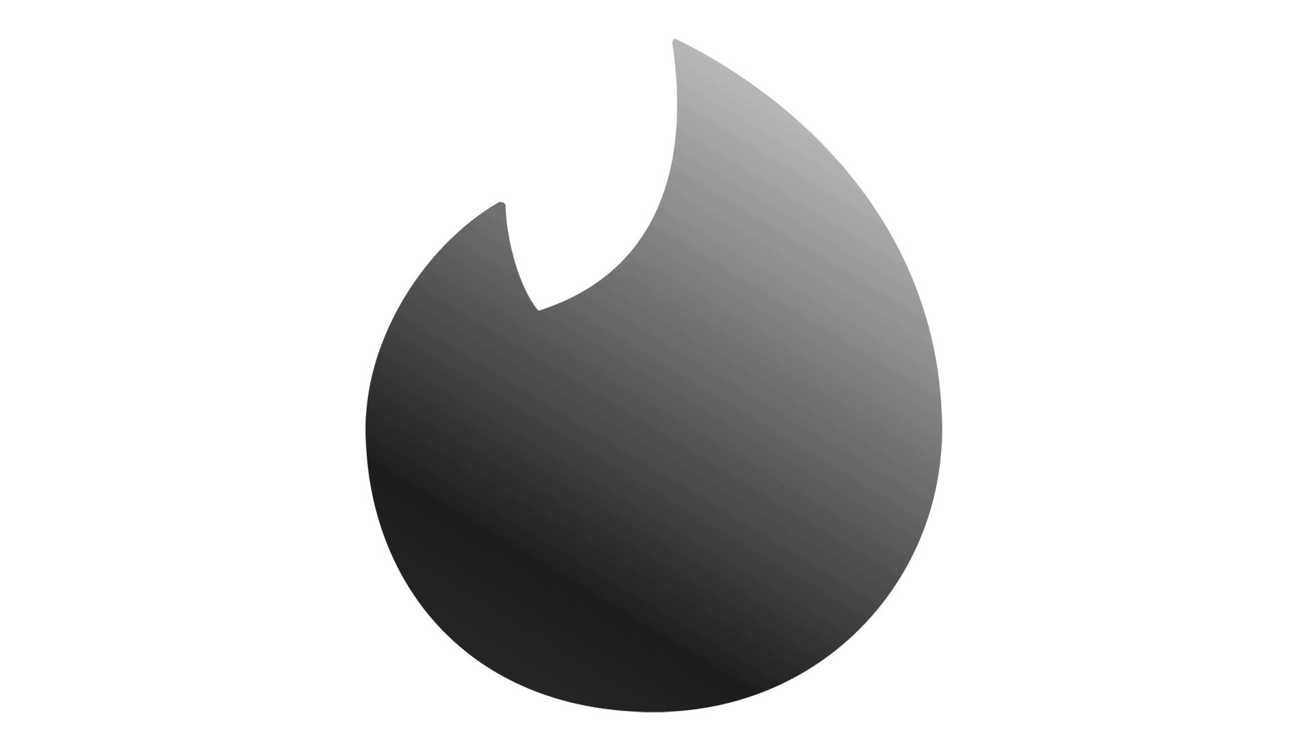
In the summer of 2017, the application got rid of its text logo replacing it with a minimalistic icon. In fact, the icon itself was already familiar to the app users: it was the flame symbol that had been used instead of the dot over the letter “i” on the old logo.
Now, the flame icon has acquired a gradient texture. While the old emblem was flat and orange, the new one has some dimension and fades from orange to pink. Also, the shape of the flame has been slightly modified. The icon has grown a bit rounder, while its tips became sharper.
There’s also another, inverted version of the emblem. Here, the flame is white, while the background has a gradient texture of orange and pink shades.
The logo modification took place shortly after the app itself was updated, too. As part of the app overhaul, a cleaner design was introduced, as well as simplified navigation and a new way of displaying photos.
Emblem symbolism
The meaning behind the flame symbol seems pretty transparent: Tinder is all about the flame inside a human body. Also, “hot” is the word we call someone who looks good. As a dating app, Tinder promises us to light up the fire of relationship. The name of the project itself fits the concept perfectly as it means “material used for lighting fire.“
The choice of colors on both the old and new Tinder logo seems perfectly natural, for the flame symbol, as orange and magenta (or red) are the colors of fire. In other words, the palette is another way of promising you “burning hot” relationships.
Those familiar with the concept of chakras, which came to us from ancient meditation practices, may notice one more symbolic meaning behind the color choice. Orange is the color of the second chakra, which is associated with creativity and sexuality.
Icon
The Tinder icon is all about passion and connection. The most famous dating app in the world uses the most common symbol for people’s relationships — the flame.
The Tinder Icon is composed of a gradient pink and orange square with rounded angles, as a background, and a stylized white flame in the middle. The flame is drawn with minimum lines and has its bottom part softened and rounded. On some versions, the white image has a delicate thin shadow, on others. It is simple and flat.
There is also a variant, where the flame is being drawn in the gradient orange and pink palette and placed on a white background.
Font
The old logo featured a minimalistic, modern typeface. Apart from the flame above the “i,” the wordmark was recognizable due to such distinctive elements as the top bar on the “t” (which lacked a half of its length) and the sloped bar on the “e.”
Colors
![]()
While the old logo was orange on the white background, the new one is more complex, in terms of the color palette, due to the gradient effect. Now, there’re several shades of orange, which are complemented by a variety of light magenta tones. In spite of the color shift, the Tinder logo has stayed consistent in its flame symbolism. Moreover, the “fiery” effect has become even more pronounced on the new logo.


