One of the world’s most known luxury fashion companies, the Michael Kors Holdings Limited has a wordmark logo and an emblem. Both may appear together, to form the Michael Kors insignia, but areoften used separately.
Meaning and history
The visual identity of the famous fashion house has been pretty constant throughout the years, and today the label still uses two symbols, which were created for it in the 1980s and 2000s. The simplicity and elegance of the Michael Kors logo beautifully combine with feminine silhouettes and patterns of his collections.
1981 — Today
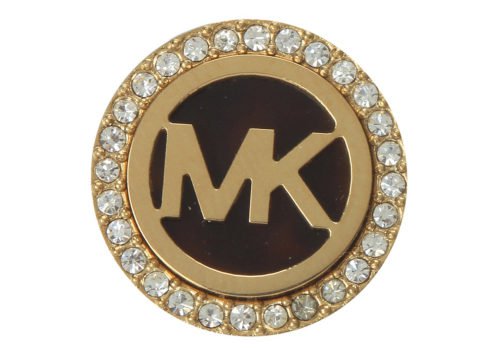
The original logo for the fashion brand was introduced in 1981 and featured a thick circular frame where the “MK” monogram was enclosed. Written in a bold sans-serif typeface, two letters of the monogram were glued to each other and shared one vertical bar. It is a simple yet very powerful and confident badge, which is still in use by the brand, but for its second, more affordable line, Michael by Michael Kors, and for accessories.
2006 — Today
The redesign of 2006 brought a new life to Michael Kors’s visual identity, making up its logo in a very traditional or the fashion industry way — a monochrome logotype in all capitals is written in a straight and neat sans-serif typeface with rounded shapes and distinct cuts of the letter edges. Two parts of the inscription are placed pretty far from each other, which adds balance and lightness to nil letters.
MK symbol
The main emblem is built around the interlacing initials, “M” and “K”. The left vertical bar of the “M” overlaps with the right vertical bar of the K, and in this way a single emblem is formed. The symbol is positioned inside a bold circle frame.
Wordmark emblem
Simple, yet effective, the wordmark logo represents everything what the Michael Kors brand stands for. It is elegant and full of understated chic.
Font
The sans serif typeface is bold and sleek. It looks very much like a customized version of the Proxima Nova, Grotesque, and Gothom types.
Color
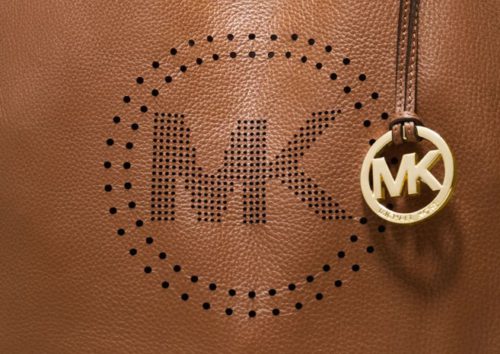
The Michael Kors logo may be given in a variety of colors, as it is often the case with the emblems of clothing and footwear brands. In each case, the color is chosen according to the palette of the item the logo appears on. Some of the most typical choices include black or gold against the white background.


