Whatever modifications the iTunes logo has gone through, it has always preserved its two main symbolic elements – notes and an oval or round shape representing an audio CD. Both of them have been present since its first version was introduced almost 20 years ago. With every modification, the emblem has been growing less realistic.
Meaning and history
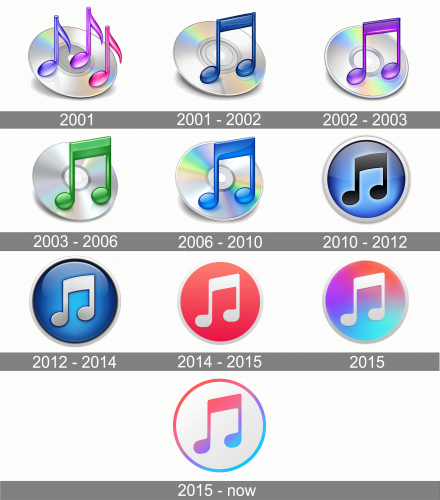
The iTunes icon is one of those, that was redesigned almost every year after the app’s launch, so it has many versions created during its history, but almost all of them feature the same style and composition and vary only in their color palette.
2001
The very first iTunes logo was introduced in 2001 and depicted a gradient compact disc with three notes, drawn in gradient pink and purple. The version didn’t stay long and was replaced by a new emblem in the same year.
2001 — 2002
The new version of the iTunes logo depicted a double blue note placed on the background with a glossy silver compact disc, which was slightly inclined, creating a gray shadow on white.
2002 — 2003
The redesign of 2002 changed the blue of the note to purple, to reflect the creativity and a variety of music compositions available on the service.
2003 — 2006
The new color was introduced in 2003, and it was green, standing for growth, prosperity, and progress. The cd on the background was enlarged, and the gray shadow became lighter and smaller.
2006 — 2010
The double note was drawn in gradient blue again, like on the logo from 2001, but with all the elements in a bigger size and the inclination angle of the compact disc smaller.
2010 — 2012
The completely new style was brought to the iTunes visual identity in 2010. It was a glossy and gradient blue circle in a wide silver outline with a flat double note in black, placed in its middle. The new color palette made the logo brighter and more confident.
2012 — 2014
The flat black note was changed to silver, which gained a delicate black outline and slight gradient along its borders, looking dynamic and voluminous. The upper part of the badge got more shine and gloss.
2014 — 2015
The logo was simplified in 2014. The blue and gray color palette was changed to coral-red and silver, with the new red circle in a thinner silver outline and fewer gradients. The contours of the nite were redrawn in a more modern way, and the surface became matte.
2015
2015 — Today
In 2015 Apple starts using the gradient purple and pink double not in a white background, which has a delicate outline in the same pink-purple palette. The iTunes logo looks stylish and elegant, being bright and tender at the same time.
Icon
The iTunes icon uses the main emblem of the software and places it on the square with rounded angles. The background can be whether white, when the note symbol is in a rainbow palette, or the symbol in white, on a rainbow background, with a white circle enclosing the note. Another option shows a white not with no circles around, placed on a smooth coral-pink background. This bright color looks truly unique and evokes a sense of happiness and joy.
Font
The sleek sans serif font featured on the logo is Myriad Bold, which was developed by Carol Twombly and Robert Slimbach.
Color
With every new version of the logo, a new color palette has been introduced. So, we can’t say that the color scheme is what makes the iTunes symbols recognizable.


