Iowa Hawkeyes is the collective name for 22 spot teams, which represent the University of Iowa in the National Collegiate Athletic Association. The public research university, established at the end of the 1840s, is located in Iowa City, Iowa, and has 30 thousand students.
Meaning and history
The oldest and the most titled club of the Iowa Hawkeyes program is the men’s football team. It played its first game in 1872. And yet, it was only seventeen years later, in late 1889, that football officially became a varsity sport in the university. The home arena of the Hawkeyes football club is Kinnick Stadium. A Division I FBS member of the NCAA, the Hawkeyes are ranked 25th of all college football programs based on total appearances in the Associated Press.
Another sport discipline with a strong representation in the Hawkeyes program is Baseball. The history of the baseball program at the UI started in 1890. Since then, the Hawkeyes have won eight Big Ten titles. They competed in the College World Series at Rosenblatt Stadium in Omaha with a 13–3 Big Ten record. The team can also boast its 11-game Big Ten winning streak.
The Iowa Hawkeyes are also strong in wrestling. And this sport discipline now takes more and more attention. As for the men’s gymnastics and swimming teams, they were eliminated from the UI list after the pandemic in 2019, as they were not very successful. Speaking of not being successful lol, we have to also mention the Hawkeyes, Basketball division.
The basketball team consisting of the UI’s students played its first official game in early 1896. However, it was only six years later that the university started its own men’s basketball program. Since 1909, when the Hawkeyes first competed in Big Ten games, they have won eight regular-season Big Ten championships. They have not been very successful lately, though, – their most productive period took place in the 1950s.
The Iowa Hawkeyes program is the strongest competitor in the first Division of the National Collegiate Athletic Association, as a member of the Big arena Conference, which is the oldest and the most prestigious athletic conference in the United States.
What is Iowa Hawkeyes?
Iowa Hawkeyes is the name of a collegiate athletic program from the University of Iowa. The program is composed of 22 men’s and women’s teams, which compete in the first Division of the National Collegiate Athletic Association in several sports disciplines, including Baseball, Basketball, Football, Gold, Cross country, and others.
In terms of visual identity, the concept of Iowa Hawkeyes is composed of one emblem, used by all 22 men’s and women’s teams, so its main characteristics are universality and recognizability. Though the badge we all see today has almost nothing in common with the Hawkeyes’ original logo version, it accents the evolution not only in design but in the overall approach.
1953 – 1962
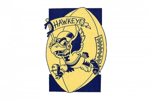
The initial logo version of Iowa Hawkeyes was composed of a friendly and funny image of a running hawk wearing a helmet. The stylized burg was placed on a background with an enlarged rugby ball on it and had an arched banner with the wordmark above its head. The yellow and blue color palette of the original emblem evolved into yellow and black and was styled with the team by today.
1962 – 1971
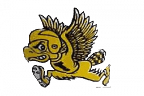
The rugby ball and a banner were removed from the logo in 1962, and the contours and lines of the hawk were cleaned and strengthened. Now the bird, wearing a football uniform, had a bold black “I” on its jersey and looked speedy and dangerous, ready to fight and win. The team had been using this cartoonish hawk badge for nine more years
1971 – 1979
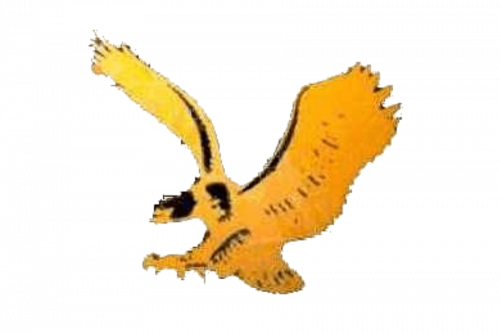
The redesign of 1971 introduced a badge with a more traditional and elegant approach. The yellow and black color palette of the logo was kept, though some more intense and dark yellow shades were added to a sleek flying hawk, which had its wings spread wide and evoked a sense of freedom, speed, and grace. It was a simple yet sophisticated emblem, which pointed to professionalism and expertise.
1979 – Today
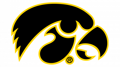
The logo, designed for the Iowa Hawkeyes in 1979 is the most long-standing and brilliantly performs all the necessary functions, such as reflecting the character of the teams, representing the main values, and being memorable and recognizable. The horizontally oriented solid black oval has a stylized modern image of the hawk, placed in profile and facing right. The smooth yellow elements of the bird look elegant and stylish, and its direction stands for moving forward and progressing.
Tigerhawk symbol
The current Iowa Athletics’ primary logo is known as the Tigerhawk. The side view of the bird’s head is given in gold against the black background. It looks very modern and stylish, showing the athletic program of the University of Iowa as a progressive and developing one. Even though the symbol was introduced at the end of the 1970s, it looks super cool and powerful today, as if it has just been created.
Block “I” emblem
There two icons called the Block “I” and the Outline Block “I”. They may be used in all white, gold, and black versions.
Basketball
The basketball team consisting of the UI’s students played its first official game in early 1896. However, it was only six years later that the university started its own men’s basketball program. Since 1909, when the Hawkeyes first competed in Big Ten games, they have won eight regular-season Big Ten championships. They have not been very successful lately, though, – their most productive time period took place in the 1950s.
Baseball
The history of the baseball program started in 1890. Since then, the Hawkeyes have won eight Big Ten titles. They competed in the College World Series at Rosenblatt Stadium in Omaha with a 13–3 Big Ten record. The team can also boast its 11-game Big Ten winning streak.
Football
The football team has a very long history – it played its first game in 1872. And yet, it was only seventeen years later, in late 1889, that football officially became a varsity sport in the university.
Their home arena is Kinnick Stadium. A Division I FBS member of the NCAA, the Hawkeyes are ranked 25th of all college football programs based upon total appearances in the Associated Press.
Font and color
The heavy uppercase lettering from the primary Iowa Hawkeyes badge is set in a stable geometric serif font, with thick bars, clean contours, distinctive cuts, and square serifs of the characters. The closest fonts to the one, used in the Iowa Hawkeyes logo are, probably, ITC Lubalin Graph Std Bold, or Vigor DT ExtraBold 875.
However, apart from the primary logotype, the athletic program of the University of Iowa has an additional wordmark, executed in a stylized serif font with solid black characters set against a yellow background, and the square serifs decorated by the sharp triangular cut-outs, which evoke a sense of determination and energy.
As for the color palette of the Iowa Hawkeyes’ visual identity, it is based on two official colors of the University of Iowa, black and yellow. Black is a sign of power and confidence, while yellow is here for energy and motion. This bright color balances the brutally black and makes the logo look a bit more modern and cool.
Iowa Hawkeyes Colors
HAWKEYES GOLD
PANTONE: PMS 116 C
HEX COLOR: #FFCD00;
RGB: (255, 205, 0)
CMYK: (0, 20, 100, 0)
BLACK
PANTONE: PMS BLACK 6 C
HEX COLOR: #000000;
RGB: (0, 0, 0)
CMYK: (0, 0, 0, 100)


