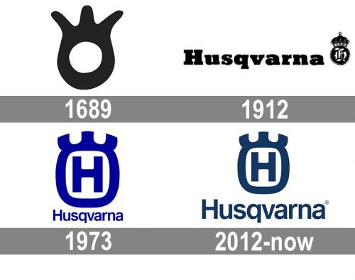
Although the Husqvarna logo has undergone a series of modifications, it has still preserved its visual core reminding of the brand’s roots.
Meaning and history
Husqvarna is an iconic Swedish company that is considered the world’s largest manufacturer of all kinds of garden tools, lawn mowers, cultivators, and small tractors. It is also very famous for saws of this brand, motorcycles, and various tools for stone processing.
In addition to the brand Husqvarna, the company owns several other trademarks, which also have a strong reputation throughout the world, — Gardena, McCulloch, Diamant Boart, Weedeater, Dixon. Several smaller brands are mainly known in Scandinavian countries. Those are Zenoah, Bluebird, Klippo, and Flymo. The right to use the Husqvarna brand on motorcycles is also owned by the German company BMW.
The shape of the original company logo was taken from the sights of the first muskets produced by Husqvarna. Over time, the shape of the emblem has been slightly transformed, but the essence remains the same.
What is Husqvarna?
Husqvarna is one of the oldest companies in the world, founded in Sweden in 1689. At that time, the company has been producing some of the best muskets, and today it is the world’s largest manufacturer of all kinds of garden tools, lawnmowers, cultivators, and small tractors.
1968 — Today
Husqvarna is a company with a very long and rich history, which dates back to the 17th century when it was founded for the production of muskets. As for the modern, motorcycle era, Husqvarna launched its manufacturing in 1903. But the logo we all know and love today is based on the very first emblem, created for the company in 1689 and placed on each of its muskets. It was a rounded seal with three lines coming up out of it, resembling a crown.
1912 — 1973
The logo, introduced by the company in 1912 featured a more traditional composition and emblem. It was composed of an extra-bold serif lettering in a title case, with an elegant royal emblem on its right. The emblem featured a circle with a smooth crown on top, the circle had an old-style gothic monogram inside and represented the history and legacy of the brand.
1973 — 2012
The iconic emblem we all can see today was first introduced in 1974. Designed by Hornaz Kapadia, boasted a rounded square in a thick blue outline with three short smooth lines coming out of its upper part. The lines had their angles sharp and cuts a bit arched. Inside the badge, the “H” is simple yet bold lines were drawn using the same blue color, and a wordmark was written under the emblem. The inscription was executed in a lightweight sans-serif typeface with only the first “H” capitalized.
2012 — Today
The color palette of the iconic logo was switched to a calmer and darker blue in 2012. Another change was about its wordmark, which now featured two levels “Husqvarna Group” and uses a more balanced and rounded sans-serif typeface, which evokes a sense of stability, expertise, and professionalism.
Font and Color
The modest title case lettering from the primary Husqvarna logo is set in a clean and stable sans-serif typeface with modern geometric contours of the characters. The closest fonts to the one, used in this insignia, are, probably, Neue Haas Grotesk Display 65 Medium or Sequel Sans Display Heavy.
The Helvetica Nue font has a lot in common with the type used in the wordmark, yet the designers definitely modified the height/width of the letters and kerned the font tighter.
As for the color palette of the Husqvarna visual identity, it is based on a drop and calm shade of blue, which symbolizes expertise, professionalism, and confidence, and evokes a sense of excellence and reliability.


