One of the world’s most successful clothing-retail companies, H&M has Swedish origin. The company works in more than 60 countries across the globe and employs over 130,000 people.
Meaning and history
There is barely any country in the world where there are no H&M stores, and the brand’s bold red logo is instantly recognizable across the globe as an emblem for affordable stylish clothing.
The brand started as “Hennes”, which stands for “Her” in Swedish, and turned into Hennes & Mauritz after the merger with men’s clothing brand, so when shortened to H & M in 1968, it was more like a symbol of Women and Men apparel, feminine and masculine.
1947 — 1968
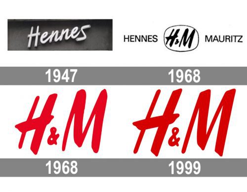
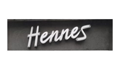
The original H&M logo was created when the brand was named Hennes, and composed of a single logotype. The wordmark in a bold handwritten typeface was set in the title case and placed slightly diagonally, looking friendly and solid. The original color palette of the Hennes visual identity was monochrome.
1968
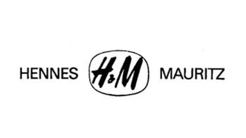
Hennes merged with Mauritz Widforss in 1968, forming Hennes & Mauritz. The logo was changed accordingly, and now featured a traditional sans-serif nameplate, where two parts were separated by an “H&M” monogram in a rounded frame. The letters inside the frame featured the same style as the “Hennes” inscription on the previous version, but with its contours cleaned and modified. This logo stayed with the company for a few months, as later in the same years the name of the brand was shortened to “H&M”.
1968 — 1999
The new logo of 1968 boasted a bright red monogram, repeating the typeface of the previous version, but with no framing. Two thick handwritten capitalized letters had a small ampersand in the same scarlet-red shade between them. The smooth lines of the logo made it look welcoming and friendly, while the bright color palette reflected the passion, style, and power of the brand, which aimed to provide young people across the globe with the most fashionable items at more than affordable prices.
1999 — Today
In 1999 the H&M logo was redesigned again, but it was more a refinement than rebranding. The color palette got switched to a bit darker one, elevating the shade of red and making it more serious and luxurious. The contours of the letters were also modernized, becoming straighter and stronger, more distinct and professionals.
Symbol
The H&M symbol is very simple and minimalistic. It features the letters “H” and “M” with an ampersand between them. It is very often criticized for being too generic – hardly a surprise taking into consideration the elaborate logos many of the modern clothing brands have.
And yet, according to some designers, it is one of the very few cases when a company can actually afford to use such a simple symbol – H&M is so popular that the emblem is instantly recognizable. You don’t have to think twice what company it belongs to.
Who is emblem targeted at?
The two letters united with the ampersand are supposed to appeal to the young buyer. According to the company, most of its clients are people under 30. The free-spirited, vivid logo is supposed to attract this very audience.
Colors
The bright shade of red makes the logo stand out in spite of its simplicity. Passion, youthfulness, and energy are the key ideas behind this color choice.
Font
As the H&M logo actually consists of nothing but letters, the font is what really attracts attention. Designers created a custom italic typeface. One of its distinctive features is the bar in the “H” letter which is a bit wider than in most standard fonts.


