DC Comics is the name of the publishing company, owned by Warner Bros. Group. One of the oldest comics publishers was established in 1934 and gave birth to dozens of legendary characters, including Batman, Joker, and Superman.
Meaning and history
DC, standing for Detective Comics, which was the first name of the iconic Batman series, is the brand with a very rich visual identity history, and its simple yet bright and recognizable badge, we all know today, is a result of numerous redesigns, held throughout eighty years of the DC Comics existence.
1940 – 1942
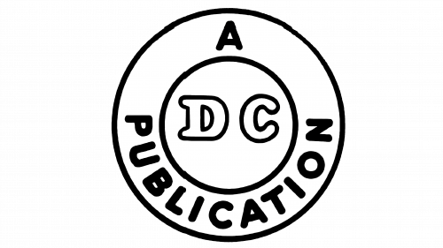
The original logo, introduced in 1940 and placed on the cover of the Batman issue, featured a white circular badge with wide double outlines, where “A Publication” lettering in all capitals of a rounded sans-serif typeface was placed around the perimeter. The “DC” lettering in an outlined serif font was placed in the middle of the badge, on a smaller circle.
1942 – 1949
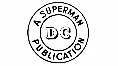
The redesign of 1942 was made due to the launch of the Superman series, so the main change of the emblem was about the lettering around its frame, as now it featured “A Superman Publication” in the same rounded sans-serif. As for the “DC” monogram in the middle, its contours were refined and strengthened, and the lettering gained a delicate black shadow.
1949 – 1970
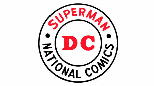
The red color appeared on the DC Comics visual identity in 1948, when the “Superman” part, placed on the upper part of the frame, and the “DC” in the center were colored red, and the bottom black part of the wordmark consisted of “National Comics” in black.
Now the two parts of the arched inscription were separated from each other by two bold black dots, and the main monogram gained a thicker and more powerful typeface with a strong character and massive shapes.
1970 – 1972
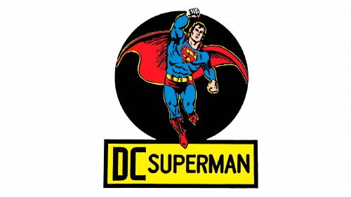
The redesign of 1979 brought a fancy Superman image to the DC Comics visual identity. Drawing the superhero in his iconic blue and red costume and placing it on a solid black circular background, the brand had its “DC Superman” wordmark in a yellow rectangular banner, set under the emblem.
1972 – 1974
The new logo was introduced in 1972, boasting a modern and minimalist design, composed of a bold customized “DC” lettering placed inside the white circle with a thin black outline. The letters were executed in a geometric sans-serif typeface with numerous angles and thick lines, looking powerful and futuristic, while the new red, white and black color palette reflected the passion, energy, and playfulness.
1974 – 1976
The logo was changed again in 1975, by adding more lettering around the badge’s perimeter and switching the color. Now the “DC” monogram was colored blue while the “The Line of Superstars” in bold sans-serif used red color. Two parts of the inscription were separated by two bold red five-pointed stars.
1976 – 2005
The badge, introduced by the company in 1976, stayed with it for almost thirty years and featured a monochrome emblem, where the small white circle was placed on a bigger black one. Four white five-pointed stars were located in the black part of the badge, while the “DC” wordmark in an extra-bold sans-serif was set diagonally on a white background, having a thin double black and white outline. The powerful and stylish logo was designed by Milton Glaser and is still highly recognizable across the globe.
2005 – 2012
In 2005 the DC Comics logo was redrawn by Josh Beatman and Richard Bruning, who brought a fresh vision to the brand’s visual identity and made the emblem sleek and modern. The new logo featured two “DC” letters in a smooth blue outline, placed on an oval swirl in two shades of blue, with a white star on its bottom part. The new tender color palette looked light and crispy, while the slightly italicized letters and the swirl added a sense of motion and progress.
2012 – 2016
The logo, created for the brand by Landor Associates in 2012, featured a bold black letter “C”, overlapped by a stylized gradient blue “D”, which was flipped like a magazine page. The “DC Comics” wordmark in all capitals of a medium-weight sans-serif typeface was set in two levels and placed under the new stylish emblem.
2016 – 2024
In 2016 the company redesign its logo again, hiring one of the most reputable design bureaus, Pentagram. The new badge, based on the logo version of the 1970s, featured a sharp stylized “DC” lettering enclosed in a thin frame. The light blue and white color palette of the new badge makes it look fresh and crispy, evoking a progressive and vivid feeling.
2024 – Today
The redesign of 2024 has created a stronger and more brutal DC logo, based on the emblem, introduced in 1977. The new DC roundel is executed in a gradient blue and white color palette and fully repeats the geometry of the version from the 1970s, but in the refined scheme, the logo looks fresher and more up-to-date.
Font
The wordmark in all capitals is executed in a bold custom serif typeface, with unique recognizable lines and playful contours of the inner part of both letters. There are sharp delicate curves, reflecting energy, innovations, and courage.


