Columbia Pictures is one of the world’s most celebrated film production company, which was established in 1918 as CBC Film Sales Corporation. Originally named after its founders, American studio was renamed in 1924 and today is the part of Sony Group.
Meaning and history
The visual identity of one of the world’s most popular entertainment studios is instantly recognizable across the globe. The logo of the company has become synonymous with cinematography and high-quality movies, which millions of people enjoy watching.
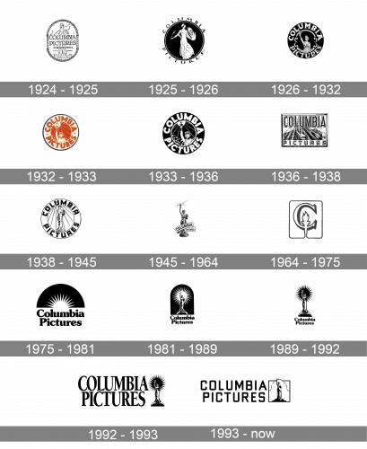
The company has a very rich visual identity history, which started in 1924, which the foundation of the studio, and went through more than ten official redesigns by today.
1924 – 1925
Before the film studio got its current name, it was called CBC Films and had only one logo, designed in 1918. CBC stood for Cohn brothers and Joe Brandt, people who founded the company. Their logo was a simple text-based badge in monochrome, with “CBC” capitalized and executed in a bold classic typeface with slight curved on the ends of the letters. The “Film Sales Corporation” was written under the main wordmark, with an elongated ornate tail of the letter “R”, which vignette ended above the cursive of “New York”.
The company was renamed in 1924 and that is when the first official Columbia Pictures logo was born. It was composed of an image of the Roman Warrior Lady with a shield in one hand and a wheat spike in the other. The wordmark was placed in the center of the oval badge, over the image. The medallion featured an ornate frame, with two Greek columns on its sides.
1925 – 1926
In 1925 the logo was refined and modernized, by creating a black background and making the contours of the image stronger and more confident. The emblem was now circular and the wordmark was placed around its perimeter, from the outside.
1926 – 1932
The iconic Lady with a Torch first appeared on the company’s logo in 1926. It was also a circular emblem with a black background and the upper part of the lady’s body with her arm stretched up and holding a torch. The inscription was placed around the perimeter, but from the inside, and featured enlarged bold capital letters, written in a custom serif typeface.
1932 – 1933
The logo was redesigned again in 1932. It was now executed in red and got more modern and distinct contours. The red background around the lady had thin white stripes, coming out of the torch, and the wordmark boasted a contemporary sans-serif font. It was a great logo design for its time.
1933 – 1936
In 1933 the logo was back to a monochrome palette, though the style of the visual identity from 1932 remained untouched. The emblem looked more powerful and professional in the combination of black and white colors, evoking a sense of influence and authority.
1936 – 1938
In 1936 the circular shape of the logo was replaced by a rectangle. The lady with a torch was still there, as well as on the additional logo, created in the same year. The secondary emblem depicted a full-size lady, drawn with huge attention to detail.
As for the main, official emblem, the rays became bolder and the inscription was now executed in two colors, in order to gain volume and look more dynamic.
1938 – 1945
However, in 1938 the company comes back to the shape of the circle. The logo is simplified — the delicate silhouette of the lady is surrounded by straight thin lines and enclosed in a double rounded frame with the wordmark in black around its perimeter. The typeface of the lettering is also changed to a more confident and strict one.
1945 – 1964
In 1945 the studio decides to use the secondary logo from 1936 as its main. The detailed image of the lady featured a wide ribbon around its bottom part, where the “Columbia Pictures” inscription in all capital was located.
1964 – 1975
The logo, created in 1964, was the most minimalist one in the whole history of the company. It was a stylized letter “C” with the torch. The symbol was executed in white and had a black outline and shadow, creating a sense of volume. The image was enclosed in a thin square with rounded angles.
1975 – 1981
The completely new design was created in 1975. It was a bold black wordmark, set in two levels, with a half-circle emblem in black and white above it. The emblem depicted a stylized torch, composed of the beam of sharp rays. It was bright, powerful and stylish.
1981 – 1989
In 1981 the company “extends” the upper part of the logo, placing the lady with a torch, surrounded by the rays, on the black background. The smooth serif typeface of the inscription remains untouched.
1989 – 1992
The color of the Columbia Pictures logo was switched. Now the Lady with a Torch is drawn in thick black contours, and placed on a white background, with the rounded black image, symbolizing a beam or rays. The lettering was slightly refined but still executed in the same style as on the previous versions.
1992 – 1993
The emblem, introduced in 1989 was complemented by bold and elegant lettering after the redesign of 1992. The iconic statue was now placed on the right from the two-leveled inscription, written in a stable, yet slightly narrowed, serif typeface with traditional contours of the characters. Now the badge looked more complete and harmonious.
1993 – Today
The logo, used by the company today, was created in 1993 and featured an enlarged wordmark, set in two levels, with the emblem in its right. The lettering is executed in a strict geometric sans-serif, with the square shape of the letters and distinct bold lines.
As for the emblem, it is a delicate yet strong image of the iconic lady, surrounded by a curved line, symbolizing the cloud. The picture is enclosed in a strict square frame.
It is a timeless logo with a legendary symbol, celebrating the company’s heritage and roots. A perfect representation of elegance and power.
Colors
The logo has a rich color palette, as it looks more like a painting depicting the lady on the background of huge mountain-shaped clouds and deep blue twilight sky.
Font
The logo wordmark uses a font belonging to the Sans Serif family.


