Blink-182 is an American punk-rock-group founded in 1992 in a suburb of San Diego, California, the USA. In seven years the band reached its first success having released their first full-scale disk “Enema of the State”. And just two years later, in 2001 their new album reached the first line in the rock music rating in the USA, Canada and Germany. The band fell apart in 2005 when one its founders and soloist, Thomas DeLonge left the team and started a separate project, but re-united in February 2011 and in two years released its new album “Neighborhoods”. Although Delong left the band again in 2015, he was replaced by Matthew Skiba from Alkaline Trio; and Blink-182 is active till nowadays.
Meaning and history
The logo of the band is very straightforward, it consists only of their name “Blink-182”. It was developed after the band received its current name. The thing is that from the outset their name had been «Duck Tape», but quite quickly the band was renamed as “Blink” that better fitted the style of their music. Nevertheless, an Irish band which had the same name, stated that they would force their American counterparts to drop the name in court. To avoid troubles, the San Diego group added the number 182 to its name.
What is Blink 182?
Blink 182 is an American rock band, which was formed in 1982 and consists of Mark Hoppus, Matt Skiba, and Travis Barker. The band performs in punk-rock musical style and is one of its brightest representatives in history. By today there have been eight studio albums released by Blink 182.
1998 – 2003
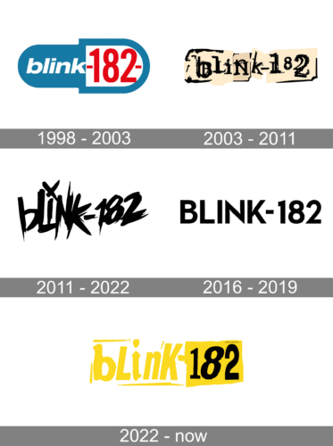
The original logotype of the band is a blue pill-like figure which was both the background for the white sans-serif ‘blink’ and the frame for the red number 182.
The image of the wordmark has been changed several times. One of the old versions was made up of two parts of an oval. The left half had a black background with the white letters “blink” while the right one, broader than the other, had a white background with black figures “182”.
2003 – 2011
The 2003 edition of the band name had black lowercase letters styled like metal parts. All of it was set on the beige-and-black 3D background.
2011 – 2022
None of the musicians has ever explained the real meaning of that number. They usually say that it was chosen by random. There have been speculations that the number is composed of two parts, 18 and 2, which correspond to the ordinal numbers of the letters “r” and “b” in the English alphabet. These should lead to “Rancho Bernardo”, a community in the northern suburb of San Diego, the place of origin of the band musicians. Another version was suggested by Travis Barker, the drummer of the group, that “182” is the American military radio code meaning “murder”.
2016 – 2019
The band logo number 3 is a simple uppercase sans-serif inscription without any special details.
2022 – Today

The redesign of 2022 has introduced a completely new super bright badge for the famous rock band, adopting a fresh and energetic yellow, white and black color palette. The new design comprises a yellow bold lowercase inscription with each character in its own style, followed by the black “182” on a yellow rectangle with uneven edges. The first part of the banner is framed by several small lines, which are short and a little arcaded on the ends.
Symbol
2003 – 2011
2011 – Today
Font
The band has used various fonts for its albums. The debut album featured the band’s name in Times Bold. On the covers of the following albums, such fonts as Helvetica Bold Oblique, Trade Gothic, Futura Book, and Resurrection were used.
Color
The current version of the Smiley emblem features various shades of grey, white, and yellow to create a 3D effect on the black background. The color scheme of the Bunny symbol includes blue, red, black, orange, green, white, and grey. The choice seems to be quite natural for the objects depicted on the logo.


