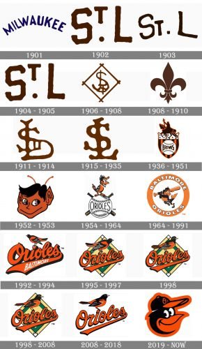
The professional baseball team Baltimore Orioles has gone through more than 15 logotypes. In most cases, there have been variations of the two main symbols: a lifelike bird and a cartoon bird.
Meaning and history
The name Baltimore Orioles and the symbol of the club, a bird, appeared only in 1954, though the history of the team started in 1901 with the Milwaukee Brewers club, which relocated to St. Louis, becoming the Browns, and, finally moved to Baltimore, staying there by now.
1901
The very first logo created for Milwaukee Brewers boasted a traditional for those times composition where the arched blue inscription in all capitals was set on a white background. It was a simple yet bold logo, which only stayed with the club for one year.
1902
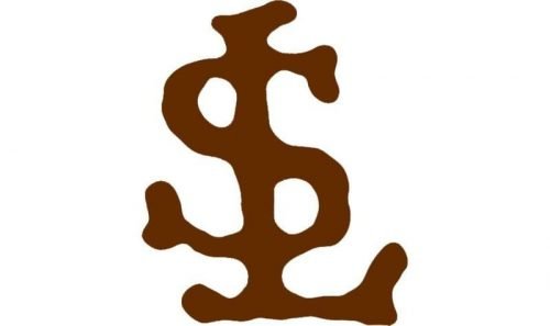
The club changed its name to St. Louis Browns in 1902, and with the new name adopts a new color palette — brown on white. The new logo featured “St. L” lettering with “S” and “L” enlarged and smaller “T” placed above the solid circle dot.
1903
In 1903 the logo was rewritten and now all letters were sitting on one line, having their contours thinner and more elegant than on the previous version. The color palette remains unchanged.
1904 — 1905
In 1904 the Browns bring back their logo from 1902, slightly refining the contours of the bold brown letters. This logotype stayed with the club for another year.
1906 — 1908
The new badge was introduced by the St Louis Browns in 1906. It was a smooth delicate monogram, composed of intertwined letters placed inside a white rhombus in a brown frame. All lines of the logo had their ends rounded.
1908 — 1910
For two years, starting in 1908, the club was using an elegant heraldic symbol for its visual identity. It was a clean and professionally executed fleur-de-lys, drawn in the chocolate brown shade and placed on a white background.
1911 — 1914
The fleur-de-lys was replaced by another monogram in 1911. It was a composition resembling the logo created for the club in 1906, but with the contours of the letters refined and the frame removed.
1915 — 1935
The lines of the “SL” lettering became bolder in 1915. The uneven contours of the symbols were smooth and their edges — softened. The emblem looked stable and evokes a sense of reliability and comfort, drawn in an intense and warm shade of brown.
1936 — 1951
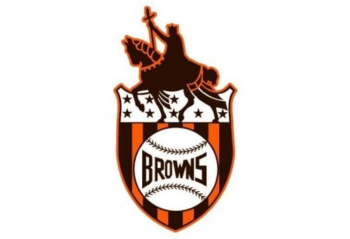
The first complicated composition was used by the Browns for their visual identity in 1936. It was a classy heraldic shield with the knight riding a horse on its top part and a striped crest on the bottom of the bead he. The crest had its vertical lines in orange and brown, and a white baseball placed in the middle. The “Browns” inscription in all capitals of a geometric sans-serif typeface was written in dark brown over the baseball.
1952 — 1953
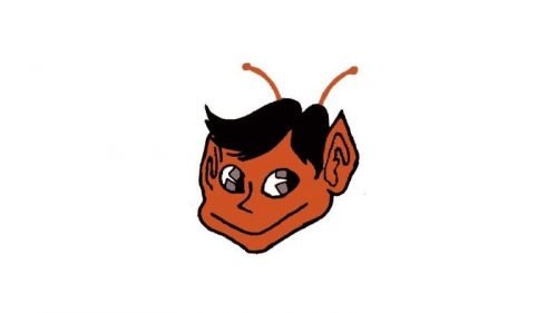
The redesign of 1952 brought the last emblem for St. Louis Browns — it was a portrait of an elf, executed in an orange and brown color palette. The creature had large eyes and two playful orange antennas coming out of its brown hair.
1954 — 1964
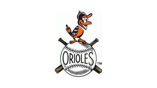
The club relocated to Baltimore and became Baltimore Orioles in 1954. In the same year, a new symbol was adopted — a smiley bird, which still is the part of the Orioles’ visual identity.
The bird in a baseball cap was sitting on a white ball with the “Orioles” inscription on it. Two crossed bats were hidden behind the ball.
1964 — 1991
In 1964 the bird was drawn with the bat in its hands and placed on a white background, enclosed in a thick orange circular frame with white lettering around its perimeter. The inscription was executed in an extra-bold sans-serif trie face a had a delicate yet visible black outline.
1992 — 1994
The logo from 1992 featured an orange script lettering with the white “Baltimore” wordmark on the logotype’s underline, and – realistically drawn bird sitting in the dot above the letter “I”.
1995 — 1997
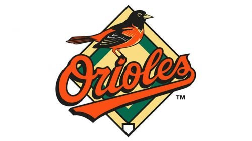
The emblem was refined in 1995, by removing the “Baltimore” inscription, enlarging the bird and turning it to the rightful and placing the elements on a rhomboid background, executed in pale yellow and green.
1998
The color palette of the Orioles’ logo got slightly lighter, and the contours were refined. The iconic bird got more details and started looking even more realistic and confident. As for the other elements, they stayed unchanged.
1998 — 2008
The changes made to the Orioles’ logo in 1998 were again only about the bird’s image. Its beak and eye were enlarged, while the tail was made a bit narrower and sharper. The color palette and style of the inscription haven’t been touched.
2008 — 2018
The redesign of 2008 changed the color palette of the Orioles’ visual identity to red and black, removing the rhombus and placing the script logotype a bit diagonally. The bird was also redrawn and its contours — cleaned. The secondary version, created for the club depicted a smiley caricature bird’s face, resembling the very first logo from 1954, and another variant with the smooth red “O’s” in a thin black outline.
2019 — Today
The smiley bird’s face became the Baltimore Orioles primary logo in 2019. Executed in black and red it looks powerful and passionate, yet the funny mood and style evoke a playful and happy feeling.
Font
The lettering featured a beautiful hand-drawn script created specifically for the Baltimore Orioles logo. It hasn’t changed that much since it was introduced in 1992.
Color
The logotype features the baseball team’s official colors: black, white, and orange. From 1995 to 2008, two more colors were used: green and yellow.


