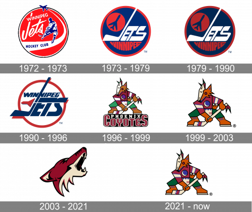
The US ice hockey team the Arizona Coyotes has had three names so far, and each time the renaming coincided with the introduction of a new emblem. That’s why the history of the Arizona Coyotes logo can be broken into three distinctive periods:
- 1972-1996 (Winnipeg Jets)
- 1997-2003 (Phoenix Coyotes)
- 2004-present (Arizona Coyotes)
Meaning and history
The history of the Arizona Coyotes visual identity can be split into two main parts — the Winnipeg era, from 1972 to 1996, and the Coyotes started in 1996. Though the logo was not changed only once, each of the chapters has a minimum of one major redesign, and it gave a lot of colors and illustrations to the club’s biography.
1972 — 1973
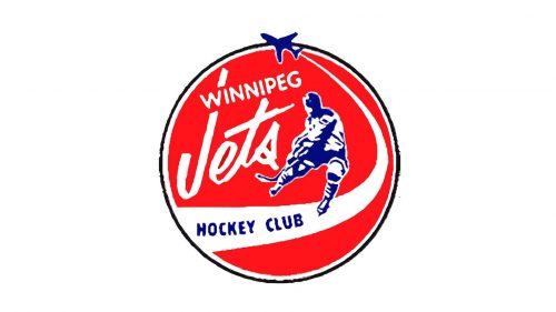
The very first logo was designed for Winnipeg Jets in 1972 and comprised a red circular barge with a bright blue and white outline. A blue and white image of a hockey player, which had a bit naive execution, was set on the right part of the badge, and a white wordmark — on the left. The inscription was positioned in two levels, with the “Winnipeg” in all-caps of a traditional sans-serif typeface, placed above the stylish custom “Jets” in a bold script font with the vertical bar of “J” elongated up and crossing the “Winnipeg”.
The thick smooth white line was underlining the player and the lettering, coming out of the small blue jet, placed on the top part of the emblem’s frame. The “Hockey Club” inscription in blue was placed in the thicker part of the white line and featured a bold narrowed sans-serif typeface.
1973 — 1979
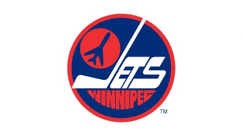
The Jets emblem was redrawn in 1973. The circular badg switched its main color from red to blue, and the outline now featured a bright red shade. The blue jet silhouette was drawn on a smaller red circle in the upper left part of the emblem, near to the white “Jets” lettering with its “J” stylized as a hockey stick. The “Winnipeg” part of the nameplate was written under the white one in red and had its contour repeating the arched bottom side of the badge.
1979 — 1990
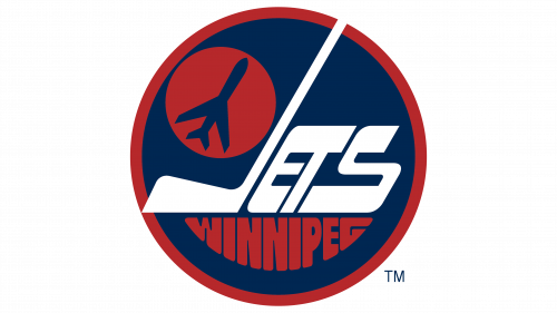
Nothing changed compositionally, except for a darker color scheme on this emblem.
1990 — 1996
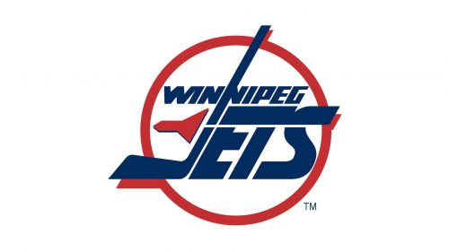
In 1990 the tricolor logo was redesigned again, making the main rifle white, the outline red, and the inscription with a symbol — blue with red. The small jet now featured red shade, and was drawn in a very abstract shape, placed on the left from the stylized “J”. The “Winnipeg” part of the nameplate was now placed above the “Jets”, just line in the original version of the logo, but both words were now written in all capitals of bold sans-serif fonts, with the upper line in a more traditional style, and the enlarged bottom part in a narrowed italicized typeface, lightened up by a thin white line coming though it and horizontally dividing the solid shapes into two parts.
1996 — 1999
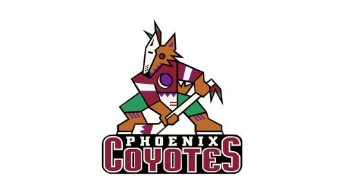
In 1996 the team loves Phoenix, Arizona, and changes its name to Coyotes, adopting a completely different logo in the same year. The new emblem featured a stylized geometric image of a coyote in a hockey uniform with the stick. The animal was drawn in different geometric segments with sharp angles and clean lines. As for the color palette, the image was built around the combination of orange, green, and purple, with some additional details in white, blue, and red.
1999 — 2003
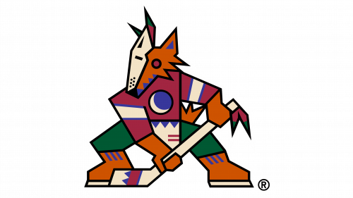
In 1999, the team decided to only use the coyote image from the previous design, without the wordmark below. Furthermore, the colors were darkened slightly for this one.
2003 — 2021
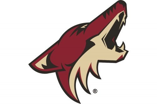
The redesign of 2003, held by Adrenalin Design Group, brought a completely different logo to the hockey club from Arizona. It is a detailed and pretty realistic image of a coyote, drawn in profile, turned to the right with its mouth open. The animal is executed in two shades of brown — a dark one which has some red shades and is close to burgundy, and a light beige, even cream, close to white, one.
2021 — Today
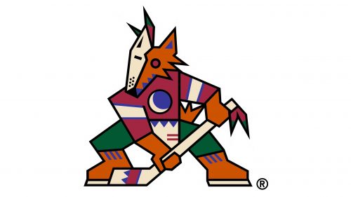
The 2021 emblem is almost exactly like the 1999 coyote drawing. The only changes include small color tweaks here and there.
Font
While the primary logo doesn’t feature any lettering at all, the team does have a wordmark. It is a two-lined insignia featuring the name of the team in a custom sans serif typeface. Some of the most distinctive letters are arguably the two “A’s” (that are each other’s mirror reflections), the “Y,” and the “T” with the slashed ends of the top bar.
Colors
There’re three colors on the Arizona Coyotes logo: brick red, black, and desert sand, which is actually a shade of beige. Both the primary logo and the alternative one are pretty consequent in terms of the color palette: none of them includes any other colors than the ones mentioned above. The palette was obviously inspired by the Red Rocks of Sedona, Arizona, with their unusual and beautiful shades.
BRICK RED
PANTONE: PMS 202 C
HEX COLOR: #8C2633;
RGB: (140,38,51)
CMYK: (29,94,75,28)
DESERT SAND
PANTONE: PMS 468 C
HEX COLOR: #E2D6B5;
RGB: (226,214,181)
CMYK: (11,12,31,0)
BLACK
PANTONE: BLACK C
HEX COLOR: #111111;
RGB: (17,17,17)
CMYK: (73,67,66,83)


