Zenith Logo PNG
The Swiss luxury watchmaker Zenith, established in 1865, experimented with various astronomy-inspired designs before opting for its current five-pointed star logo.
Meaning and history
Compared to other famous watch brands, Zenith is the one with quite a lot of redesigns of the visual identity — there have been five different versions of the logo created for the brand throughout its history. And the original version has nothing in common with the one we all can see today.
Old
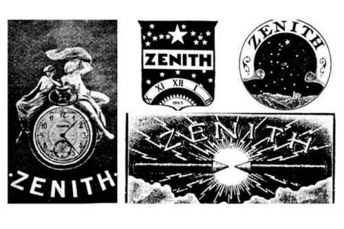
At the beginning of the brand’s history, the Zenith logo was very detailed and ornate. The very first version featured an image of two people in smooth draped clothes sitting on a circular clock. The “Zenith” lettering was written in white uppercase, arched from the center, under the clock.
Since the first redesign, the watch brand starts using astrological motives in its visual identity. This is when the iconic star first appears. Although the early version of the logo had several stars in different sizes, they have always been five-pointed.
Zenith experimented with the logo shape a lot — there were crest and circular emblems, along with simple rectangular. And it is interesting to track the history of the brand’s growth through its visual identity redesign. The only thing that has never been changed is the color palette. Monochrome, a timeless combination of black and white, still stays the main scheme for the watch brand, though today it is being complemented by a secondary, red and white palette.
New
After the last redesign, the Zenith logo became simpler yet more elegant and confident. The iconic star symbol still takes the main part of the legendary brand’s visual identity, being drawn in black and placed above the strict yet modern and airy logotype.
The new logo is built in four levels — with the star on top, the “Zenith” wordmark in the uppercase under it, and the two-story tagline “Swiss Watch Manufacturer” with the “Since 1865” in smaller sized letters at the bottom.
The bran uses a custom sans-serif typeface with straight clean and medium-weight thickness lines, which have a lot of space between them, making the rigorous contours of the inscription lighter and the whole badge — more sophisticated.
As for the star, it is drawn in solid black, with distinct edges and angles, and has five very thin white Rays coming from its middle to the peaks of the corners. These Rays add volume and dynamic to a plain symbol, and show the brand as the progressive and developing one.
Font
There’re two slightly different typefaces on the current wordmark. While both of them are rather clear sans serif fonts, the word “Zenith” is set in a wider type than the rest of the logo.
Colors
The regular Zenith watch logo is black on the white background but may appear in varying color schemes when featured on watch faces depending on the background.


