YouTube TV is an online television service that was created at the beginning of 2017. it provides access to a variety of television channels, already counting in the dozens. The YouTube apps for iOS and Android, as well as YouTube Music and Kids, already support offline viewing, so you can download and watch interesting videos without worrying about the Internet connection.
Meaning and history
YouTube TV is kinda similar to YouTube Premium but allows you to watch cable channels online and download the content into your device to be able to watch it offline whenever and wherever it is good for you.
YouTube TV offers a pretty good selection of streaming services, but there are a few notable gaps compared to most major cable lines, though the media giant keeps expanding its portfolio of channels.
All four broadcasting giants, ABC, CBS, Fox, and NBC, have their content available for YouTube TV. In addition to them, ESPN, USA, and FX are on the YTV menu. Some channels are available for an additional fee.
As for the visual identity of the service, the YouTube TV logo is based on the logo of its mother brand.
March – August 2017
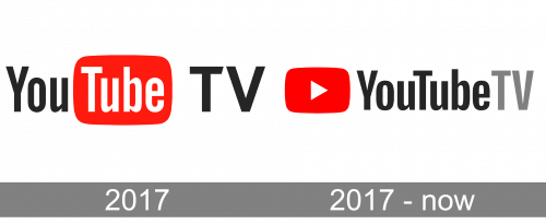
The initial YouTube TV logo was created in March 2017 but only stayed for four months, until August. It was a concept based on two elements — the official primary insignia and the graphical emblem, used on its own and as a web and mobile icon of the application. The black red and white YouTube logo was followed by a slightly enlarged black “TV” executed in a modern full-sized sans-serif typeface. As for the iconic, it boasted a stylized television drawing — a large horizontally oriented rectangle with rounded corners, standing on a smaller one. The image was executed in several shades of red, had a solid white dot placed in the bottom right part and a dark solid play-button triangle in the center.
August 2017 – Today
After the redesign in August 2017, the YouTube TV logo started looking more professional and modern due to the use of a minimalistic concept and laconic shapes. The new emblem has cleaner lines and is drawn in one shade of red; with the white horizontally oriented triangle in the center. As for the main logo, it was changed according to the major YouTube redesign and now features a black “YouTube” lettering in a narrowed sans-serif typeface, set on the right from the red arched rectangular emblem with the white triangle on it, and followed by a ray capitalized “TV”, set on a small distance from it.


