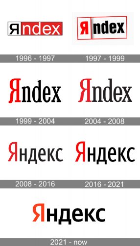
The first Yandex logo (1996) was inspired by that of the company CompTek, in which the Yandex web search engine was created. The history of the emblem has included at least five updates so far.
Meaning and history
Yandex is the number one search engine in Russia, which was established in 1997. The software was developed by CompTek, a company, founded in 1988. Yandex began to grow and develop at an extraordinary rate, and already in 2001, it surpassed the largest search engine in the Russian segment of the web, Rambler, becoming a leader in Runet.
Yandex Today is a huge and reputable information company, which is a search and ecosystem, a complex of useful Internet services. The main audience of the platform is the Russian Federation, Belarus, and Kazakhstan. Recognized as one of the fastest-growing corporations in its home country, as a search engine, in terms of the total volume of processed queries, it is second only to Google, Yahoo, and Baidu.
What is Yandex?
Yandex is the Russian number one Internet Corporation, which is often compared to Google. The company, established in 2000, provides its users with search engines, newsfeeds, and mail services.
1996 – 1997
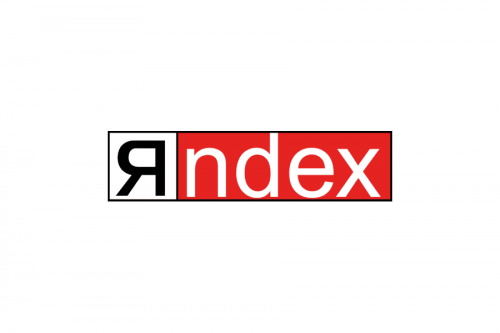
Both the CompTek and Yandex logos featured a rectangle with a thin black outline. The rectangle was broken into two parts. In the left part, black letters on the white background could be seen, while the right part contained white letters on the red background.
In the case of the CompTek logo, the company name was broken into “Comp” and “TEK.” In case of Yandex, the first box housed the letter “я” (“ya”) in the Cyrillic script, while the second box housed the lettering “ndex” in the Latin alphabet.
In comparison with the parent logo, Yandex featured a brighter shade of red. The letters were slightly thinner.
You may wonder why the name of the search engine included letters from the two different scripts. It turns out, originally the word “Yandex” was made up as an abbreviation meaning “yet another indexer.” The word was used as a name for new technology and was given in Latin letters because the information about it was saved to a computer file (and “Yandex” was the name of this file).
When the project developed into a web search engine, its creators decided to bring the abbreviation closer to its Russian roots. So, they wrote the first letters in the Cyrillic script, which is used in the Russian alphabet.
1997 – 1999
The new emblem was developed in 1997 by the design firm Art. Lebedev Studio, which has been responsible for the evolution of the logo ever since. This was the logo used at the moment of the official launch of the web search engine on 23 September 1997.
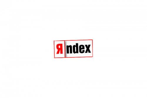
This one preserved the two-box structure. Now, there was some depth in the design: the box on the left appeared to be a bit closer to the reader, while the right rectangle seemed to have moved backward. The red filling was removed. The first letters were given in red, while the rest of the word was black. The letters were bold, “я” being a bit bigger than the rest.
1999 – 2004
In the case of CompTek, the two-part structure was beneficial. As the company name was difficult to pronounce (and memorize) because of the consonant cluster (mpt), it was only natural that the word was broken into two meaningful parts to make it easier to understand and remember. The word “Yandex,” by contrast, was pretty easy to pronounce. Also, it couldn’t be broken into meaningful parts – it was rather a single whole. So, the two-part structure didn’t fit – Yandex obviously needed a different approach.
As the web search engine turned out to be a huge success, the need for a logo that would be more professional and distinctive than the old one emerged. Once again, the design was developed in Art. Lebedev Studio. The 1999 logo has become a classic. While there have been a couple of updates since then, the overall style of the insignia has remained unchanged.
The 1999 logo got rid of any boxes or other elements apart from the letters themselves. The first letter (Cyrillic), which was now significantly higher than all the rest, was given in red. The text “ndex” was in black. The design featured a serif type.
2004 – 2008
The modification was very subtle and included only the details of the glyphs. The letters became a bit thinner and less curvy.
2008 – 2016
This time, all the letters on the logo were given in the Cyrillic script and a sans serif font.
2016 – 2021
In addition to the primary logo, a whole set of versions was developed according to the word’s declension paradigm in the Russian language.
2021 – Today
The redesign of 2021 introduced a refined and refreshed Yandex visual identity, which is fully based on the previous logo versions of the company, but has a stronger character, reflected by the wider and more stable shapes of the letters in the inscription. The color palette remained the same — the iconic red for the first letter, and black all the others. The lines on the new logotype became thicker and bolder, which made the lettering look more confident and professional.
English version
The primary Yandex logo has always been the one in Russian as in this country the search engine generates not less than 51 of all search traffic. However, as the Russian insignia would be incomprehensible and illegible for the English-speaking community, a global version has been developed.
It is pretty similar in style but looks a bit more playful than the original one because the two top bars on the “Y” have different lengths. The only glyph present in both the versions is the “e,” which looks pretty similar.
Yandex Money logo
The logo of the online payment service consists of three parts: the primary Yandex logo, the word “Money” in thinner letters, and (optionally) a yellow purse. In the Russian version, the word “Money” is replaced by its translation.
Yandex Music logo
In addition to the primary logo, you can see the word “Music” and a red note in a yellow circle.
Yandex Taxi logo
The structure and the overall approach are the same as in the case of the Yandex Money and Music. An icon can be used featuring five black squares inside a yellow speech bubble.


