Despite all the updates the package of Wrigley’s Spearmint chewing gum has gone over its almost 130-year history, it has almost always preserved the following elements:
- a green arrow featuring the word “Spearmint” in white
- the word “Wrigley’s” in red above
- a peppermint leaf (or the whole plant)
Let’s look at the way these and other elements have been transformed over the years.
Meaning and history
The Wm. Wrigley Jr. Company (the Wrigley Company) was established in 1891. It was only two years later, in 1893, that one of its pillar brands, Wrigley’s Spearmint, was launched.
1913
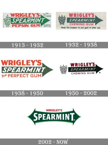
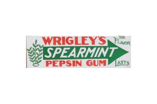
One of the oldest packages preserved already featured the iconic green arrow housing the word “Spearmint” in a heavily italicized sans serif typeface. The writing “Wrigley’s” in red can be seen above, while the text below reads “Pepsin Gum” (also in red).
The peppermint bush can be seen to the left of the main Wrigley’s Spearmint logo.
1932
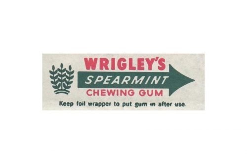
The letting “Pepsin Gum” was replaced by “The Perfect Gum,” also in a red type. The bush was replaced by the functional text “To open unwind red tape” in large letters. The word “Wrigley’s” grew somewhat bolder and more prominent.
1938
The writing about the red tape grew smaller, which could be explained by the fact that, by 1938, the majority of the consumers already knew how to use it. Also, the small text in green below the arrow disappeared leaving the design cleaner.
1950
The spearmint bush made a return. It appeared in its old place, to the left of the arrow. The lettering “The perfect gum” was replaced by the more modest “Chewing Gum,” also in red.
While the way the bush looked was slightly altered over the years and additional elements could be added, the overall structure of the design remained unchanged for around half a century.
2002
The company experimented with the package, due to which more than one version of the Wrigley’s Spearmint logo appeared. In all of them, the type in the word “Spearmint” was straightened. In some of them, the words “Chewing gum” disappeared.
The spearmint bush in one version of the package was divided into several sprigs, which could be seen to the right and left of the wordmark. Here, the arrow still had only one head.
There is also a version where just a single leaf remains instead of the bush. Here, it is placed above the arrow. The arrow, in its turn, has two heads (like in the old package if the Doublemint gum).
You can often come across a package looking very much like the one from the 1950s with the only exception that there is a white ellipse inside the arrow now and the lettering is not italicized.


