Wix is a software company headquartered in Israel, which focuses on providing cloud-based web development services. The project, which works on the freemium business model, was started by a group of Israeli developers including Avishai Abrahami, Nadav Abrahami, and Giora Kaplan.
Meaning and history
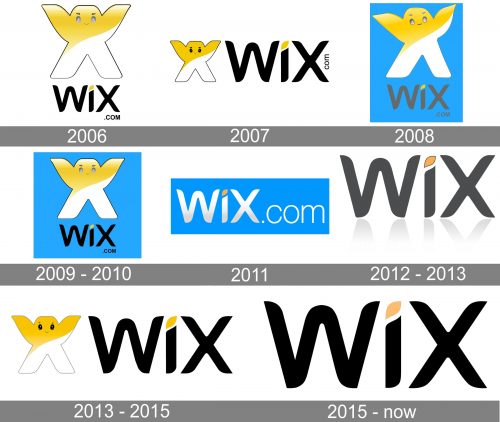
While the Wix logo has gone through multiple alterations, it is easy to see that the majority of the modifications have revolved around the same themes and shapes.
What is Wix.com
Wix.com Ltd. provides a set of tools to build a website, which can be either an HTML5 website or a mobile site. The process is performed with the help of drag and drop tools. There is a range of social plug-ins, online marketing elements, contact forms, etc. that can be added to the basic set.
2006
The brand was registered in 2006 and became available in an open beta version the following year.
The original logo already featured the mascot, a friendly-looking creature based on the letter “X.” Here, the creature has highly detailed eyes. Its top half is yellow, while the lower part of the body is white.
The word “WIX” below is smaller. It is set in a type that echoes the shape of the mascot. You can also see the writing “.com” in tiny letters, which has been present in several other versions. After all, it has been important for the company to clearly display the name of its website.
2007
There are more similarities than differences with the previous version.
The mascot has moved to the left-hand side of the wordmark, which, in its turn, has grown larger. The eyes of the mascot are darker, and its facial expression is different.
2008
The mascot has returned to its original prominent position. This time, it looks more vivid and emotional due to the modified position of its “hands.” The result is more eye-catching.
Additionally, now the logo is featured over the blue background.
2009 – 2010
Although the previous logo appeared dynamic, the company’s design team decided to get rid of it returning to the static version, where both the hands of the mascot were positioned on the same level.
2010 – 2011
The wordmark became the only part of the official logo. It was now silver with a subtle gradient, except for the playful dot over the “i” – the dot has remained yellow. The blue background was still there, but it grew a tad lighter.
2012 – 2013
The blue background has disappeared. The wordmark has lost the lettering “.com” and has become black. The “dot” over the “i” has adopted a thin black outline. Dark shades have been drawn below the wordmark, to add some depth.
2013 – 2015
The mascot made a comeback, while the wordmark grew flatter due to the disappearance of the shades. This version looks pretty much like the one from 2007, except that there is “.com” lettering now.
2015 – Today
Once again, the company got rid of the mascot. At least, it is nowhere to be seen in the primary version of the WIx logo. Here, there is only the lettering “Wix,” which looks almost exactly like in the previous design. Only the color of the “dot” appears a little darker, with a subtle peachy undertone.
There is also a variation with the lettering “.com” added. It is smaller and is set in a by far lighter type lest it distracts the eye from the main part of the logo.
Additionally, you can come across a version, where even the “dot” over the “i” is black.
Colors and font
The combination of black with a light yellow accent has been present in the majority of the versions of the Wix logo. At some points, blue was added.
The typography isn’t based on a ready-made font – each letter was drawn specifically for the brand, due to which it has its distinctive style.


