Wirecard is a German fin-tech company, which was established in 1999 in order to provide individual customers and businesses from all over the world with high-class services and solutions in fields of online transactions and money keeping.
Wirecard AG is an insolvent German payment processor and financial services provider, whose former CEO, COO, two board members, and other executives have been arrested or otherwise implicated in criminal proceedings. Wirecard has gone down as the most spectacular case of financial misconduct in postwar German history. (Wikipedia)
Meaning and history

The company’s visual identity is modest and laconic. Its text-based logo is neat and simple, an ideal representative of a professional service provider, which values quality above all.
The wordmark in all the lowercase letters is executed in white, when placed on the website, and uses the deep blue for the icon. This color palette is a traditional reflection of stability, power, and reliability, which perfectly represents the purpose and nature of the company, evoking a sense of protection and loyalty.
For the icon the platform uses a simple blue letter “W” with a small square above its right bar, forming a stylized letter “I”. Its simplicity elevates the visual identity of the company, making it timeless and sophisticated.
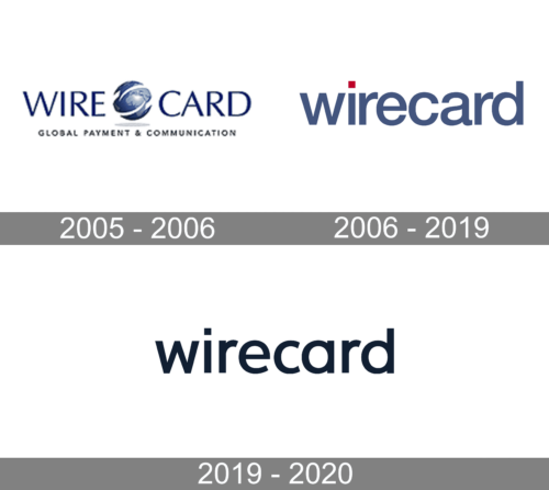
2005 – 2006

The logo of this company looked very professional and modern. It had the name of the company split in half by an abstract, futuristic illustration of the globe that had a shadow underneath for an illusion of volume. The globe was just slightly taller than the inscription, which had all uppercase letters with very short serifs. Underneath, it specified “Global Payment & Communication” in a much smaller font, but also using all capitalized letters. The whole emblem was done in deep blue color, which is often used by communications companies and represents stability and confidence among other positive values.
2006 – 2019

The company continued to use blue, although a slightly different shade of it, because it inspires trust and loyalty and stands for security. There was no more globe or any other inscriptions besides “Wirecard”. Here, it is seen in all lowercase letters that are spaced very closely. The font has no serif and uses thick strokes for a bold look. The unique feature of this logo is a red square that is used instead of the dot above the “i”.
2019 – 2020

A more stylish version was presented in 2019. It featured only the name again, but now it was printed using only black. The black color, bold lines, and wide spacing created an image of a powerful company with a strong standing in the market. The font has undergone minimal modifications.
Font
The wordmark is executed in a beautiful sans-serif typeface, which is very similar to URW Form Expand Medium font, but with the dot above the “I” replaced by a square. The font boasts sleek neat lines and smooth shapes of the letters, which evoke a sense of timelessness and classic elegance.


