Winamp is a multimedia player software, created for Windows in 1997. The program was sold to Radionomy in 2014 and today it supports almost 20 languages and is used by millions of people all over the world.
Meaning and history
Winamp, a notable name in the digital music realm, was founded by Justin Frankel and Dmitry Boldyrev in 1997. This revolutionary media player, developed under the banner of Nullsoft, quickly gained a cult following for its versatile features and customizable interface. Initially launched as a freeware MP3 player, Winamp stood out with its user-friendly design and the ability to play various audio formats.
The company’s main achievements include pioneering the use of skins and plugins, allowing users to personalize their experience extensively. Winamp’s introduction of the SHOUTcast streaming technology marked a significant milestone, profoundly impacting internet radio broadcasting. By the early 2000s, Winamp had amassed millions of users, making it one of the most popular media players worldwide.
In recent years, Winamp has navigated a series of ownership changes. AOL acquired Nullsoft in 1999, and later, Radionomy bought Winamp in 2014. Despite facing competition from modern streaming services, Winamp continues to maintain a loyal user base. The current position of the company reflects an effort to adapt to the evolving digital landscape, with plans to revamp the software to cater to contemporary audiences while preserving its nostalgic appeal.
What is Winamp?
Winamp is a versatile media player known for its customizable interface and support for numerous audio formats. Initially famed for MP3 playback, it expanded to include features like internet radio and music library management, appealing to a wide range of users.
1998 – 2010

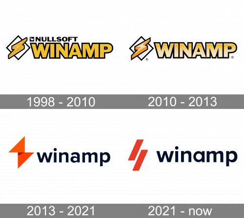
The iconic lightning bolt symbol was adopted for the Winamp visual identity in 1998. And its first version featured a three-dimensional yellow symbol placed on a white rhombus with a thick black outline. The lettering was set in the same shade of yellow and executed in a bold sans-serif typeface having its massive and neat letters in the same black outline. The “Nullsoft” inscription was set in the upper part of the main logotype, in bold black lines.
2010 – 2013

The redesign of 2010 enlarged and slightly stretched the emblem diagonally. The inscription got its yellow color in gradient now and the letters also became narrower and taller. Though the black outline of all elements remained untouched, without the black “Nullsoft” logotype the whole image started looking lighter and more energetic.
2013 – 2021
The logo was and is composed of a wordmark with an emblem on its left, and the current version is fully based on the previous one, but in a modern interpretation.
The original Winamp logo featured all capital lettering in a bold sans-serif typeface with straight lines and angles. The gold letters featured a black outline, which added strength and made the logotype look solid.
The Winamp original emblem consisted of a flashlight sign, placed above a white rhombus in a black outline. The golden flash was also outlined in black.
The redesign of the 2018 changed everything, but the original mood and concept remain. The new wordmark in all the lowercase lettering is written in a rounded sans-serif typeface and looks friendly and welcoming.
The new emblem keeps the shapes of both the rhombus and the flashlight, performing a new sign, composed of two orange triangles.
The new black and orange color palette of the Winamp logo is a reflection of the creativity and progress of the software, it also shows its professionalism and a perfect reputation.
2021 – Today

The 2021 update simplified the lightning bolt emblem into two orange lines, arranged at an angle. It’s the same idea, but simpler. The coloring also changed to a single shade of orange for the whole emblem.


