

![]() Whataburger Logo PNG
Whataburger Logo PNG
Whataburger is an American privately held restaurant chain, based in San Antonio, Texas, that specializes in hamburgers. The company only has its locations in the United States, with 900 restaurants all over the country.
Meaning and history
![]()
Whataburger is a pretty unique company, as from the day of its founding, in 1950, and until 2019, it has been owned by one family, the Dobsons. And only at the end of 2019 the chain, established by Harmon Dobson, was acquired a private equity firm, but the family of the founder still has a small stack in it.
Whataburger is a regional chain, which was born in Texas and today has almost a thousand locations across the USA. It is a very successful business, with a lot of fans across the country, known for its hamburgers and fries.
Probably, the loudest thing, which made the whole world recognize the name of the chain, was a small scandal in the press, that happened in 2016, when the company accused the authors of the “Wonder Woman” project of plagiarism. It was about the updated logo of the movie, which was almost an exact copy of Whataburger symbols.
Whataburger representatives noted that the company would not “go to war” with DC, but began “friendly talks about it.” “We noted the similarity of the Wonder Woman logo, which was registered in 1985, with our symbolism, but we had not previously emphasized it,” said a company representative.
What is Whataburger?
Whataburger is the name of an American fast food restaurant chain, which was established in Texas in 1950, and by today has grown into a large chain, with about 900 locations across the country. The menu of the restaurants is based on burgers and French fries.
In terms of visual identity, Whataburger has been loyal to its symbol since the beginning of the 1970s. Before that, the chain was pretty modest and simple in its insignias — with just the lettering on the banner.
1950 – 1972
![]()
The very first logo of the Whataburger chain was introduced in 1950 and stayed with the company for more than 20 years. It was a blue and white banner, extended horizontally and with its sides rounded. Enclosed into a double blue and white outline, the banner featured a bold white uppercase wordmark written on it in a modern geometric sans-serif typeface.
1968 – 1972
![]()
In 1968 the company has introduced another version of the logo, which was used along with the original version, in some of the locations. It was stylized uppercase lettering in a bold cartoonish typeface with interesting contours of the characters. The lettering was set in monochrome, usually accompanied by a drawing with the drive-in locations of the chain.
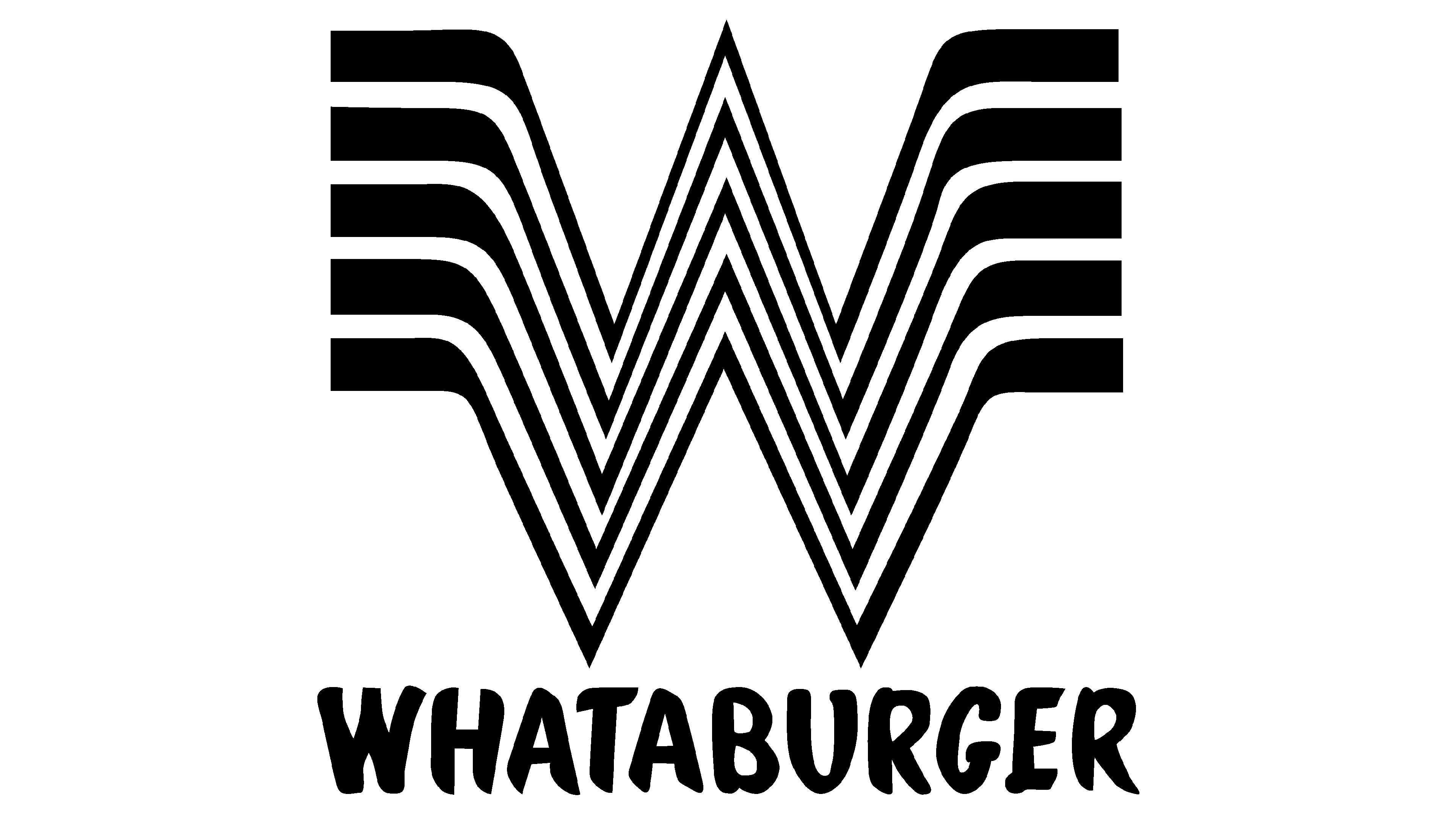
1972 – Today
![]()
The redesign of 1972 created the Whataburger logo, which has become iconic and is still used by the company in all of its locations today. The orange and white composition boasts an emblem with a stylized layered letter “W”, drawn in five parallel figures with the “wings” spread horizontally to the sides. The emblem is placed above the uppercase inscription in a bold designer typeface, resembling the font from the previous version, but with the contours refined and modernized.
Font and color
The bold and funky lettering from the primary Whataburger logo is set in a cool and modern sans-serif font with the uppercase characters slightly dancing on the line. The closest fonts to the one, used in this insignia, are, probably, Big Fish Casuals, or Hold On Regular, with some minor modifications of the characters’ contours.
As for the color palette of the Whataburger visual identity, it is based on a bright and juicy combination of orange and white, which symbolized energy, dynamics, and passion. At the same time, orange is a very warm and cozy color, which evokes a sense of friendliness and hospitality.


