The fast-food restaurant chain Tim Hortons Inc. has Canadian roots. It is headquartered in Toronto, but the number of countries, where it operates, is around 15. The number of locations is over 4,500.
Meaning and history

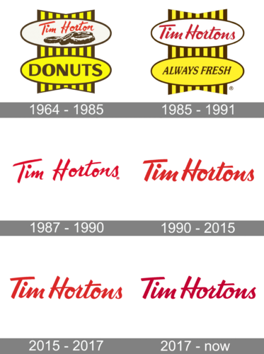
The evolution of the Tim Hortons logo reflects the overall trend for simpler logotypes. It has been growing more minimalist with every update, from the rather detailed original emblem of 1964 to the sleek modern wordmark. Let’s see how the designers of the logo managed to preserve the crucial meaning even when they had to sacrifice essential elements of the image.
1964 – 1985 – Tim Horton Donuts
The earliest version featured two ovals each standing on one of their flatter sides. The ovals were equal and were positioned one above the other.
What was placed inside differed dramatically, though. The top oval housed the lettering “Tim Horton” in red. Right below the wordmark, chocolate donuts with white cream could be seen. There were four of them visible. The background was white.
The lower oval had a yellow filling and featured the word “Donuts” in an all-caps sans serif type. The letters looked somewhat unusual because of the unexpected variations of the thickness of the glyphs.
What is Tim Hortons
Tim Hortons is a fast-food restaurant chain owned by International (2014–present). Its previous parent companies were Wendy’s (1995–2006) and Restaurant Brands. The restaurant chain was established in 1964 by co-founders Tim Horton, a renowned hockey player, and Jim Charade.
Behind the two ovals, there was a kind of short ribbon with brown and yellow stripes.
The meaning of the brown color on the logo is transparent – it just represents chocolate. The yellow color, in its turn, may represent the rich, oily dough.
1985 – 1991 – Tim Hortons
The name was simplified, and so was the logo. At least the one used on signage in Canada – it was very close to the original one. The overall structure remained unchanged, but there were fewer details.
The donuts disappeared from the top oval. Now, it was occupied by the red wordmark. The cursive script became a little more regular without losing its handwritten style.
The disappearance of the word “Donuts” gave the company a chance to reflect its more diverse menu. The designers decided to preserve the lower oval. This time, they placed the promise “Always Fresh” there. The ribbon remained almost unchanged, although it lost the brown trim at the top and at the lower part.
Locations in the United States would typically use a different logo. What made it similar to the original was the scripted name of the brand in red. However, here, there was a single oval. Its filling was white with a light brownish gradient somewhat reminiscent of baked dough. Below the oval, there was a brown banner that read “Cafe & Bake Shop.”
The ribbon in the background was simplified. It had slightly rounded ends and only five stripes. The yellow was replaced by red.
We should also mention the anniversary logo released in 2014.
1987 – 1990
1990 – 2015
2015 – 2017

Only the wordmark was left. Similar to the original logo, it was set in a casual cursive script imitating a handwritten note. This added personal touch. Firstly, it looked as if the owner of the company personally wanted to guarantee the quality of the meals. Also, it reminded us of the handwritten recipes our mothers and grandmothers used to exchange and the handwritten notes they used to place on jars of homemade jam, for instance.
2017 – Today

The shade of red went slightly darker.
Colors and font
The Tim Hortons logo is based on the color that is considered the most appetizing one, red. The cursive script is legible and meaningful.


